Blend Behaviors
Expression Blend 3 includes a number of very cool new features (see here for a good summary). But there are two that I think are particularly important – SketchFlow Rapid Prototyping, and Blend Behaviors. I’ll cover SketchFlow in some depth in a future post. In this post I’m going to talk about Blend behaviors and how they can be used to extend Helix, my prototype Silverlight navigation framework.
What Are Behaviors?
Behaviors are objects that encapsulate some form of interactive behavior. Blend allows them to be easily 'attached’ to visual elements in the UI, via drag-drop or declaratively in XAML. They enable developers or designers to rapidly add rich interactivity to the UI without having to write code.
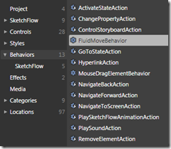
 Blend 3 ships with a number of behaviors (shown left) that allow you to easily animate an element, change it’s visual state, start/stop a storyboard, play sounds, etc.
However, the key thing is that Blend allows you to create new behaviors of your very own. And not only that, but when you do they will automatically show up in the Blend toolbox ready for use by a developer or a UI designer.
There is also an Expression Gallery here dedicated to community developed behaviors, so if you develop a particularly cool behavior you can readily share it with other Blend users.
Behaviors – Think XAML Extension Methods!
The implementation details and concepts behind Blend behaviors are pretty simple. They leverage the simple but powerful ‘attached property’ mechanism in WPF and Silverlight. Instead of attaching a simple value though (like Grid.Row=”2”) you’re attaching an object that encapsulates behavior. Such objects are sometimes called Attached Behaviors. They provide an elegant way to extend existing controls without having to modify the control’s code or it’s UI template. I like to think of attached behaviors as the XAML equivalent of extension methods in C#.
Developers have been using attached behaviors for quite a while now as a way of extending Silverlight and WPF. In fact, they are pretty much the only way that you can extend Silverlight, since it lacks a number of other key extensibility mechanisms (such as custom markup extensions). As such, they’ve proven to be a very useful way to add missing functionality to Silverlight.
For example, since Silverlight controls do not (yet) inherently support commanding, we used this technique in Prism for wiring up button-derived controls to commands on the ViewModel:
<Button prism:Click.Command="{Binding ViewOrdersCommand}" />
I also used this technique in Helix to implement CollectionView support (now thankfully redundant since it’s supported in Silverlight 3.0).
Both Prism and Helix provide base classes that allow you to more easily create attached behaviors, and there are a number of other third party behavior frameworks that you can use too. But now that we have the Blend Behaviors Framework, we can hopefully all standardize on a single framework.
Triggers, Actions and Behaviors
Blend behaviors actually come in two main flavors – Actions and what I’ll call Full Behaviors.
Actions are simple behaviors that encapsulate an action (believe it or not) that are associated with a trigger. You can use an action and trigger pair to make something happen as the result of an event fired by the parent control. You can, for example, change a property value, control a storyboard, play a sound, or cause a control to move to a particular visual state as the result of a Click, MouseLeave, MouseEnter, MouseLeftButtonDown event, or any other event that the parent control fires.
Here’s a simple example – when the user moves the mouse over the image, the opacity property is changed to 0.5:
 <Image Source="MyImage.png">
   <i:Interaction.Triggers>
       <i:EventTrigger EventName="MouseEnter">
           <ic:ChangePropertyAction PropertyName="Opacity" Value="0.5"/>
       </i:EventTrigger>
   </i:Interaction.Triggers>
 </Image>
You could of course choose a different event to trigger the action, or choose a different property to change. Blend makes it very easy to drag an action onto a control and to configure it to do what you want.
Some actions operate solely on the parent control that the trigger is connected to. Some actions can operate on a control other than the parent. These actions are called Targeted Actions. If no target is explicitly specified, the target defaults to the parent control.
You’ll notice that the EventTrigger is added to a triggers collection. That means you can add as many triggers to a control as you like. Other types of triggers are possible too, not just ones that are associated with the target control’s events. For example, you can imagine using mouse/stylus gestures as triggers, etc.
Full behaviors are useful for encapsulating more complex interactive behavior that aren’t necessarily associated with a single trigger. The following example uses one of the coolest behaviors that Blend provides – the MouseDragElementBehavior. By simply attaching this behavior to a control, you can allow the user to drag it around in the UI!
 <Image Source="MyImage.png">
     <i:Interaction.Behaviors>
         <il:MouseDragElementBehavior ConstrainToParentBounds="True"/>
     </i:Interaction.Behaviors>
 </Image>
Again, you’ll notice that it gets added to a behavior collection, so you can have multiple behaviors on a single control.
Blend provides an assembly, System.Windows.Interactivity, that contains a number of base classes that you can use to define your own triggers, actions and behaviors. Simply add a reference to this assembly to your project (you’ll find it in the ‘C:\Program Files\Microsoft SDKs\Expression\Blend 3\Interactivity\Libraries\Silverlight|WPF’ directory or thereabouts) and away you go. Any triggers, actions, or behaviors that you define will automatically be available in the Blend toolbox. Let’s see this in action…
A Custom Action
Some of you may have been following my series of posts on the Helix navigation framework for Silverlight. If so, you’ll know that Helix provides a NavigateLink control that you can use within a page to link to another page that the user can navigate to. The NavigateLink control derives from Silverlight’s HyperlinkButton control. It’s a very simple control – the only thing is really does is to fire a navigate event up the visual tree so that it can be handled by a Frame control which then manages the actual navigation.
But what if you don’t want to use a NavigateLink button control to initiate navigation? Say you want to navigate using a different control, like an Image or a ListBox, or in response to a different event than Click, like MouseEnter/Leave or SelectionChanged? Well, now you can with the HelixNavigateAction!
The HelixNavigateAction class is pretty simple. It derives from the Blend TargetedTriggerAction class – the target in this case is a Frame so you can initiate navigation on a specific frame. It defines two dependency properties, NavigateUri and NavigationParameter. The overridden Invoke method is the only interesting part of this class and is shown below.
 protected override void Invoke( object parameter )
 {
     Uri navigationUri = this.NavigateUri;

     // Navigate to the specified Uri.
     if ( this.NavigateUri != null )
     {
         // See if we have to format the navigation Uri with
         // any parameters.
         ...

         // See if the target frame has been specified explicitly.
         // If not, bubble a request navigate event through the visual tree.
         Frame frame = this.Target as Frame;
         if ( frame != null )
         {
             frame.Navigate( navigationUri );
         }
         else
         {
             // Bubble the RequestNavigate event to the nearest
             // parent Frame.
             UIElement parent = this.AssociatedObject as UIElement;
             parent.RaiseEvent(
               Microsoft.Samples.Helix.Controls.Frame.RequestNavigateEvent,
               new RequestNavigateEventArgs( navigationUri, TargetName ) );
         }
     }
 }
As you can see, we first check to see if a target Frame has been specified. If it has, we call the Navigate method on it directly. If not, then we raise a RequestNavigate event which will bubble up through the visual tree until a containing Frame control is found. That’s pretty much it. In the next section we’ll see how we can use the HelixNavigateAction class in Blend.
While creating actions in Blend is fairly straightforward, there are a couple of wrinkles to be aware of… If you look closely at the classes provided in the System.Windows.Interactivity namespace, you’ll see that there are two main action classes – TriggerAction<T> and TargetedTriggerAction<T>. Both ultimately derive from the TriggerAction base class. Now you’d probably think that the generic parameter <T> in each of these classes would specify the same kind of type. Well, it seems that the <T> in TriggerAction<T> specifies the type of Associated (parent) control, but the <T> in TargetedTriggerAction<T> specifies the type of the Target control. For a TargetedTriggerAction, to constrain the type of the parent control, you have to add a TypeContstraint attribute to the class:
|
HelixNavigateAction In Action
So with our newly minted HelixNavigateAction class all compiled, let’s put it through it’s paces in Blend. You can download the sample project (including the latest version of Helix) here.
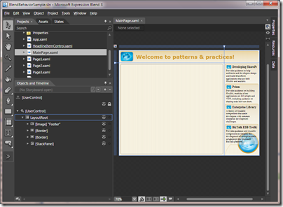
We’ll start with a simple app with main screen that contains a frame (the big area on the left) and four headline controls (on the right).
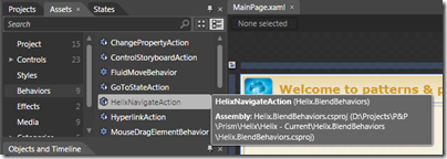
We’re going to use the HelixNavigateAction to navigate the frame to various pages as the user clicks on the headline controls on the right. If you click on the Assets tab and then on Behaviors, you will see a list of Behaviors and Actions that you can use. You’ll notice that the HelixNavigateAction is already there for us!
Simply drag the HelixNavigateAction over and drop it one of the headline controls on the right hand side of the main screen. You see the action get added to the object tree and the property grid will show various trigger and action properties. Let’s setup the trigger first by choosing the MouseLeftButtonDown event in the EventName dropdown. Next, we’ll set the target. For this we can use the rather nifty target picker! You just click on the round target icon and then click on the Frame and hey presto! the TargetName property is filled in:
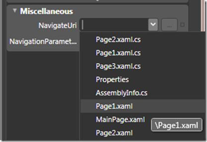
Finally, we just have to specify the Uri to navigate to. For that we simply use the dropdown on the NavigateUri property and select whichever page we want to navigate to:
Repeat for the other three controls and that’s it, we’re all done! For grins, change the trigger event to MouseEnter to get a ‘hot-spot’ navigation effect. You can run the completed app here.
With Blend and the Blend Behaviors Framework we have a pretty powerful and flexible way to create re-usable components that encapsulate interactive behavior and a way to use them to snap together an application very rapidly.
I’ve only really scratched the surface here. There are plenty of other cool and powerful things that we can do with behaviors. Also, it may be that we can leverage this framework in the next release of Prism, and thereby replace our implementation in favor of the Blend implementation. Not only will this reduce the amount of code in Prism, it will also allow us to leverage the built-in design-time support that Blend provides…
Helix
I made a few small changes to the Helix framework to support the use of Blend Behaviors. I also updated the samples for Silverlight 3.0. You can download the latest version here (version 0.31).
Blend Behavior Resources
You might find the following resources useful as you explore Blend and the Blend Behaviors Framework:
- The Expression Blend home page: expression.microsoft.com/en-us/cc136530.aspx
- Expression Behavior Gallery: gallery.expression.microsoft.com/en-us/site/search?f%5B0%5D.Type=Tag&f%5B0%5D.Value=Behavior
- Christian Schormann’s posts on Behaviors: electricbeach.org/?cat=30
- Kirupa Chinnathambi’s posts on Behaviors: blog.kirupa.com/?cat=18


