Windows Logos through the years

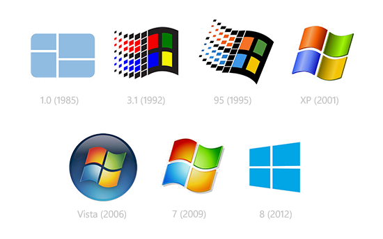
With the upcoming General Availability release of Microsoft Windows 8 on 26th October 2012, I thought it would be fun to take a look back at how the Windows logos have changed through the years.
Back on 20th November 1985, Microsoft released Microsoft Windows 1.0 which had the following logo with the 4 panes of a single colour:
When Windows 3.0 released in May 1990, the familiar red, green, blue and yellow colours were added to the panes of the window:
From that point on, the logos for Windows 95, XP, Vista and 7 have been progressions based on the four colours:
Now we have the new Windows 8 logo, which in some ways goes back to the single colour simplicity of the very first windows logo:
For other fun posts on product logos, have a look at:
Hope you found this interesting.
David
PS: I had not seen the original Windows 1.0 logo before I researched this article. Thanks to Minimally Minimal to reminding us.
Comments
Anonymous
September 17, 2012
Interesting Blog about MS Windows logo and implementation through the years and preferred Minimally Minimal is also tremendous, thanks for making it shareable.Anonymous
June 02, 2016
time to update this article, there is a new logo. Again.Anonymous
June 02, 2016
Hi WendyThere is a new logo for Windows 10, but I can't update the blog after I left Microsoft in Oct 2014.DavidAnonymous
July 29, 2016
why did you skip windows 9?- Anonymous
July 30, 2016
AnthonyBecause Seven Eight Nine...... (Say it aloud). :-)David
- Anonymous


