Where's my CanUX blog?
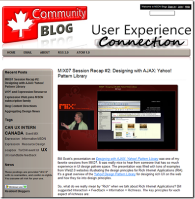
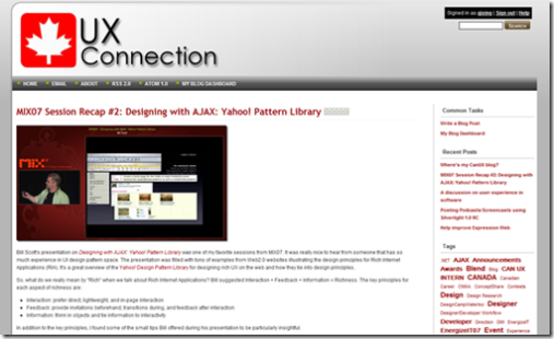
If you frequently visit this blog, you may have already noticed some not-so-subtle changes to the look and feel we made. It's not a mistake - we've been deliberating the overhaul of the experience you have on this blog over the past little while.
There were a lot of little and not-so-little things that bugged us (and a number of the readers of this blog!) about the experience of reading this online journal. Personally, my biggest pet peeve was the size of the text column in the blog itself. Way too narrow.
Well, we made the changes we hope you like them. Among the big changes that you will notice are:
- A dynamic page width feature that will better suit both 4:3 and 16:9 screen aspect ratios
- A faster page load experience
- Links to the other community blogs we provide (i.e.: CdnDevs, CanITPro, CdnITManagers)
We hope you like the changes. This is an iterative process and as suggestions are given to us and ideas pop into our heads, we'll make more changes to make your experience on this blog even better. On that note, if you have ideas for us or comments on the changes we've made, we'd love to hear about them - send us a comment on this post and we'll gather the feedback!
Here is a before and after look comparison. Thanks to our intern, Mark Zielinski, working hard to give a fresh look to our blog.
 |
 |
| Before | After |
Paul and Qixing
Comments
Anonymous
August 23, 2007
PingBack from http://msdnrss.thecoderblogs.com/2007/08/23/wheres-my-canux-blog/Anonymous
August 24, 2007
The comment has been removedAnonymous
September 06, 2007
The comment has been removed