Sidebar Gadgets Design Guidelines
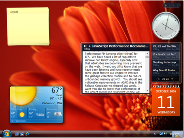
Gadgets are becoming more and more popular now. They are on your desktop display (figure 1), personal webpages, blogs, shopping sites, ...Everywhere! One of the new additions to Vista UI is the sidebar gadgets panel.
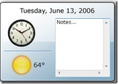
| Figure 1 | Figure 2 |
 |
 |
While these little gadgets are useful, careful design considerations are need to ensure they are non-obtrusive and usable. For example, since gadgets are small in size, they are designed for highly specialized tasks. More importantly, one gadget should be only designed for one simple task such as keeping track of time or weather condition. Therefore, if you want to create a gadget for flight booking, you may want to break down the complex task into several manageable smaller tasks. For example, you may want to create a flight viewing gadget sitting on your desktop to show you the next available flights and their prices to a preset destination. There may be a link on the gadget to direct the users to buy tickets on airline websites. However, this gadget seems to be useful only for frequent travelers. Well defined task is just one of the design concepts we need to be careful when designing gadgets. The Windows UX team concluded a list of design concepts and guidelines on sidebar gadget design. Some key concepts are:
- Perform a single, well-defined task very well (see figure 2 for a bad example, non of the functionality performs well)
- Provide functionality that is useful all the time
- Make sure the gadget works well in the periphery by being quickly accessible while not being distracting
- Use a visually attractive theme that indicates the gadget's singular task
- Make your gadget unique through its functionality and visualization, but use standard interactions.
Check out the guidelines and let us know what you think. If you have a well-designed gadget and would like to share, please send it my way.
Qixing
Technorati Tags: UX Guidelines, Gadgets Design