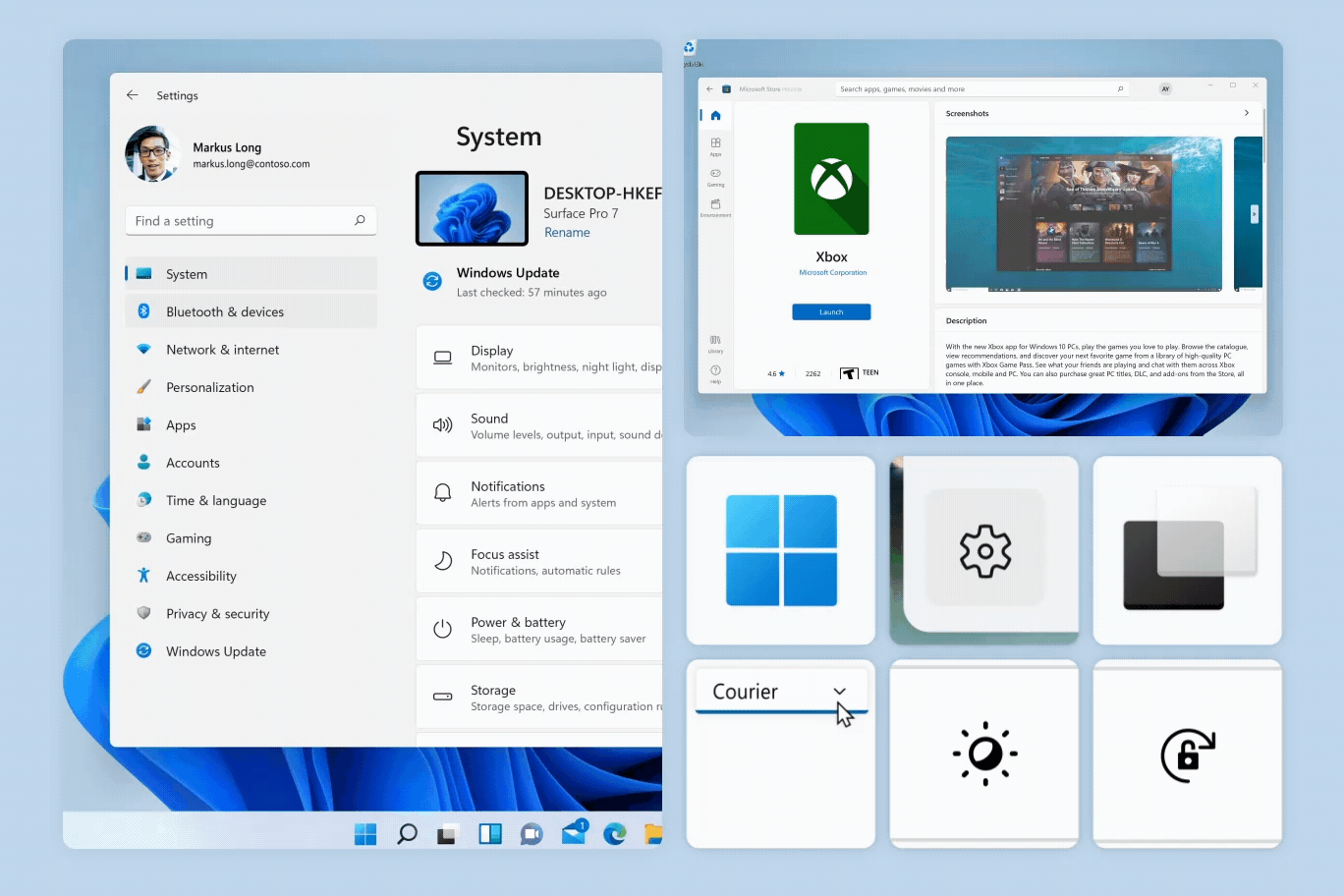
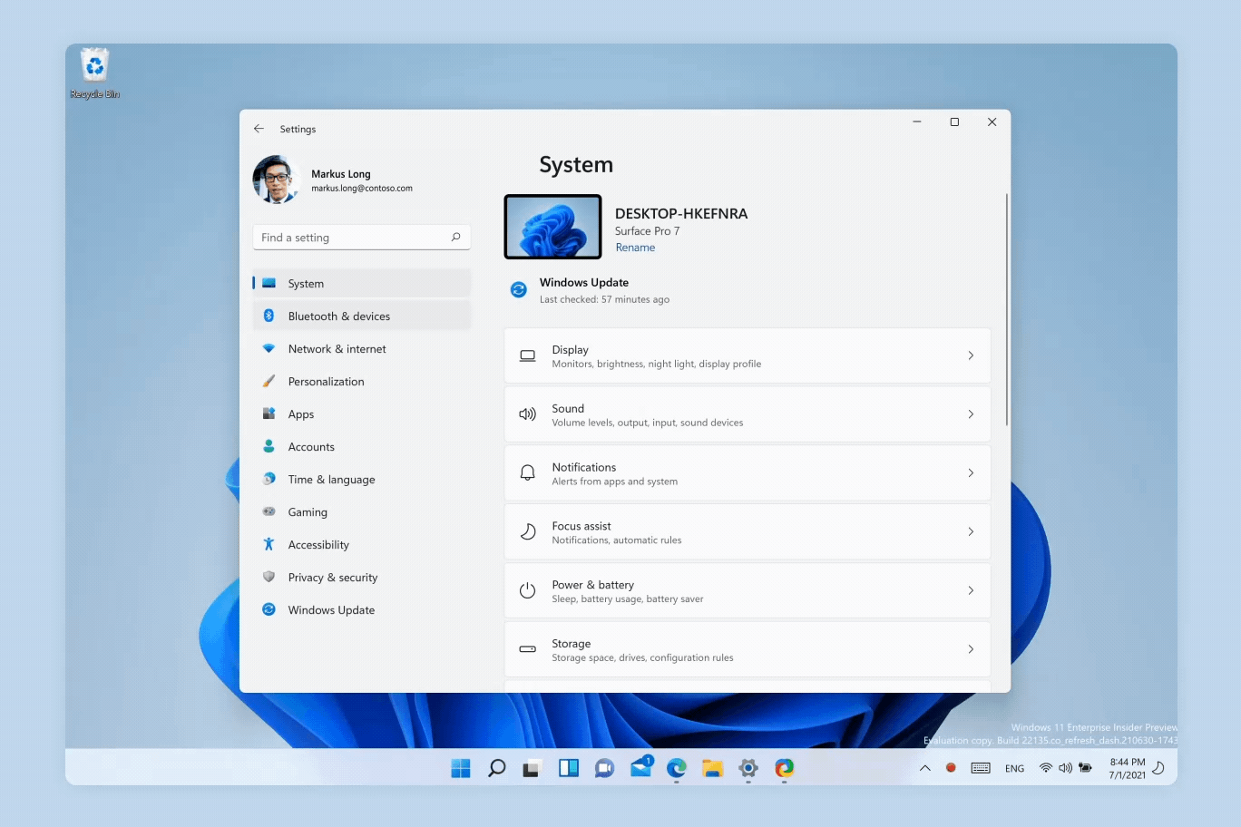
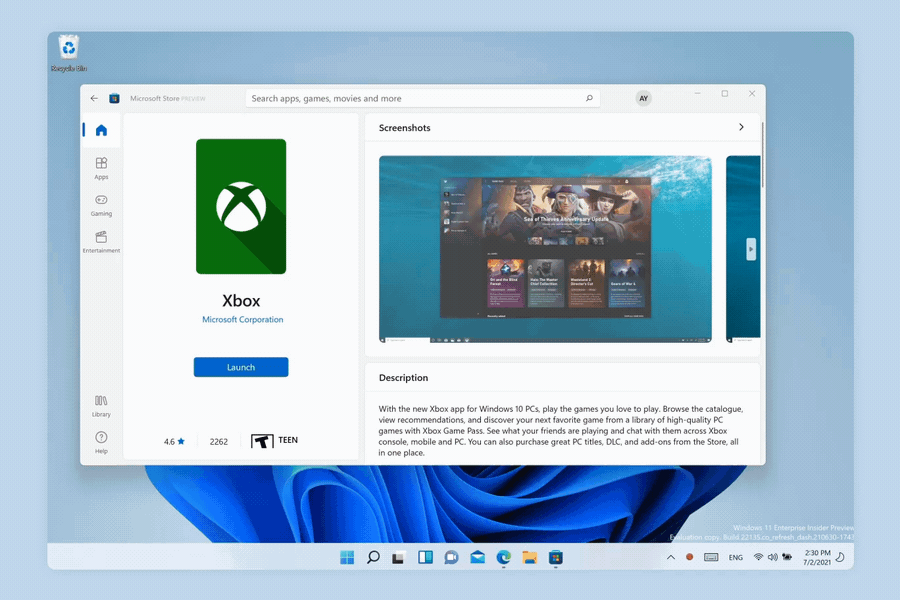
Motion in Windows
Motion describes the way the interface animates and responds to user interaction. Motion in Windows is reactive, direct, and context appropriate. It provides feedback to user input and reinforces spatial paradigms that support way-finding.
Tip
This article describes how the Fluent Design language is applied to Windows apps. For more information, see Fluent Design - Motion.
Motion principles
These principles guide the use of motion in Windows.
Connected: Elements of actions connect seamlessly
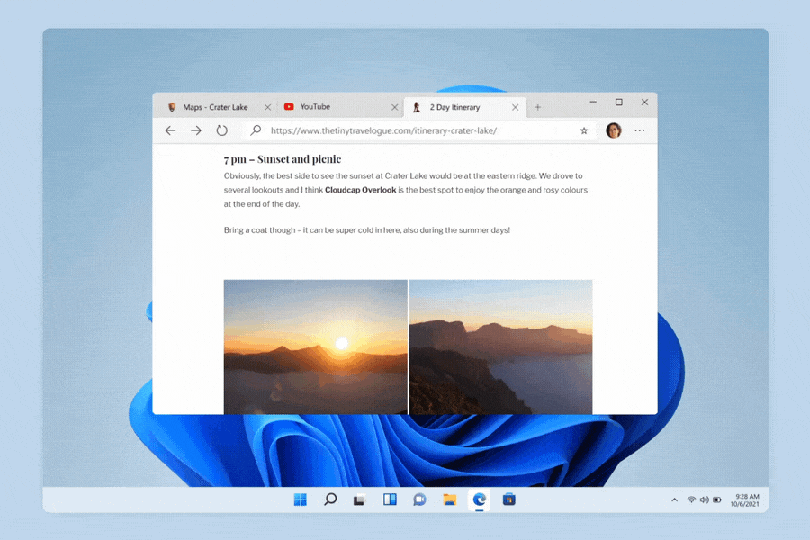
Elements that change position and size should visually connect from one state to another, even if they aren't connected under the hood. Users are guided to follow elements going from point to point, lowering the cognitive load of static state changes.
Example: When a window transitions between floating, snapped, and maximized, it always feels like the same window.
Tip
To improve accessibility and readability, this page uses still images in the default view. You can click an image to see the animated version.
Consistent: Elements should behave in similar ways when sharing entry points
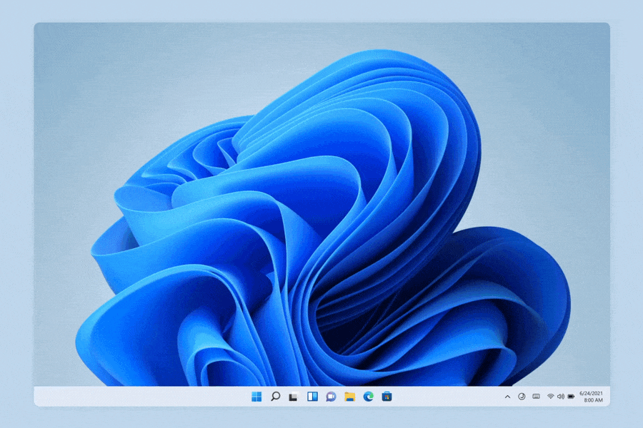
Surfaces that share the same UI entry point should invoke and dismiss the same way to bring consistency to interactions. Each transition should respect the timing, easing, and direction of other elements so a surface feels cohesive.
Example: All taskbar flyouts slide up when invoked, and slide down when dismissed.
Click the image to see it animated.
Responsive: The system responds and adapts to user input and choices
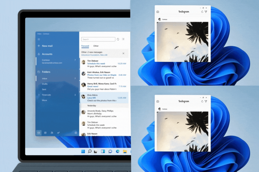
Clear indicators show the system recognizes and adapts gracefully to different input, postures, and orientations. Apps should build on OS behaviors to feel responsive, alive, and aid usage depending on input methods.
Example: Taskbar icons spread out when keyboards are detached. Window edges invoke a different visual depending on cursor or touch input.
Click the image to see it animated.
Delightful: Unexpected moments of joy with purpose
Motion adds personality and energy to the experience in order to transform simple actions into moments of delight. These moments are always brief and fleeting, and help reinforce user actions.
Example: Minimizing a window causes an app icon to bounce down, while restoring bounces an app icon up.
Click the image to see it animated.
Resourceful: Utilizes existing controls to bring consistency where possible
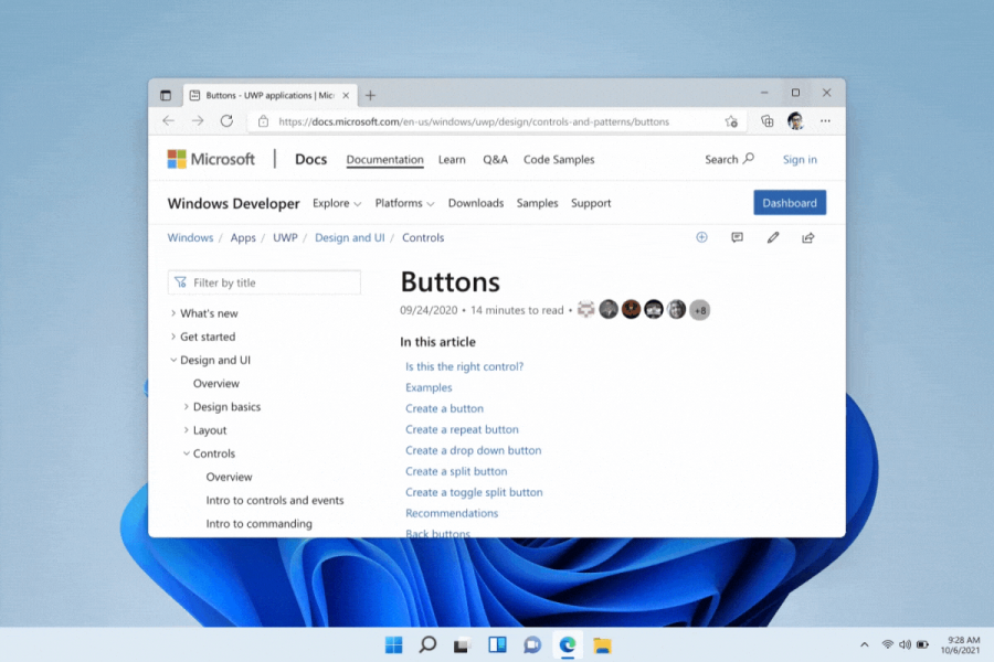
Avoid custom animations where possible. Use animation resources like WinUI controls for page transitions, in-page focus, and micro interactions. If you can't use WinUI controls, mimic existing OS behaviors based on where the app entry point lives.
Example: Page transitions, connected animations, and animated icons are the recommended WinUI controls that add delightful and necessary motion to apps.
Click the image to see it animated.
Examples
The WinUI 3 Gallery app includes interactive examples of most WinUI 3 controls, features, and functionality. Get the app from the Microsoft Store or get the source code on GitHub
Usage
Animation properties
Windows motion is fast, direct, and context-appropriate. Timing and easing curves are adjusted based on the purpose of the animation to create a coherent experience.
| Purpose | Definition | Ease | Timing | Used For |
|---|---|---|---|---|
| Direct Entrance | Fast – In | Cubic-bezier(0,0,0,1) | 167, 250, 333 | Position, Scale, Rotation |
| Existing Elements | Point to Point | Cubic-bezier(0.55,0.55,0,1) | 167, 250, 333ms | Position, Scale, Rotation |
| Direct Exit | Fast – Out | Cubic-bezier(0,0,0,1) | 167ms | Position, Scale, Rotation (ALWAYS combine with fade out) |
| Gentle Exit | Soft – Out | Cubic-bezier(1,0,1,1) | 167ms | Position, Scale |
| Bare Minimum | Fade – In + Out | Linear | 83ms | Opacity |
| Strong Entrance | Elastic In (3 Keyframes) | (3 values below) | (3 values below) | Position, Scale |
| Keyframe 1 | Cubic-Bezier(0.85, 0, 0, 1) | 167ms | ||
| Keyframe 2 | Cubic-Bezier(0.85, 0, 0.75, 1) | 167ms | ||
| Keyframe 3 | Cubic-Bezier(0.85, 0, 0, 1) | 333ms |
Controls
This release of Windows introduces purposeful micro-interactions in WinUI controls. Add these controls to your app to help better organize information, and help your app's users transition from page to page, layer to layer, and state to state of an interaction.
Page Transition: Page-to-page transitions within the same surface
Use page transitions to transition smoothly from page to page, and configure animation directions to respect the flow of an app.
Page transitions guide your user's eyes to incoming and outgoing content, lowering cognitive load.
Click the image to see it animated.
Connected Animation: Layer-to-layer transitions within the same page
Use connected animations to highlight specific pieces of information within a page or surface, while retaining context.
Connected animations give focus to selected elements, and seamlessly transition between the focused and non-focused states.
Click the image to see it animated.
Animated Icon: Adds delight and reveals information through micro interactions
Use animated icons to implement lightweight, vector-based icons and illustrations with motion using Lottie animations.
Animated icons draw attention to specific entry points, provide feedback from state to state, and add delight to an interaction.
Click the image to see it animated.
Windows developer
