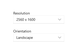
Labels
A label is the name or title of a control or a group of related controls.
Important APIs: Header property, TextBlock class
In XAML, many controls have a built-in Header property that you use to display the label. For controls that don't have a Header property, or to label groups of controls, you can use a TextBlock instead.

Recommendations
- Use a label to indicate to the user what they should enter into an adjacent control. You can also label a group of related controls, or display instructional text near a group of related controls.
- When labeling controls, write the label as a noun or a concise noun phrase, not as a sentence, and not as instructional text. Avoid colons or other punctuation.
- When you do have instructional text in a label, you can be more generous with text-string length and also use punctuation.
Get the sample code
Related topics
- Text controls
- TextBox.Header property
- PasswordBox.Header property
- ToggleSwitch.Header property
- DatePicker.Header property
- TimePicker.Header property
- Slider.Header property
- ComboBox.Header property
- RichEditBox.Header property
- TextBlock class
Tee yhteistyötä kanssamme GitHubissa
Tämän sisällön lähde on GitHubissa, jossa voit myös luoda ja tarkastella ongelmia ja pull-pyyntöjä. Katso lisätietoja osallistujan oppaasta.
Windows developer
