Visualize SQL Server data using R (SQL Server and RevoScaleR tutorial)
Applies to:
SQL Server 2016 (13.x) and later versions
This is tutorial 6 of the RevoScaleR tutorial series on how to use RevoScaleR functions with SQL Server.
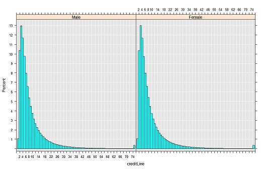
In this tutorial, you'll use R functions to view the distribution of values in the creditLine column by gender.
- Create min-max variables for histogram inputs
- Visualize data in a histogram using rxHistogram from RevoScaleR
- Visualize with scatter plots using levelplot from lattice included in the base R distribution
As this tutorial demonstrates, you can combine open-source and Microsoft-specific functions in the same script.
Add maximum and minimum values
Based on the computed summary statistics from the previous tutorial, you've discovered some useful information about the data that you can insert into the data source for further computations. For example, the minimum and maximum values can be used to compute histograms. In this exercise, add the high and low values to the RxSqlServerData data source.
Start by setting up some temporary variables.
sumDF <- sumOut$sDataFrame
var <- sumDF$Name
Use the variable ccColInfo that you created in the previous tutorial to define the columns in the data source.
Add new computed columns (numTrans, numIntlTrans, and creditLine) to the column collection that override the original definition. The script below adds factors based on minimum and maximum values, obtained from sumOut, which is storing the in-memory output from rxSummary.
ccColInfo <- list(
    gender = list(type = "factor",
      levels = c("1", "2"),
      newLevels = c("Male", "Female")),
    cardholder = list(type = "factor",
      levels = c("1", "2"),
      newLevels = c("Principal", "Secondary")),
    state = list(type = "factor",
      levels = as.character(1:51),
      newLevels = stateAbb),
    balance  = list(type = "numeric"),
    numTrans = list(type = "factor",
      levels = as.character(sumDF[var == "numTrans", "Min"]:sumDF[var == "numTrans", "Max"])),
    numIntlTrans = list(type = "factor",
        levels = as.character(sumDF[var == "numIntlTrans", "Min"]:sumDF[var =="numIntlTrans", "Max"])),
    creditLine = list(type = "numeric")
        )
Having updated the column collection, apply the following statement to create an updated version of the SQL Server data source that you defined earlier.
sqlFraudDS <- RxSqlServerData(
    connectionString = sqlConnString,
    table = sqlFraudTable,
    colInfo = ccColInfo,
    rowsPerRead = sqlRowsPerRead)
The sqlFraudDS data source now includes the new columns added using ccColInfo.
At this point, the modifications affect only the data source object in R; no new data has been written to the database table yet. However, you can use the data captured in the sumOut variable to create visualizations and summaries.
Tip
If you forget which compute context you're using, run rxGetComputeContext(). A return value of "RxLocalSeq Compute Context" indicates that you are running in the local compute context.
Visualize data using rxHistogram
Use the following R code to call the rxHistogram function and pass a formula and data source. You can run this locally at first, to see the expected results, and how long it takes.
rxHistogram(~creditLine|gender, data = sqlFraudDS, histType = "Percent")Internally, rxHistogram calls the rxCube function, which is included in the RevoScaleR package. rxCube outputs a single list (or data frame) containing one column for each variable specified in the formula, plus a counts column.
Now, set the compute context to the remote SQL Server computer and run rxHistogram again.
rxSetComputeContext(sqlCompute)
rxHistogram(~creditLine|gender, data = sqlFraudDS,  histType = "Percent")
The results are exactly the same because you're using the same data source, but in the second step, the computations are performed on the remote server. The results are then returned to your local workstation for plotting.

Visualize with scatter plots
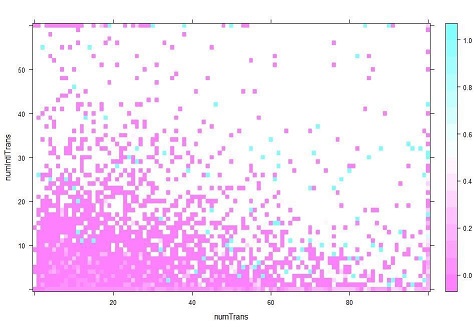
Scatter plots are often used during data exploration to compare the relationship between two variables. You can use built-in R packages for this purpose, with inputs provided by RevoScaleR functions.
Call the rxCube function to compute the mean of fraudRisk for every combination of numTrans and numIntlTrans:
cube1 <- rxCube(fraudRisk~F(numTrans):F(numIntlTrans), data = sqlFraudDS)To specify the groups used to compute group means, use the
F()notation. In this example,F(numTrans):F(numIntlTrans)indicates that the integers in the variablesnumTransandnumIntlTransshould be treated as categorical variables, with a level for each integer value.The default return value of rxCube is an rxCube object, which represents a cross-tabulation.
Call rxResultsDF function to convert the results into a data frame that can easily be used in one of R's standard plotting functions.
cubePlot <- rxResultsDF(cube1)The rxCube function includes an optional argument, returnDataFrame = TRUE, that you could use to convert the results to a data frame directly. For example:
print(rxCube(fraudRisk~F(numTrans):F(numIntlTrans), data = sqlFraudDS, returnDataFrame = TRUE))However, the output of rxResultsDF is cleaner and preserves the names of the source columns. You can run
head(cube1)followed byhead(cubePlot)to compare the output.Create a heat map using the levelplot function from the lattice package, included with all R distributions.
levelplot(fraudRisk~numTrans*numIntlTrans, data = cubePlot)Results

From this quick analysis, you can see that the risk of fraud increases with both the number of transactions and the number of international transactions.
For more information about the rxCube function and crosstabs in general, see Data summaries using RevoScaleR.