Xamarin.Forms control templates
Xamarin.Forms control templates enable you to define the visual structure of ContentView derived custom controls, and ContentPage derived pages. Control templates separate the user interface (UI) for a custom control, or page, from the logic that implements the control or page. Additional content can also be inserted into the templated custom control, or templated page, at a pre-defined location.
For example, a control template can be created that redefines the UI provided by a custom control. The control template can then be consumed by the required custom control instance. Alternatively, a control template can be created that defines any common UI that will be used by multiple pages in an application. The control template can then be consumed by multiple pages, with each page still displaying its unique content.
Create a ControlTemplate
The following example shows the code for a CardView custom control:
public class CardView : ContentView
{
    public static readonly BindableProperty CardTitleProperty = BindableProperty.Create(nameof(CardTitle), typeof(string), typeof(CardView), string.Empty);
    public static readonly BindableProperty CardDescriptionProperty = BindableProperty.Create(nameof(CardDescription), typeof(string), typeof(CardView), string.Empty);
    // ...

    public string CardTitle
    {
        get => (string)GetValue(CardTitleProperty);
        set => SetValue(CardTitleProperty, value);
    }

    public string CardDescription
    {
        get => (string)GetValue(CardDescriptionProperty);
        set => SetValue(CardDescriptionProperty, value);
    }
    // ...
}
The CardView class, which derives from the ContentView class, represents a custom control that displays data in a card-like layout. The class contains properties, which are backed by bindable properties, for the data it displays. However, the CardView class does not define any UI. Instead, the UI will be defined with a control template. For more information about creating ContentView derived custom controls, see Xamarin.Forms ContentView.
A control template is created with the ControlTemplate type. When you create a ControlTemplate, you combine View objects to build the UI for a custom control, or page. A ControlTemplate must have only one View as its root element. However, the root element usually contains other View objects. The combination of objects makes up the control's visual structure.
While a ControlTemplate can be defined inline, the typical approach to declaring a ControlTemplate is as a resource in a resource dictionary. Because control templates are resources, they obey the same scoping rules that apply to all resources. For example, if you declare a control template in the root element of your application definition XAML file, the template can be used anywhere in your application. If you define the template in a page, only that page can use the control template. For more information about resources, see Xamarin.Forms Resource Dictionaries.
The following XAML example shows a ControlTemplate for CardView objects:
<ContentPage xmlns="http://xamarin.com/schemas/2014/forms"
             xmlns:x="http://schemas.microsoft.com/winfx/2009/xaml"
             ...>
    <ContentPage.Resources>
      <ControlTemplate x:Key="CardViewControlTemplate">
          <Frame BindingContext="{Binding Source={RelativeSource TemplatedParent}}"
                 BackgroundColor="{Binding CardColor}"
                 BorderColor="{Binding BorderColor}"
                 CornerRadius="5"
                 HasShadow="True"
                 Padding="8"
                 HorizontalOptions="Center"
                 VerticalOptions="Center">
              <Grid>
                  <Grid.RowDefinitions>
                      <RowDefinition Height="75" />
                      <RowDefinition Height="4" />
                      <RowDefinition Height="Auto" />
                  </Grid.RowDefinitions>
                  <Grid.ColumnDefinitions>
                      <ColumnDefinition Width="75" />
                      <ColumnDefinition Width="200" />
                  </Grid.ColumnDefinitions>
                  <Frame IsClippedToBounds="True"
                         BorderColor="{Binding BorderColor}"
                         BackgroundColor="{Binding IconBackgroundColor}"
                         CornerRadius="38"
                         HeightRequest="60"
                         WidthRequest="60"
                         HorizontalOptions="Center"
                         VerticalOptions="Center">
                      <Image Source="{Binding IconImageSource}"
                             Margin="-20"
                             WidthRequest="100"
                             HeightRequest="100"
                             Aspect="AspectFill" />
                  </Frame>
                  <Label Grid.Column="1"
                         Text="{Binding CardTitle}"
                         FontAttributes="Bold"
                         FontSize="Large"
                         VerticalTextAlignment="Center"
                         HorizontalTextAlignment="Start" />
                  <BoxView Grid.Row="1"
                           Grid.ColumnSpan="2"
                           BackgroundColor="{Binding BorderColor}"
                           HeightRequest="2"
                           HorizontalOptions="Fill" />
                  <Label Grid.Row="2"
                         Grid.ColumnSpan="2"
                         Text="{Binding CardDescription}"
                         VerticalTextAlignment="Start"
                         VerticalOptions="Fill"
                         HorizontalOptions="Fill" />
              </Grid>
          </Frame>
      </ControlTemplate>
    </ContentPage.Resources>
    ...
</ContentPage>
When a ControlTemplate is declared as a resource, it must have a key specified with the x:Key attribute so that it can be identified in the resource dictionary. In this example, the root element of the CardViewControlTemplate is a Frame object. The Frame object uses the RelativeSource markup extension to set its BindingContext to the runtime object instance to which the template will be applied, which is known as the templated parent. The Frame object uses a combination of Grid, Frame, Image, Label, and BoxView objects to define the visual structure of a CardView object. The binding expressions of these objects resolve against CardView properties, due to inheriting the BindingContext from the root Frame element. For more information about the RelativeSource markup extension, see Xamarin.Forms Relative Bindings.
Consume a ControlTemplate
A ControlTemplate can be applied to a ContentView derived custom control by setting its ControlTemplate property to the control template object. Similarly, a ControlTemplate can be applied to a ContentPage derived page by setting its ControlTemplate property to the control template object. At runtime, when a ControlTemplate is applied, all of the controls that are defined in the ControlTemplate are added to the visual tree of the templated custom control, or templated page.
The following example shows the CardViewControlTemplate being assigned to the ControlTemplate property of each CardView object:
<ContentPage xmlns="http://xamarin.com/schemas/2014/forms"
             xmlns:x="http://schemas.microsoft.com/winfx/2009/xaml"
             xmlns:controls="clr-namespace:ControlTemplateDemos.Controls"
             ...>
    <StackLayout Margin="30">
        <controls:CardView BorderColor="DarkGray"
                           CardTitle="John Doe"
                           CardDescription="Lorem ipsum dolor sit amet, consectetur adipiscing elit. Nulla elit dolor, convallis non interdum."
                           IconBackgroundColor="SlateGray"
                           IconImageSource="user.png"
                           ControlTemplate="{StaticResource CardViewControlTemplate}" />
        <controls:CardView BorderColor="DarkGray"
                           CardTitle="Jane Doe"
                           CardDescription="Phasellus eu convallis mi. In tempus augue eu dignissim fermentum. Morbi ut lacus vitae eros lacinia."
                           IconBackgroundColor="SlateGray"
                           IconImageSource="user.png"
                           ControlTemplate="{StaticResource CardViewControlTemplate}" />
        <controls:CardView BorderColor="DarkGray"
                           CardTitle="Xamarin Monkey"
                           CardDescription="Aliquam sagittis, odio lacinia fermentum dictum, mi erat scelerisque erat, quis aliquet arcu."
                           IconBackgroundColor="SlateGray"
                           IconImageSource="user.png"
                           ControlTemplate="{StaticResource CardViewControlTemplate}" />
    </StackLayout>
</ContentPage>
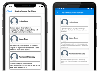
In this example, the controls in the CardViewControlTemplate become part of the visual tree for each CardView object. Because the root Frame object for the control template sets its BindingContext to the templated parent, the Frame and its children resolve their binding expressions against the properties of each CardView object.
The following screenshots show the CardViewControlTemplate applied to the three CardView objects:
Important
The point in time that a ControlTemplate is applied to a control instance can be detected by overriding the OnApplyTemplate method in the templated custom control, or templated page. For more information, see Get a named element from a template.
Pass parameters with TemplateBinding
The TemplateBinding markup extension binds a property of an element that is in a ControlTemplate to a public property that is defined by the templated custom control or templated page. When you use a TemplateBinding, you enable properties on the control to act as parameters to the template. Therefore, when a property on a templated custom control or templated page is set, that value is passed onto the element that has the TemplateBinding on it.
Important
The TemplateBinding markup expression enables the RelativeSource binding from the previous control template to be removed, and replaces the Binding expressions.
The TemplateBinding markup extension defines the following properties:
Path, of typestring, the path to the property.Mode, of typeBindingMode, the direction in which changes propagate between the source and target.Converter, of typeIValueConverter, the binding value converter.ConverterParameter, of typeobject, the parameter to the binding value converter.StringFormat, of typestring, the string format for the binding.
The ContentProperty for the TemplateBinding markup extension is Path. Therefore, the "Path=" part of the markup extension can be omitted if the path is the first item in the TemplateBinding expression. For more information about using these properties in a binding expression, see Xamarin.Forms Data Binding.
Warning
The TemplateBinding markup extension should only be used within a ControlTemplate. However, attempting to use a TemplateBinding expression outside of a ControlTemplate will not result in a build error or an exception being thrown.
The following XAML example shows a ControlTemplate for CardView objects, that uses the TemplateBinding markup extension:
<ContentPage xmlns="http://xamarin.com/schemas/2014/forms"
             xmlns:x="http://schemas.microsoft.com/winfx/2009/xaml"
             ...>
    <ContentPage.Resources>
        <ControlTemplate x:Key="CardViewControlTemplate">
            <Frame BackgroundColor="{TemplateBinding CardColor}"
                   BorderColor="{TemplateBinding BorderColor}"
                   CornerRadius="5"
                   HasShadow="True"
                   Padding="8"
                   HorizontalOptions="Center"
                   VerticalOptions="Center">
                <Grid>
                    <Grid.RowDefinitions>
                        <RowDefinition Height="75" />
                        <RowDefinition Height="4" />
                        <RowDefinition Height="Auto" />
                    </Grid.RowDefinitions>
                    <Grid.ColumnDefinitions>
                        <ColumnDefinition Width="75" />
                        <ColumnDefinition Width="200" />
                    </Grid.ColumnDefinitions>
                    <Frame IsClippedToBounds="True"
                           BorderColor="{TemplateBinding BorderColor}"
                           BackgroundColor="{TemplateBinding IconBackgroundColor}"
                           CornerRadius="38"
                           HeightRequest="60"
                           WidthRequest="60"
                           HorizontalOptions="Center"
                           VerticalOptions="Center">
                        <Image Source="{TemplateBinding IconImageSource}"
                               Margin="-20"
                               WidthRequest="100"
                               HeightRequest="100"
                               Aspect="AspectFill" />
                    </Frame>
                    <Label Grid.Column="1"
                           Text="{TemplateBinding CardTitle}"
                           FontAttributes="Bold"
                           FontSize="Large"
                           VerticalTextAlignment="Center"
                           HorizontalTextAlignment="Start" />
                    <BoxView Grid.Row="1"
                             Grid.ColumnSpan="2"
                             BackgroundColor="{TemplateBinding BorderColor}"
                             HeightRequest="2"
                             HorizontalOptions="Fill" />
                    <Label Grid.Row="2"
                           Grid.ColumnSpan="2"
                           Text="{TemplateBinding CardDescription}"
                           VerticalTextAlignment="Start"
                           VerticalOptions="Fill"
                           HorizontalOptions="Fill" />
                </Grid>
            </Frame>
        </ControlTemplate>
    </ContentPage.Resources>
    ...
</ContentPage>
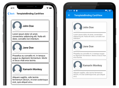
In this example, the TemplateBinding markup extension resolves binding expressions against the properties of each CardView object. The following screenshots show the CardViewControlTemplate applied to the three CardView objects:
Important
Using the TemplateBinding markup extension is equivalent to setting the BindingContext of the root element in the template to its templated parent with the RelativeSource markup extension, and then resolving bindings of child objects with the Binding markup extension. In fact, the TemplateBinding markup extension creates a Binding whose Source is RelativeBindingSource.TemplatedParent.
Apply a ControlTemplate with a style
Control templates can also be applied with styles. This is achieved by creating an implicit or explicit style that consumes the ControlTemplate.
The following XAML example shows an implicit style that consumes the CardViewControlTemplate:
<ContentPage xmlns="http://xamarin.com/schemas/2014/forms"
             xmlns:x="http://schemas.microsoft.com/winfx/2009/xaml"
             xmlns:controls="clr-namespace:ControlTemplateDemos.Controls"
             ...>
    <ContentPage.Resources>
        <ControlTemplate x:Key="CardViewControlTemplate">
            ...
        </ControlTemplate>

        <Style TargetType="controls:CardView">
            <Setter Property="ControlTemplate"
                    Value="{StaticResource CardViewControlTemplate}" />
        </Style>
    </ContentPage.Resources>
    <StackLayout Margin="30">
        <controls:CardView BorderColor="DarkGray"
                           CardTitle="John Doe"
                           CardDescription="Lorem ipsum dolor sit amet, consectetur adipiscing elit. Nulla elit dolor, convallis non interdum."
                           IconBackgroundColor="SlateGray"
                           IconImageSource="user.png" />
        <controls:CardView BorderColor="DarkGray"
                           CardTitle="Jane Doe"
                           CardDescription="Phasellus eu convallis mi. In tempus augue eu dignissim fermentum. Morbi ut lacus vitae eros lacinia."
                           IconBackgroundColor="SlateGray"
                           IconImageSource="user.png"/>
        <controls:CardView BorderColor="DarkGray"
                           CardTitle="Xamarin Monkey"
                           CardDescription="Aliquam sagittis, odio lacinia fermentum dictum, mi erat scelerisque erat, quis aliquet arcu."
                           IconBackgroundColor="SlateGray"
                           IconImageSource="user.png" />
    </StackLayout>
</ContentPage>
In this example, the implicit Style is automatically applied to each CardView object, and sets the ControlTemplate property of each CardView to CardViewControlTemplate.
For more information about styles, see Xamarin.Forms Styles.
Redefine a control’s UI
When a ControlTemplate is instantiated and assigned to the ControlTemplate property of a ContentView derived custom control, or a ContentPage derived page, the visual structure defined for the custom control or page is replaced with the visual structure defined in the ControlTemplate.
For example, the CardViewUI custom control defines its user interface using the following XAML:
<ContentView xmlns="http://xamarin.com/schemas/2014/forms"
             xmlns:x="http://schemas.microsoft.com/winfx/2009/xaml"
             x:Class="ControlTemplateDemos.Controls.CardViewUI"
             x:Name="this">
    <Frame BindingContext="{x:Reference this}"
           BackgroundColor="{Binding CardColor}"
           BorderColor="{Binding BorderColor}"
           CornerRadius="5"
           HasShadow="True"
           Padding="8"
           HorizontalOptions="Center"
           VerticalOptions="Center">
        <Grid>
            <Grid.RowDefinitions>
                <RowDefinition Height="75" />
                <RowDefinition Height="4" />
                <RowDefinition Height="Auto" />
            </Grid.RowDefinitions>
            <Grid.ColumnDefinitions>
                <ColumnDefinition Width="75" />
                <ColumnDefinition Width="200" />
            </Grid.ColumnDefinitions>
            <Frame IsClippedToBounds="True"
                   BorderColor="{Binding BorderColor, FallbackValue='Black'}"
                   BackgroundColor="{Binding IconBackgroundColor, FallbackValue='Gray'}"
                   CornerRadius="38"
                   HeightRequest="60"
                   WidthRequest="60"
                   HorizontalOptions="Center"
                   VerticalOptions="Center">
                <Image Source="{Binding IconImageSource}"
                       Margin="-20"
                       WidthRequest="100"
                       HeightRequest="100"
                       Aspect="AspectFill" />
            </Frame>
            <Label Grid.Column="1"
                   Text="{Binding CardTitle, FallbackValue='Card title'}"
                   FontAttributes="Bold"
                   FontSize="Large"
                   VerticalTextAlignment="Center"
                   HorizontalTextAlignment="Start" />
            <BoxView Grid.Row="1"
                     Grid.ColumnSpan="2"
                     BackgroundColor="{Binding BorderColor, FallbackValue='Black'}"
                     HeightRequest="2"
                     HorizontalOptions="Fill" />
            <Label Grid.Row="2"
                   Grid.ColumnSpan="2"
                   Text="{Binding CardDescription, FallbackValue='Card description'}"
                   VerticalTextAlignment="Start"
                   VerticalOptions="Fill"
                   HorizontalOptions="Fill" />
        </Grid>
    </Frame>
</ContentView>
However, the controls that comprise this UI can be replaced by defining a new visual structure in a ControlTemplate, and assigning it to the ControlTemplate property of a CardViewUI object:
<ContentPage xmlns="http://xamarin.com/schemas/2014/forms"
             xmlns:x="http://schemas.microsoft.com/winfx/2009/xaml"
             ...>
    <ContentPage.Resources>
        <ControlTemplate x:Key="CardViewCompressed">
            <Grid>
                <Grid.RowDefinitions>
                    <RowDefinition Height="100" />
                </Grid.RowDefinitions>
                <Grid.ColumnDefinitions>
                    <ColumnDefinition Width="100" />
                    <ColumnDefinition Width="*" />
                </Grid.ColumnDefinitions>
                <Image Source="{TemplateBinding IconImageSource}"
                        BackgroundColor="{TemplateBinding IconBackgroundColor}"
                        WidthRequest="100"
                        HeightRequest="100"
                        Aspect="AspectFill"
                        HorizontalOptions="Center"
                        VerticalOptions="Center" />
                <StackLayout Grid.Column="1">
                    <Label Text="{TemplateBinding CardTitle}"
                           FontAttributes="Bold" />
                    <Label Text="{TemplateBinding CardDescription}" />
                </StackLayout>
            </Grid>
        </ControlTemplate>
    </ContentPage.Resources>
    <StackLayout Margin="30">
        <controls:CardViewUI BorderColor="DarkGray"
                             CardTitle="John Doe"
                             CardDescription="Lorem ipsum dolor sit amet, consectetur adipiscing elit. Nulla elit dolor, convallis non interdum."
                             IconBackgroundColor="SlateGray"
                             IconImageSource="user.png"
                             ControlTemplate="{StaticResource CardViewCompressed}" />
        <controls:CardViewUI BorderColor="DarkGray"
                             CardTitle="Jane Doe"
                             CardDescription="Phasellus eu convallis mi. In tempus augue eu dignissim fermentum. Morbi ut lacus vitae eros lacinia."
                             IconBackgroundColor="SlateGray"
                             IconImageSource="user.png"
                             ControlTemplate="{StaticResource CardViewCompressed}" />
        <controls:CardViewUI BorderColor="DarkGray"
                             CardTitle="Xamarin Monkey"
                             CardDescription="Aliquam sagittis, odio lacinia fermentum dictum, mi erat scelerisque erat, quis aliquet arcu."
                             IconBackgroundColor="SlateGray"
                             IconImageSource="user.png"
                             ControlTemplate="{StaticResource CardViewCompressed}" />
    </StackLayout>
</ContentPage>
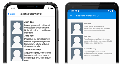
In this example, the visual structure of the CardViewUI object is redefined in a ControlTemplate that provides a more compact visual structure that's suitable for a condensed list:
Substitute content into a ContentPresenter
A ContentPresenter can be placed in a control template to mark where content to be displayed by the templated custom control or templated page will appear. The custom control or page that consumes the control template will then define content to be displayed by the ContentPresenter. The following diagram illustrates a ControlTemplate for a page that contains a number of controls, including a ContentPresenter marked by a blue rectangle:
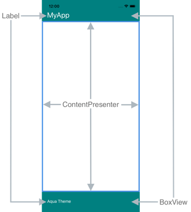
The following XAML shows a control template named TealTemplate that contains a ContentPresenter in its visual structure:
<ControlTemplate x:Key="TealTemplate">
    <Grid>
        <Grid.RowDefinitions>
            <RowDefinition Height="0.1*" />
            <RowDefinition Height="0.8*" />
            <RowDefinition Height="0.1*" />
        </Grid.RowDefinitions>
        <BoxView Color="Teal" />
        <Label Margin="20,0,0,0"
               Text="{TemplateBinding HeaderText}"
               TextColor="White"
               FontSize="Title"
               VerticalOptions="Center" />
        <ContentPresenter Grid.Row="1" />
        <BoxView Grid.Row="2"
                 Color="Teal" />
        <Label x:Name="changeThemeLabel"
               Grid.Row="2"
               Margin="20,0,0,0"
               Text="Change Theme"
               TextColor="White"
               HorizontalOptions="Start"
               VerticalOptions="Center">
            <Label.GestureRecognizers>
                <TapGestureRecognizer Tapped="OnChangeThemeLabelTapped" />
            </Label.GestureRecognizers>
        </Label>
        <controls:HyperlinkLabel Grid.Row="2"
                                 Margin="0,0,20,0"
                                 Text="Help"
                                 TextColor="White"
                                 Url="https://learn.microsoft.com/xamarin/xamarin-forms/"
                                 HorizontalOptions="End"
                                 VerticalOptions="Center" />
    </Grid>
</ControlTemplate>
The following example shows TealTemplate assigned to the ControlTemplate property of a ContentPage derived page:
<controls:HeaderFooterPage xmlns="http://xamarin.com/schemas/2014/forms"
                           xmlns:x="http://schemas.microsoft.com/winfx/2009/xaml"
                           xmlns:controls="clr-namespace:ControlTemplateDemos.Controls"
                           ControlTemplate="{StaticResource TealTemplate}"
                           HeaderText="MyApp"
                           ...>
    <StackLayout Margin="10">
        <Entry Placeholder="Enter username" />
        <Entry Placeholder="Enter password"
               IsPassword="True" />
        <Button Text="Login" />
    </StackLayout>
</controls:HeaderFooterPage>
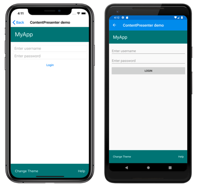
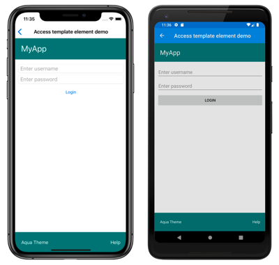
At runtime, when TealTemplate is applied to the page, the page content is substituted into the ContentPresenter defined in the control template:
Get a named element from a template
Named elements within a control template can be retrieved from the templated custom control or templated page. This can be achieved with the GetTemplateChild method, which returns the named element in the instantiated ControlTemplate visual tree, if found. Otherwise, it returns null.
After a control template has been instantiated, the template's OnApplyTemplate method is called. The GetTemplateChild method should therefore be called from a OnApplyTemplate override in the templated control or templated page.
Important
The GetTemplateChild method should only be called after the OnApplyTemplate method has been called.
The following XAML shows a control template named TealTemplate that can be applied to ContentPage derived pages:
<ControlTemplate x:Key="TealTemplate">
    <Grid>
        ...
        <Label x:Name="changeThemeLabel"
               Grid.Row="2"
               Margin="20,0,0,0"
               Text="Change Theme"
               TextColor="White"
               HorizontalOptions="Start"
               VerticalOptions="Center">
            <Label.GestureRecognizers>
                <TapGestureRecognizer Tapped="OnChangeThemeLabelTapped" />
            </Label.GestureRecognizers>
        </Label>
        ...
    </Grid>
</ControlTemplate>
In this example, the Label element is named, and can be retrieved in the code for the templated page. This is achieved by calling the GetTemplateChild method from the OnApplyTemplate override for the templated page:
public partial class AccessTemplateElementPage : HeaderFooterPage
{
    Label themeLabel;

    public AccessTemplateElementPage()
    {
        InitializeComponent();
    }

    protected override void OnApplyTemplate()
    {
        base.OnApplyTemplate();
        themeLabel = (Label)GetTemplateChild("changeThemeLabel");
        themeLabel.Text = OriginalTemplate ? "Aqua Theme" : "Teal Theme";
    }
}
In this example, the Label object named changeThemeLabel is retrieved once the ControlTemplate has been instantiated. changeThemeLabel can then be accessed and manipulated by the AccessTemplateElementPage class. The following screenshots show that the text displayed by the Label has been changed:
Bind to a viewmodel
A ControlTemplate can data bind to a viewmodel, even when the ControlTemplate binds to the templated parent (the runtime object instance to which the template is applied).
The following XAML example shows a page that consumes a viewmodel named PeopleViewModel:
<ContentPage xmlns="http://xamarin.com/schemas/2014/forms"
             xmlns:x="http://schemas.microsoft.com/winfx/2009/xaml"
             xmlns:local="clr-namespace:ControlTemplateDemos"
             xmlns:controls="clr-namespace:ControlTemplateDemos.Controls"
             ...>
    <ContentPage.BindingContext>
        <local:PeopleViewModel />
    </ContentPage.BindingContext>

    <ContentPage.Resources>
        <DataTemplate x:Key="PersonTemplate">
            <controls:CardView BorderColor="DarkGray"
                               CardTitle="{Binding Name}"
                               CardDescription="{Binding Description}"
                               ControlTemplate="{StaticResource CardViewControlTemplate}" />
        </DataTemplate>
    </ContentPage.Resources>

    <StackLayout Margin="10"
                 BindableLayout.ItemsSource="{Binding People}"
                 BindableLayout.ItemTemplate="{StaticResource PersonTemplate}" />
</ContentPage>
In this example, the BindingContext of the page is set to a PeopleViewModel instance. This viewmodel exposes a People collection and an ICommand named DeletePersonCommand. The StackLayout on the page uses a bindable layout to data bind to the People collection, and the ItemTemplate of the bindable layout is set to the PersonTemplate resource. This DataTemplate specifies that each item in the People collection will be displayed using a CardView object. The visual structure of the CardView object is defined using a ControlTemplate named CardViewControlTemplate:
<ControlTemplate x:Key="CardViewControlTemplate">
    <Frame BindingContext="{Binding Source={RelativeSource TemplatedParent}}"
           BackgroundColor="{Binding CardColor}"
           BorderColor="{Binding BorderColor}"
           CornerRadius="5"
           HasShadow="True"
           Padding="8"
           HorizontalOptions="Center"
           VerticalOptions="Center">
        <Grid>
            <Grid.RowDefinitions>
                <RowDefinition Height="75" />
                <RowDefinition Height="4" />
                <RowDefinition Height="Auto" />
            </Grid.RowDefinitions>
            <Label Text="{Binding CardTitle}"
                   FontAttributes="Bold"
                   FontSize="Large"
                   VerticalTextAlignment="Center"
                   HorizontalTextAlignment="Start" />
            <BoxView Grid.Row="1"
                     BackgroundColor="{Binding BorderColor}"
                     HeightRequest="2"
                     HorizontalOptions="Fill" />
            <Label Grid.Row="2"
                   Text="{Binding CardDescription}"
                   VerticalTextAlignment="Start"
                   VerticalOptions="Fill"
                   HorizontalOptions="Fill" />
            <Button Text="Delete"
                    Command="{Binding Source={RelativeSource AncestorType={x:Type local:PeopleViewModel}}, Path=DeletePersonCommand}"
                    CommandParameter="{Binding CardTitle}"
                    HorizontalOptions="End" />
        </Grid>
    </Frame>
</ControlTemplate>
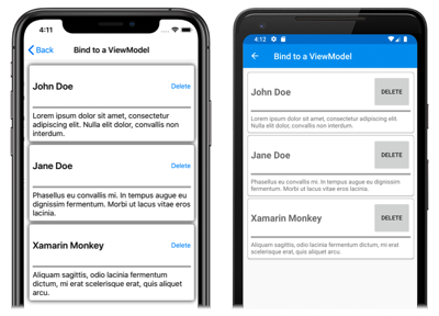
In this example, the root element of the ControlTemplate is a Frame object. The Frame object uses the RelativeSource markup extension to set its BindingContext to the templated parent. The binding expressions of the Frame object and its children resolve against CardView properties, due to inheriting the BindingContext from the root Frame element. The following screenshots show the page displaying the People collection, which consists of three items:
While the objects in the ControlTemplate bind to properties on its templated parent, the Button within the control template binds to both its templated parent, and to the DeletePersonCommand in the viewmodel. This is because the Button.Command property redefines its binding source to be the binding context of the ancestor whose binding context type is PeopleViewModel, which is the StackLayout. The Path part of the binding expressions can then resolve the DeletePersonCommand property. However, the Button.CommandParameter property doesn't alter its binding source, instead inheriting it from its parent in the ControlTemplate. Therefore, the CommandParameter property binds to the CardTitle property of the CardView.
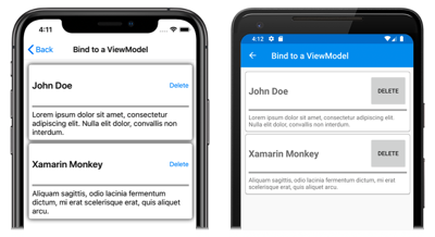
The overall effect of the Button bindings is that when the Button is tapped, the DeletePersonCommand in the PeopleViewModel class is executed, with the value of the CardName property being passed to the DeletePersonCommand. This results in the specified CardView being removed from the bindable layout:
For more information about relative bindings, see Xamarin.Forms Relative Bindings.
