Xamarin.Forms Reusable RoundEffect
Important
It's no longer necessary to use a RoundEffect to render a control as a circle. The latest recommended approach is to clip the control using an EllipseGeometry. For more information, see Clip with a Geometry.
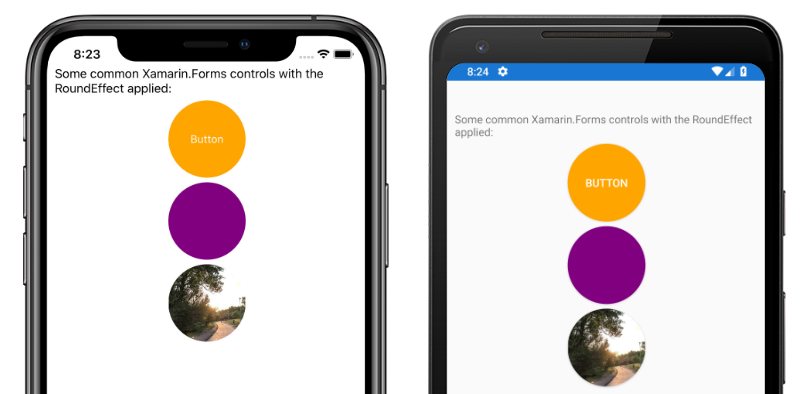
The RoundEffect simplifies rendering any control that derives from VisualElement as a circle. This effect can be used to create circular images, buttons, and other controls:
Create a shared RoutingEffect
An effect class must be created in the shared project to create a cross-platform effect. The sample application creates an empty RoundEffect class that derives from the RoutingEffect class:
public class RoundEffect : RoutingEffect
{
    public RoundEffect() : base($"Xamarin.{nameof(RoundEffect)}")
    {
    }
}
This class allows the shared project to resolve the references to the effect in code or XAML but does not provide any functionality. The effect must have implementations for each platform.
Implement the Android effect
The Android platform project defines a RoundEffect class that derives from PlatformEffect. This class is tagged with assembly attributes that allow Xamarin.Forms to resolve the effect class:
[assembly: ResolutionGroupName("Xamarin")]
[assembly: ExportEffect(typeof(RoundEffectDemo.Droid.RoundEffect), nameof(RoundEffectDemo.Droid.RoundEffect))]
namespace RoundEffectDemo.Droid
{
    public class RoundEffect : PlatformEffect
    {
        // ...
    }
}
The Android platform uses the concept of an OutlineProvider to define the edges of a control. The sample project includes a CornerRadiusProvider class that derives from the ViewOutlineProvider class:
class CornerRadiusOutlineProvider : ViewOutlineProvider
{
    Element element;

    public CornerRadiusOutlineProvider(Element formsElement)
    {
        element = formsElement;
    }

    public override void GetOutline(Android.Views.View view, Outline outline)
    {
        float scale = view.Resources.DisplayMetrics.Density;
        double width = (double)element.GetValue(VisualElement.WidthProperty) * scale;
        double height = (double)element.GetValue(VisualElement.HeightProperty) * scale;
        float minDimension = (float)Math.Min(height, width);
        float radius = minDimension / 2f;
        Rect rect = new Rect(0, 0, (int)width, (int)height);
        outline.SetRoundRect(rect, radius);
    }
}
This class uses the Width and Height properties of the Xamarin.Forms Element instance to calculate a radius that is half of the shortest dimension.
Once an outline provider is defined the RoundEffect class can consume it to implement the effect:
public class RoundEffect : PlatformEffect
{
    ViewOutlineProvider originalProvider;
    Android.Views.View effectTarget;

    protected override void OnAttached()
    {
        try
        {
            effectTarget = Control ?? Container;
            originalProvider = effectTarget.OutlineProvider;
            effectTarget.OutlineProvider = new CornerRadiusOutlineProvider(Element);
            effectTarget.ClipToOutline = true;
        }
        catch (Exception ex)
        {
            Console.WriteLine($"Failed to set corner radius: {ex.Message}");
        }
    }

    protected override void OnDetached()
    {
        if(effectTarget != null)
        {
            effectTarget.OutlineProvider = originalProvider;
            effectTarget.ClipToOutline = false;
        }
    }
}
The OnAttached method is called when the effect is attached to an element. The existing OutlineProvider object is saved so it can be restored when the effect is detached. A new instance of the CornerRadiusOutlineProvider is used as the OutlineProvider and ClipToOutline is set to true to clip overflowing elements to the outline borders.
The OnDetatched method is called when the effect is removed from an element and restores the original OutlineProvider value.
Note
Depending on the element type, the Control property may or may not be null. If the Control property is not null, the rounded corners can be applied directly to the control. However, if it is null the rounded corners must be applied to the Container object. The effectTarget field allows the effect to be applied to the appropriate object.
Implement the iOS effect
The iOS platform project defines a RoundEffect class that derives from PlatformEffect. This class is tagged with assembly attributes that allow Xamarin.Forms to resolve the effect class:
[assembly: ResolutionGroupName("Xamarin")]
[assembly: ExportEffect(typeof(RoundEffectDemo.iOS.RoundEffect), nameof(RoundEffectDemo.iOS.RoundEffect))]
namespace RoundEffectDemo.iOS
{
    public class RoundEffect : PlatformEffect
    {
        // ...
    }
On iOS, controls have a Layer property, which has a CornerRadius property. The RoundEffect class implementation on iOS calculates the appropriate corner radius and updates the layer's CornerRadius property:
public class RoundEffect : PlatformEffect
{
    nfloat originalRadius;
    UIKit.UIView effectTarget;

    protected override void OnAttached()
    {
        try
        {
            effectTarget = Control ?? Container;
            originalRadius = effectTarget.Layer.CornerRadius;
            effectTarget.ClipsToBounds = true;
            effectTarget.Layer.CornerRadius = CalculateRadius();
        }
        catch (Exception ex)
        {
            Console.WriteLine($"Failed to set corner radius: {ex.Message}");
        }
    }

    protected override void OnDetached()
    {
        if (effectTarget != null)
        {
            effectTarget.ClipsToBounds = false;
            if (effectTarget.Layer != null)
            {
                effectTarget.Layer.CornerRadius = originalRadius;
            }
        }
    }

    float CalculateRadius()
    {
        double width = (double)Element.GetValue(VisualElement.WidthRequestProperty);
        double height = (double)Element.GetValue(VisualElement.HeightRequestProperty);
        float minDimension = (float)Math.Min(height, width);
        float radius = minDimension / 2f;

        return radius;
    }
}
The CalculateRadius method calculates a radius based on the minimum dimension of the Xamarin.Forms Element. The OnAttached method is called when the effect is attached to a control, and updates the layer's CornerRadius property. It sets the ClipToBounds property to true so overflowing elements are clipped to the borders of the control. The OnDetatched method is called when the effect is removed from a control and reverses these changes, restoring the original corner radius.
Note
Depending on the element type, the Control property may or may not be null. If the Control property is not null, the rounded corners can be applied directly to the control. However, if it is null the rounded corners must be applied to the Container object. The effectTarget field allows the effect to be applied to the appropriate object.
Consume the effect
Once the effect is implemented across platforms, it can be consumed by Xamarin.Forms controls. A common application of the RoundEffect is making an Image object circular. The following XAML shows the effect being applied to an Image instance:
<Image Source=outdoors"
       HeightRequest="100"
       WidthRequest="100">
    <Image.Effects>
        <local:RoundEffect />
    </Image.Effects>
</Image>
The effect can also be applied in code:
var image = new Image
{
    Source = ImageSource.FromFile("outdoors"),
    HeightRequest = 100,
    WidthRequest = 100
};
image.Effects.Add(new RoundEffect());
The RoundEffect class can be applied to any control that derives from VisualElement.
Note
For the effect to calculate the correct radius, the control it's applied to must have explicit sizing. Therefore, the HeightRequest and WidthRequest properties should be defined. If the affected control appears in a StackLayout, its HorizontalOptions property should not use one of the Expand values such as LayoutOptions.CenterAndExpand or it will not have accurate dimensions.
