Layout Options in Xamarin.iOS
There are two different mechanisms for controlling the layout when a view is resized or rotated:
- Autosizing – The Autosizing inspector in the designer provides a way to set the
AutoresizingMaskproperties. This will let a control be anchored to the edges of their container and/or fix their size. Autosizing works in all versions of iOS. This is described in more detail below - Auto Layout – A feature, introduced in iOS 6 that allows fine-grained control over the relationships of the UI controls. It will allow control of the positions of elements relative to other elements on the design surface. This topic is covered in more detail in the Auto Layout with the Xamarin iOS Designer guide.
Autosizing
When a user resizes a window, such as when the device is rotated and the orientation changes, the system will automatically resize the Views inside that window according to their autosizing rules. These rules can be set in C# using the
AutoresizingMask property of the UIView or in the Properties Pad of the iOS Designer,
as illustrated below:
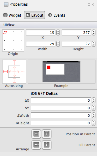
When a control is selected, this allows you to manually specify the location and dimensions of the control, as well as choosing Autosizing behavior. As illustrated in the screenshot below, we can use the springs and struts in the autosizing control to define the selected View's relationship to it's parent:
Adjusting a spring will cause the view to resize based on the width or height of its parent view. Adjusting a strut will make the view maintain a constant distance between itself and its parent view, on that particular edge.
These settings can also be set in code:
textfield1.Frame = new RectangleF(15, 277, 79, 27);
textfield1.AutoresizingMask = UIViewAutoresizing.FlexibleRightMargin | UIViewAutoresizing.FlexibleBottomMargin;
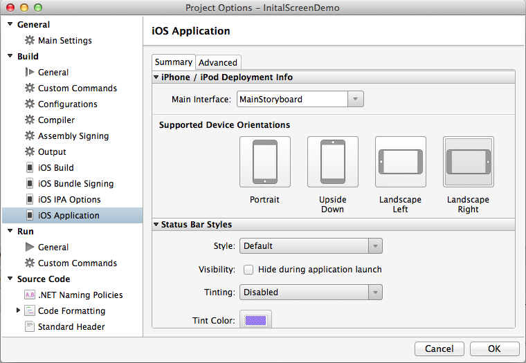
To test the Autosizing settings, enable different Supported Device Orientations in the project’s options:
In the code behind we can use the following code, which causes the two text controls to resize horizontally:
textview1.AutoresizingMask = UIViewAutoresizing.FlexibleWidth;
textfield1.AutoresizingMask = UIViewAutoresizing.FlexibleWidth;
imageview1.AutoresizingMask = UIViewAutoresizing.FlexibleTopMargin | UIViewAutoresizing.FlexibleLeftMargin;
We can also adjust the controls using the Designer. Selecting the struts as exhibited below will cause the image to stay right-aligned without being clipped off the bottom of the view:
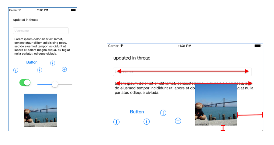
These screenshots show how the controls resize or reposition themselves when the screen is rotated:
Notice that the text view and text field both stretch to keep the same left and right margins, due to the FlexibleWidth
setting. The image has the top and left margin flexible, which means it preserves the bottom and right margins – keeping
the image in view when the screen is rotated. Complex layouts typically require a combination of these settings on every visible control to keep the user-interface consistent and to prevent controls from overlapping when the view’s bounds change (due to rotation or other resizing event).


