Sliders, Switches, and Segmented Controls in Xamarin.iOS
Sliders
The slider control allows for simple selection of a numeric value within a range. The control defaults to a value between 0 and 1 but these limits can be customized.
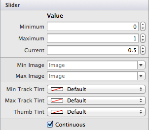
The following screenshot shows the properties that are editable in the Designer:
You can set these values in code as shown below, including wiring up a handler to display the currently selected value
in a UILabel control:
slider1.MinValue = -1;
slider1.MaxValue = 2;
slider1.Value = 0.5f; // the current value
slider1.ValueChanged += (sender,e) => label1.Text = ((UISlider)sender).Value.ToString ();
You can also customize the visual appearance of the slider by setting
slider1.ThumbTintColor = UIColor.Blue;
slider1.MinimumTrackTintColor = UIColor.Gray;
slider1.MaximumTrackTintColor = UIColor.Green;
The customized slider looks like this:
Important
There is currently a bug causing the ThumbTint to not
render at run time as expected. You can add the following line of code before the code above as a
workaround. [Source]:
slider1.SetThumbImage(UIImage.FromBundle("thumb.png"),UIControlState.Normal);
You can use any image, as it will be overridden, but make sure it is placed in the Resources directory and is called in your code.
Switch
iOS uses the UISwitch as a boolean input that may be represented by a radio-button on other platforms. The user can
manipulate the control by moving the thumb between the On/Off positions.
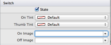
The appearance of the switch can be customized in the Properties Pad of the designer, which will let you control the default state, On/Off tint colors and an On/Off Image. This is illustrated in the image below:
The properties of the switch can also be set in code, for example the code below will show a switch with the default
value of On:
switch1.On = true;
Segmented Controls
A Segmented Control is an organized way to allow users to interact with a small number of options. It is laid out horizontally and each segment functions as a separate button. When using the Designer, the Segmented Control can be found under ToolBox > Controls, and should look like the following image:
A unique feature of the Designer allows for each segment to be selected individually on the design surface, as illustrated below:
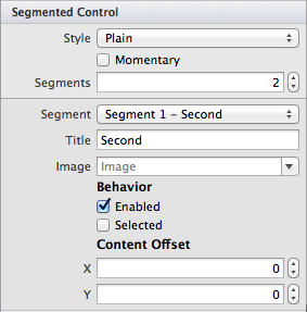
This allows the Properties Pad to be used to more precisely control the properties of each segment. You can see the editable properties in the screenshot below:
It should be noted that the Segmented Control Style has been deprecated in iOS7, and therefore, adjusting options for this in an iOS7 application will have no effect.


