Working with tvOS Buttons in Xamarin
Warning
The iOS Designer was deprecated in Visual Studio 2019 version 16.8 and Visual Studio 2019 for Mac version 8.8, and removed in Visual Studio 2019 version 16.9 and Visual Studio for Mac version 8.9. The recommended way to build iOS user interfaces is directly on a Mac running Xcode's Interface Builder. For more information, see Designing user interfaces with Xcode.
Use an instance of the UIButton class to create a focusable, selectable button in a tvOS window. When the user selects a button, it sends an Action message to the target object allow your Xamarin.tvOS app respond to the user's input.
For more information on working with Focus and navigating with the Siri Remote, please see our Working with Navigation and Focus and Siri Remote and Bluetooth Controllers documentation.
About Buttons
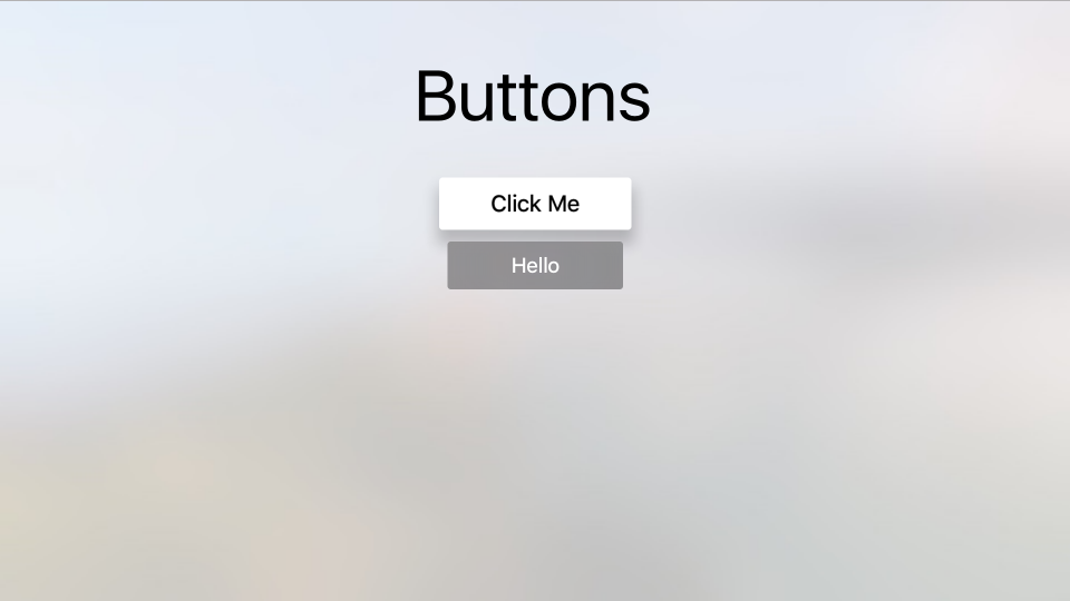
In tvOS, Buttons are used for app-specific actions and may contain a title, a icon or both. As the user navigates the app's User Interface using the Siri Remote, Focus shifts to the given Button making it change text and background colors. A shadow is also applied to the Button adding a 3D effect making it appear to rise above the rest of the User Interface.
Apple has the following suggestions for working with Buttons:
- Use Either a Title or an Icon - While the both an icon and a title can be included in a Button, space is limited so try not to combine both.
- Clearly Mark Destructive Buttons - If the Button performs a destructive action (such as deleting a file), clearly mark it as such using text and/or icon. Destructive actions should always present an Alert asking the user to confine the action.
- Don't Use Back Buttons - The Menu button on the Siri Remote is used to return to the previous screen. The one exception to this rule is for In-App Purchases or destructive actions where a Cancel button should be displayed.
For more information on working with Focus and Navigation, please see our Working with Navigation and Focus documentation.
Button Icons
Apple suggests that you use simple, highly recognizable images for your Button icons. Overly complex icons are hard to recognize on a TV screen across the room on a couch, so try to use the simplest representation possible to get the idea across. Whenever possible, use standard, well-know images for icons (such as a magnifying glass for search).
Button Titles
Apple has the following suggestions when creating the titles for your Buttons:
- Show Descriptive Text Below Icons Buttons - Where possible, place clear, descriptive text below icon only Buttons to further get the Button's purpose across.
- Use Verbs or Verb Phrases for the Title - Clearly state the action that will take place when the user clicks the Button.
- Use Title-Style Capitalization - With the exception of articles, conjunctions or prepositions (four letters or less), every word of the Button's title should be capitalized.
- Use a Short, To-The-Point Title - Use the shortest possible verbiage to describe the Button's action.
Buttons and Storyboards
The easiest way to work with buttons in a Xamarin.tvOS app is to add them to the app's UI using the Xamarin Designer for iOS.
In the Solution Explorer, double-click the
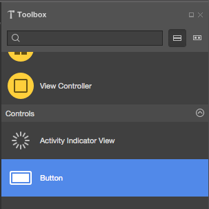
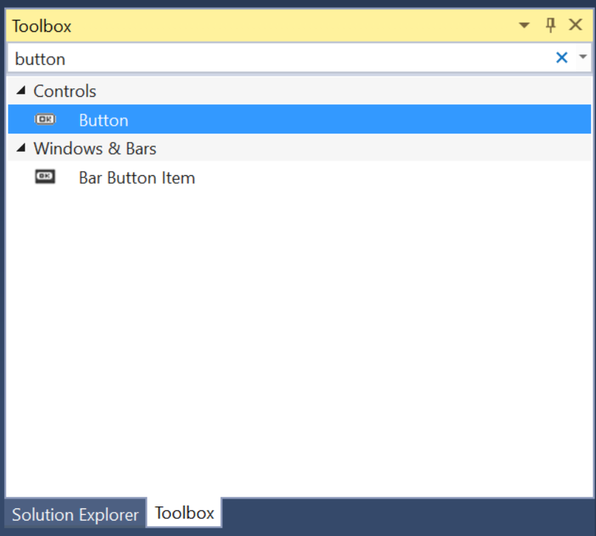
Main.storyboardfile and open it for editing.Drag a Button from the Library and drop it on the View:
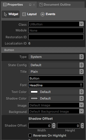
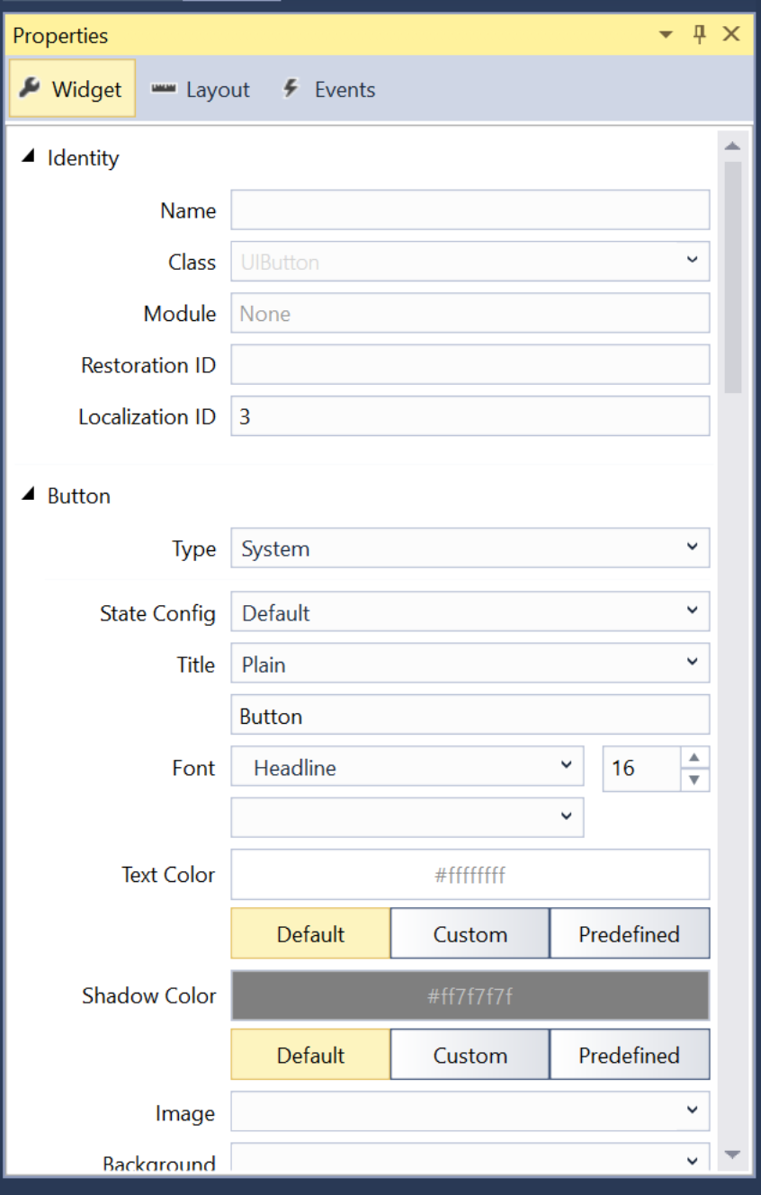
In the Properties Explorer, you can adjust several properties of the button such as its Title and Text Color:
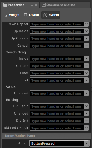
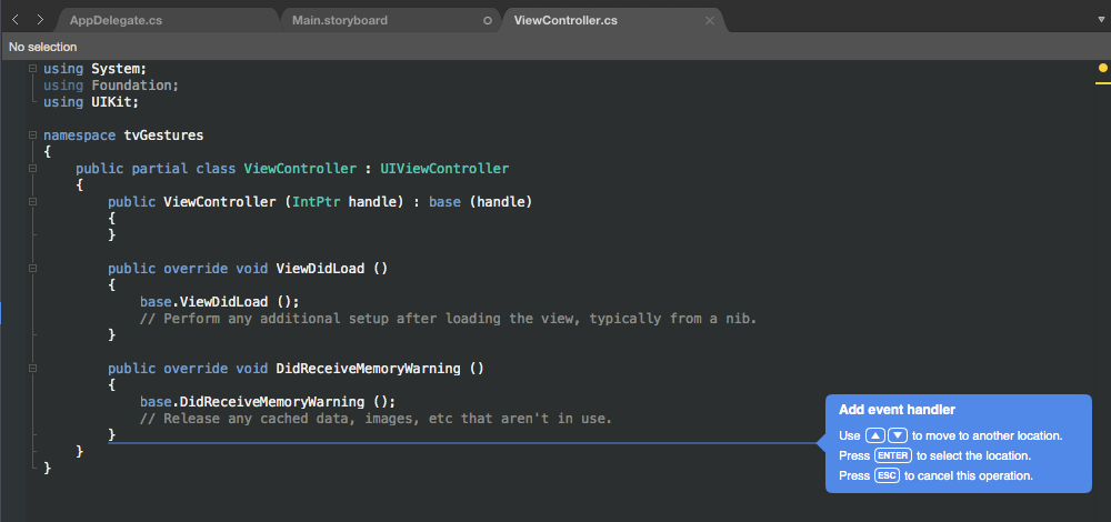
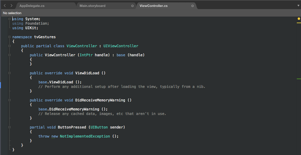
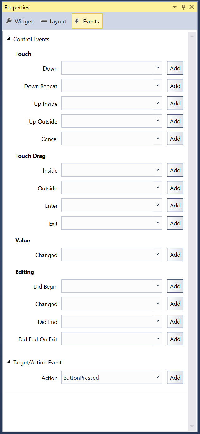
Next, switch to the Events Tab and wire-up an Event from the Button and call it
ButtonPressed:You will be automatically switched to the
ViewController.csview where you can place the new Action in your code using the Up and Down arrow keys:Press the Enter to select the location:
Save the changes to all files.
As long as a button's Enabled property is true and it is not covered by another control or view, it can be made the in-focus item using the Siri Remote. If the user selects the button and clicks the Touch Surface, the ButtonPressed action defined above would be executed.
Important
While it is possible to assign actions such as TouchUpInside to a UIButton when creating an Event Handler, it will never be called because Apple TV doesn't have a touch screen or support touch events. You should always use the default Action Type when creating Actions for tvOS user interface elements.
For more information on working with Storyboards, please see our Hello, tvOS Quick Start Guide.
Buttons and Code
Optionally, a UIButton can be created in C# code and added to the tvOS app's view. For example:
var button = new UIButton(UIButtonType.System);
button.Frame = new CGRect (25, 25, 300, 150);
button.SetTitle ("Hello", UIControlState.Normal);
button.AllEvents += (sender, e) => {
    // Do something when the button is clicked
    ...
};
View.AddSubview (button);
When you create a new UIButton in code, you specify its UIButtonType as one of the following:
- System - This is the standard type of button presented by tvOS and is the type that you will use most often.
- DetailDisclosure - Presents a "turn down" type of button used to hide or show detailed information.
- InfoDark - A dark detailed info button displayed an "i" in a circle.
- InfoLight - A light detailed info button displayed an "i" in a circle.
- AddContact - Display the button as an Add Contact button.
- Custom - Allows you to customize several traits of the button.
Next, you define the on-screen size and location of the button. Example:
button.Frame = new CGRect (25, 25, 300, 150);
Then, set the title for the button. UIButtons are different than most UIKit controls in that they have a State so you can't just simply change the title, you have to change it for a given UIControlState. For example:
button.SetTitle ("Hello", UIControlState.Normal);
Next, use the AllEvents event to see when the user has clicked the button. Example:
button.AllEvents += (sender, e) => {
    // Do something when the button is clicked
    ...
};
Finally, you add the button to the view to display it:
View.AddSubview (button);
Important
While it is possible to assign actions such as TouchUpInside to a UIButton, it will never be called because Apple TV doesn't have a touch screen or support touch events. You should always use events such as AllEvents or PrimaryActionTriggered.
Styling a Button
tvOS provides several properties of a UIButton that can be used to provide its title and style it with things like background color and images.
Button Titles
As we saw above, UIButtons are different than most UIKit controls in that they have a State so you can't just simply change the title, you have to change it for a given UIControlState. For example:
button.SetTitle ("Hello", UIControlState.Normal);
You can set the title color for the button using the SetTitleColor method. For example:
button.SetTitleColor (UIColor.White, UIControlState.Normal);
And you can adjust the title's shadow using the SetTitleShadowColor. For example:
button.SetTitleShadowColor(UIColor.Black, UIControlState.Normal);
You can set the title shadow to change from Engraved to Embossed when the button is highlighted using the following code:
button.ReverseTitleShadowWhenHighlighted = true;
Additionally, you can use attributed text as the button's title. For example:
var normalAttributedTitle = new NSAttributedString (buttonTitle, foregroundColor: UIColor.Blue, strikethroughStyle: NSUnderlineStyle.Single);
myButton.SetAttributedTitle (normalAttributedTitle, UIControlState.Normal);

var highlightedAttributedTitle = new NSAttributedString (buttonTitle, foregroundColor: UIColor.Green, strikethroughStyle: NSUnderlineStyle.Thick);
myButton.SetAttributedTitle (highlightedAttributedTitle, UIControlState.Highlighted);
Button Images
A UIButton can have an image attached to it and can use an image as its background.
To set the background image of a button for a given UIControlState, use the following code:
button.SetBackgroundImage(UIImage.FromFile("my image.png"), UIControlState.Normal);
Set the AdjustsImageWhenHiglighted property to true to draw the image lighter when the button is highlighted (this is the default). Set the AdjustsImageWhenDisabled property to true to draw the image darker when the button is disabled (again, this is the default).
To set the image displayed on the button, use the following code:
button.SetImage(UIImage.FromFile("my image.png"), UIControlState.Normal);
Use the TintColor property to set a color tint that is applied to both the title and the button's image. For buttons of the Custom type, this property has no effect, you must implement the TintColor behavior yourself.
Summary
This article has covered designing and working with buttons inside of a Xamarin.tvOS app. It showed how to work with buttons in the iOS Designer and how to create buttons in C# code. Finally, it showed how to modify a button's title and change its style and appearance.
