tvOS User interface Styles in Xamarin
This article covers the Light and Dark UI Themes that Apple has added to tvOS 10 and how to implement them in a Xamarin.tvOS app.
tvOS 10 now supports both a Dark and Light User Interface theme that all of the build-in UIKit controls will automatically adapt to, based on the user's preferences. Additionally, the developer can manually adjust UI elements based on the theme that the user has selected and can override a given theme.
About the New User Interface Styles
As stated above, tvOS 10 now supports both a Dark and Light User Interface theme that all of the build-in UIKit controls will automatically adapt to, based on the user's preferences.
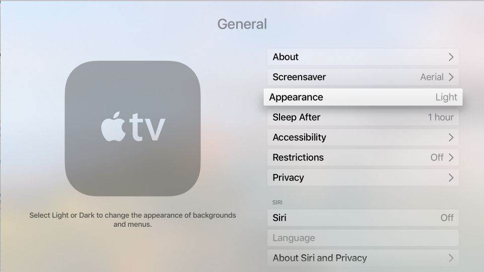
The user can switch this theme by going to Settings > General > Appearance and switching between Light and Dark:
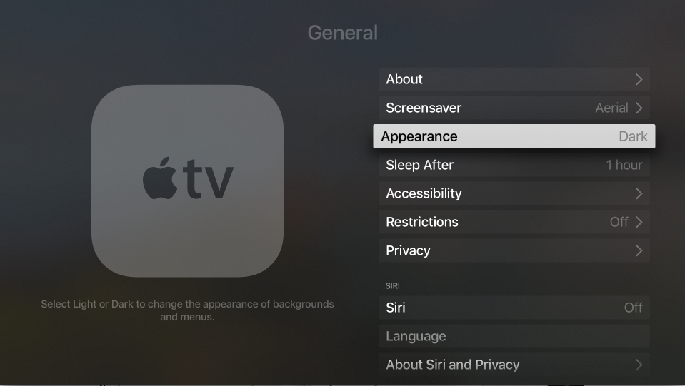
When the Dark theme is selected, all of the User Interface elements will switch to light text on a dark background:
The user has the option to switch the theme at any time and might do so based on the current activity, where the Apple TV is located or the time of day.
The Light UI Theme is the default theme, and any existing tvOS apps will still use the Light theme, regardless of the user's preferences, unless they are modified for tvOS 10 to take advantage of the Dark theme. A tvOS 10 app also has the ability to override the current theme and always use either the Light or Dark theme for some or all of its UI.
Adopting the Light and Dark Themes
To support this feature, Apple has added a new API to the UITraitCollection class and a tvOS app must opt-in to support the Dark appearance (via a setting in its Info.plist file).
To opt-in to Light and Dark theme support, do the following:
In the Solution Explorer, double-click the
Info.plistfile to open it for editing.Select the Source view (from the bottom of the editor).
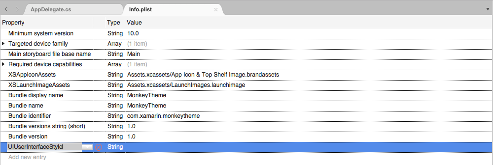
Add a new key and call it
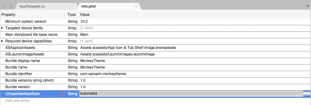
UIUserInterfaceStyle:Leave the type set to
Stringand enter a value ofAutomatic:Save the changes to the file.
There are three possible values for the UIUserInterfaceStyle key:
- Light - Forces the tvOS app's UI to always use the Light theme.
- Dark - Forces the tvOS app's UI to always use the Dark theme.
- Automatic - Switches between the Light and Dark theme based on the user's preferences in Settings. This is the preferred setting.
UIKit Theme Support
If a tvOS app is using standard, built-in UIView based controls, they will automatically respond to the UI theme without any developer intervention.
Additionally, UILabel and UITextView will automatically change their color based on the select UI theme:
- The text will be black in the Light theme.
- The text will be white in the Dark theme.
If the developer ever changes the text color manually (either in the Storyboard or code), they will be responsible for handling color changes based on the UI theme.
New Blur Effects
For supporting the Light and Dark themes in a tvOS 10 app, Apple has added two new Blur Effects. These new effects will automatically adjust the blur based on the UI theme that the user has selected as follows:
UIBlurEffectStyleRegular- Uses a light blur in the Light theme and a dark blur in the Dark theme.UIBlurEffectStyleProminent- Uses an extra-light blur in the Light theme and an extra-dark blur in the Dark theme.
Working with Trait Collections
The new UserInterfaceStyle property of the UITraitCollection class can be used to get the currently selected UI theme and will be a UIUserInterfaceStyle enum of one of the following values:
- Light - The Light UI theme is selected.
- Dark - The Dark UI theme is selected.
- Unspecified - The View has not been displayed to screen yet, so the current UI theme is unknown.
Additionally, Trait Collections have the following features in tvOS 10:
- The Appearance proxy can be customized based on the
UserInterfaceStyleof a givenUITraitCollectionto change things such as images or item colors based on theme. - A tvOS app can handle Trait Collection changes by overriding the
TraitCollectionDidChangemethod of aUIVieworUIViewControllerclass.
Important
The Xamarin.tvOS Early Preview for tvOS 10 doesn't fully support UIUserInterfaceStyle for UITraitCollection yet. Full support will be added in a future release.
Customizing Appearance Based on Theme
For User Interface elements that support the Appearance proxy, their appearance can be adjusted based on the UI Theme of their Trait Collection. So, for a given UI element, the developer can specify one color for the Light theme and another color for the Dark theme.
button.SetTitleColor (UIColor.Red, UIControlState.Normal);

// TODO - Pseudocode because this isn't currently supported in the preview bindings.
var light = new UITraitCollection(UIUserInterfaceStyle.Light);
var dark = new UITraitCollection(UIUserInterfaceStyle.Dark);

button.ForTraitCollection(light).SetTitleColor (UIColor.Red, UIControlState.Normal);
button.ForTraitCollection(dark).SetTitleColor (UIColor.White, UIControlState.Normal);
Important
Unfortunately, the Xamarin.tvOS Preview for tvOS 10 doesn't fully support UIUserInterfaceStyle for UITraitCollection, so this type of customization is not yet available. Full support will be added in a future release.
Responding to Theme Changes Directly
In the developer requires deeper control over the appearance of a UI Element based on the UI theme selected, they can override the TraitCollectionDidChange method of a UIView or UIViewController class.
For example:
public override void TraitCollectionDidChange (UITraitCollection previousTraitCollection)
{
    base.TraitCollectionDidChange (previousTraitCollection);

    // Take action based on the Light or Dark theme
    ...
}
Overriding a Trait Collection
Based on the design of a tvOS app, there might be times when the developer needs to override the Trait Collection of a given User Interface element and have it always use a specific UI theme.
This can be done using the SetOverrideTraitCollection method on the UIViewController class. For example:
// Create new trait and configure it
var trait = new UITraitCollection ();
...

// Apply new trait collection
SetOverrideTraitCollection (trait, this);
For more information, please see the Traits and Overriding Traits sections of our Introduction to Unified Storyboards documentation.
Trait Collections and Storyboards
In tvOS 10, an app's Storyboard can be set to respond to Trait Collections and many UI elements can be made Light and Dark Theme aware. The current Xamarin.tvOS Early Preview for tvOS 10 doesn't support this feature in the Interface Designer yet, so the Storyboard will need to be edited in Xcode's Interface Builder as a workaround.
To enable Trait Collection support, do the following:
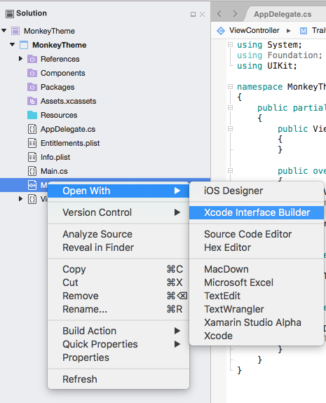
Right-click on the Storyboard file in the Solution Explorer and select Open With > Xcode Interface Builder:
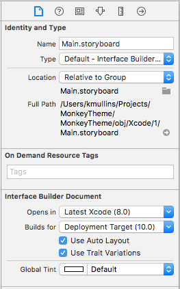
To enable Trait Collection support, switch to the File Inspector and check the Use Trait Variations property in the Interface Builder Document section:
Confirm the change to use Trait Variations:
Save the changes to the Storyboard file.
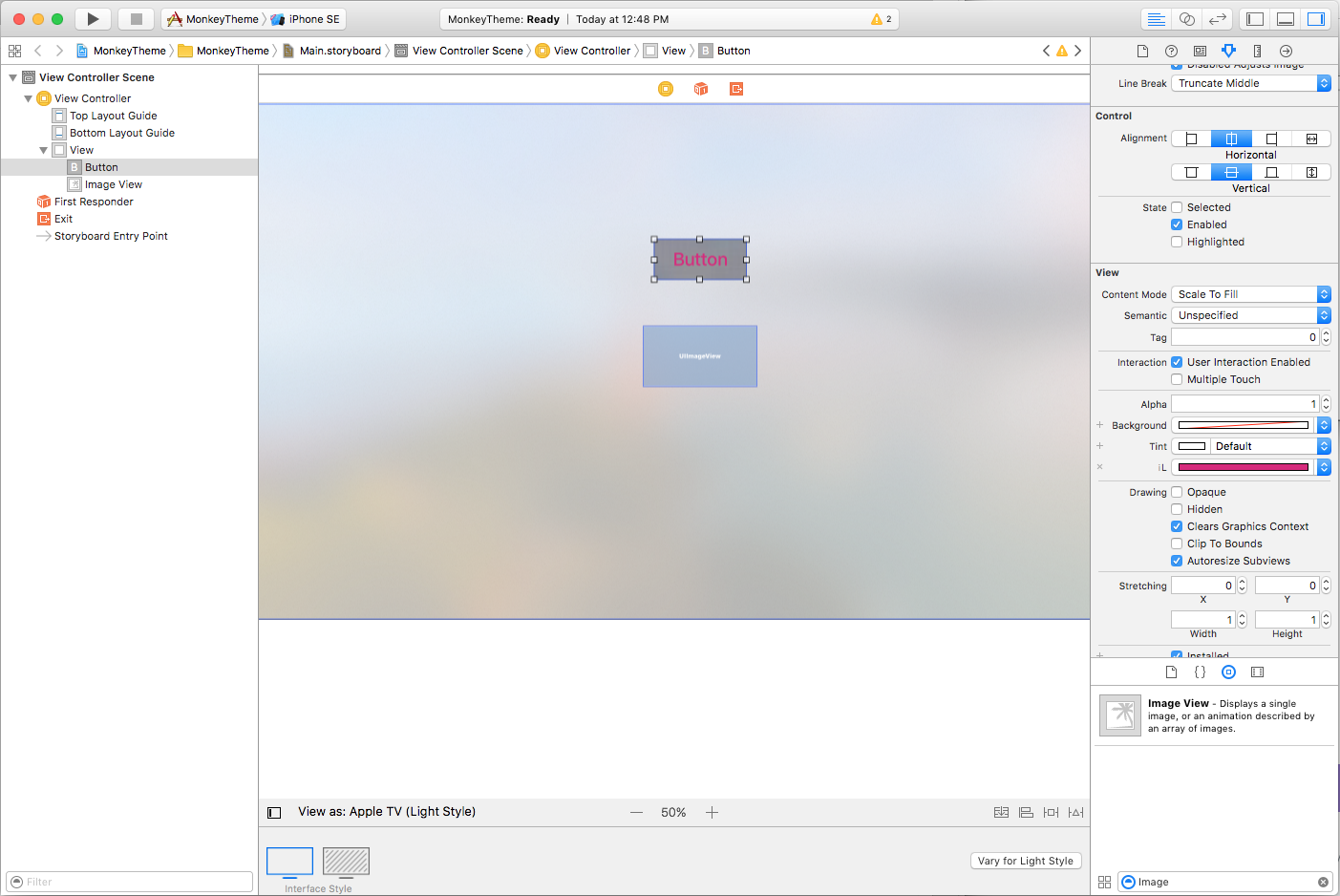
Apple has added the following abilities when editing tvOS Storyboards in Interface Builder:
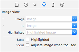
The developer can specify different variations of User Interface elements based on UI theme in the Attribute Inspector:
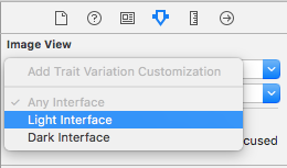
The developer can preview a UI design in either the Light or Dark theme from within Interface Builder:
Additionally, the tvOS Simulator now has a keyboard shortcut to allow the developer to quickly switch between the Light and Dark themes when debugging a tvOS app. Use the Command-Shift-D keyboard sequence to toggle between Light and Dark.
Summary
This article has covered the Light and Dark UI Themes that Apple has added to tvOS 10 and how to implement them in a Xamarin.tvOS app.
