Customizing a ListView's Appearance with Xamarin.Android
The appearance of a ListView is dictated by the layout of the rows being
displayed. To change the appearance of a ListView, use a
different row layout.
Built-in Row Views
There are twelve built-in Views that can be referenced using Android.Resource.Layout:
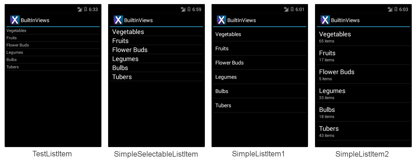
TestListItem – Single line of text with minimal formatting.
SimpleListItem1 – Single line of text.
SimpleListItem2 – Two lines of text.
SimpleSelectableListItem – Single line of text that supports single or multiple item selection (added in API level 11).
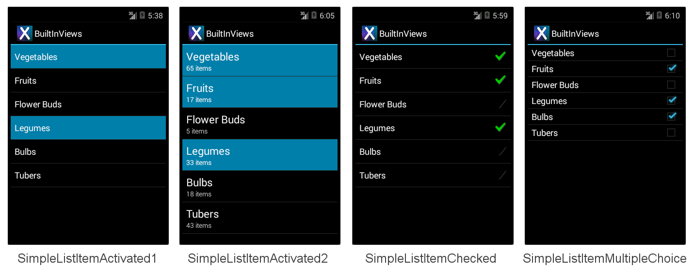
SimpleListItemActivated1 – Similar to SimpleListItem1, but the background color indicates when a row is selected (added in API level 11).
SimpleListItemActivated2 – Similar to SimpleListItem2, but the background color indicates when a row is selected (added in API level 11).
SimpleListItemChecked – Displays check marks to indicate selection.
SimpleListItemMultipleChoice – Displays check boxes to indicate multiple-choice selection.
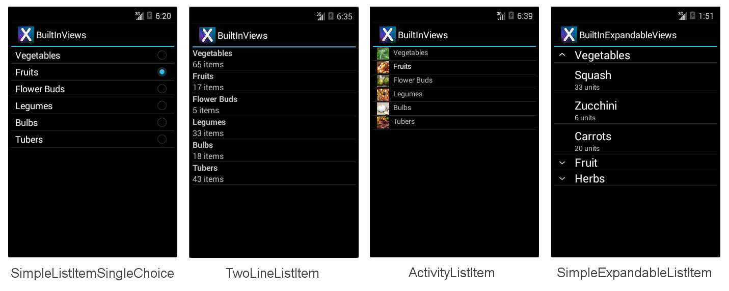
SimpleListItemSingleChoice – Displays radio buttons to indicate mutually-exclusive selection.
TwoLineListItem – Two lines of text.
ActivityListItem – Single line of text with an image.
SimpleExpandableListItem – Groups rows by categories, and each group can be expanded or collapsed.
Each built-in row view has a built in style associated with it. These screenshots show how each view appears:
The BuiltInViews/HomeScreenAdapter.cs sample file (in the
BuiltInViews solution) contains the code to produce the
non-expandable list item screens. The view is set in the GetView
method like this:
view = context.LayoutInflater.Inflate(Android.Resource.Layout.SimpleListItem1, null);
The view's properties can then be set by referencing the standard
control identifiers Text1, Text2 and Icon under
Android.Resource.Id (do not set properties that the view does not
contain or an exception will be thrown):
view.FindViewById<TextView>(Android.Resource.Id.Text1).Text = item.Heading;
view.FindViewById<TextView>(Android.Resource.Id.Text2).Text = item.SubHeading;
view.FindViewById<ImageView>(Android.Resource.Id.Icon).SetImageResource(item.ImageResourceId); // only use with ActivityListItem
The BuiltInExpandableViews/ExpandableScreenAdapter.cs sample file
(in the BuiltInViews solution) contains the code to produce the
SimpleExpandableListItem screen. The group view is set in the
GetGroupView method like this:
view = context.LayoutInflater.Inflate(Android.Resource.Layout.SimpleExpandableListItem1, null);
The child view is set in the GetChildView method like this:
view = context.LayoutInflater.Inflate(Android.Resource.Layout.SimpleExpandableListItem2, null);
The properties for the group view and the child view can then be set
by referencing the standard Text1 and Text2
control identifiers as shown above. The SimpleExpandableListItem
screenshot (shown above) provides an example of a one-line group
view (SimpleExpandableListItem1) and a two-line child view
(SimpleExpandableListItem2). Alternately, the group view can be
configured for two lines (SimpleExpandableListItem2) and the child view
can be configured for one line (SimpleExpandableListItem1), or both
group view and child view can have the same number of lines.
Accessories
Rows can have accessories added to the right of the view to indicate selection state:
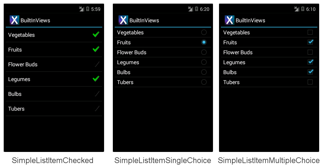
SimpleListItemChecked – Creates a single-selection list with a check as the indicator.
SimpleListItemSingleChoice – Creates radio-button-type lists where only one choice is possible.
SimpleListItemMultipleChoice – Creates checkbox-type lists where multiple choices are possible.
The aforementioned accessories are illustrated in the following screens, in their respective order:
To display one of these accessories pass the required layout resource ID to
the adapter then manually set the selection state for the required rows. This
line of code shows how to create and assign an Adapter using one of
these layouts:
ListAdapter = new ArrayAdapter<String>(this, Android.Resource.Layout.SimpleListItemChecked, items);
The ListView itself supports different selection modes, regardless of
the accessory being displayed. To avoid confusion, use Single
selection mode with SingleChoice accessories and the Checked or
Multiple mode with the MultipleChoice style. The selection mode is
controlled by the ChoiceMode property of the ListView.
Handling API Level
Earlier versions of Xamarin.Android implemented enumerations as integer properties. The latest version has introduced proper .NET enumeration types which makes it much easier to discover the potential options.
Depending on which API level you are targeting, ChoiceMode is either
an integer or an enumeration. The sample file
AccessoryViews/HomeScreen.cs has a block commented out if you wish
to target the Gingerbread API:
// For targeting Gingerbread the ChoiceMode is an int, otherwise it is an
// enumeration.

lv.ChoiceMode = Android.Widget.ChoiceMode.Single; // 1
//lv.ChoiceMode = Android.Widget.ChoiceMode.Multiple; // 2
//lv.ChoiceMode = Android.Widget.ChoiceMode.None; // 0

// Use this block if targeting Gingerbread or lower
/*
lv.ChoiceMode = 1; // Single
//lv.ChoiceMode = 0; // none
//lv.ChoiceMode = 2; // Multiple
//lv.ChoiceMode = 3; // MultipleModal
*/
Selecting Items Programmatically
Manually setting which items are 'selected' is done with the
SetItemChecked method (it can be called multiple times for multiple
selection):
// Set the initially checked row ("Fruits")
lv.SetItemChecked(1, true);
The code also needs to detect single selections differently from
multiple selections. To determine which row has been selected in
Single mode use the CheckedItemPosition integer property:
FindViewById<ListView>(Android.Resource.Id.List).CheckedItemPosition
To determine which rows have been selected in Multiple mode you need
to loop through the CheckedItemPositions SparseBooleanArray. A
sparse array is like a dictionary that only contains entries where the
value has been changed, so you must traverse the entire array looking
for true values to know what has been selected in the list as
illustrated in the following code snippet:
var sparseArray = FindViewById<ListView>(Android.Resource.Id.List).CheckedItemPositions;
for (var i = 0; i < sparseArray.Size(); i++ )
{
   Console.Write(sparseArray.KeyAt(i) + "=" + sparseArray.ValueAt(i) + ",");
}
Console.WriteLine();
Creating Custom Row Layouts
The four built-in row views are very simple. To display more complex layouts (such as a list of emails, or tweets, or contact info) a custom view is required. Custom views are generally declared as AXML files in the Resources/Layout directory and then loaded using their resource Id by a custom adapter. The view can contain any number of display classes (such as TextViews, ImageViews and other controls) with custom colors, fonts and layout.
This example differs from the previous examples in a number of ways:
Inherits from
Activity, notListActivity. You can customize rows for anyListView, however other controls can also be included in anActivitylayout (such as a heading, buttons or other user interface elements). This example adds a heading above theListViewto illustrate.Requires an AXML layout file for the screen; in the previous examples the
ListActivitydoes not require a layout file. This AXML contains aListViewcontrol declaration.Requires an AXML layout file to render each row. This AXML file contains the text and image controls with custom font and color settings.
Uses an optional custom selector XML file to set the appearance of the row when it is selected.
The
Adapterimplementation returns a custom layout from theGetViewoverride.ItemClickmust be declared differently (an event handler is attached toListView.ItemClickrather than an overridingOnListItemClickinListActivity).
These changes are detailed below, starting with creating the activity's view and the custom row view and then covering the modifications to the Adapter and Activity to render them.
Adding a ListView to an Activity Layout
Because HomeScreen no longer inherits from ListActivity it doesn't
have a default view, so a layout AXML file must be created for the
HomeScreen's view. For this example, the view will have a heading
(using a TextView) and a ListView to display data. The layout is
defined in the Resources/Layout/HomeScreen.axml file which is shown
here:
<?xml version="1.0" encoding="utf-8"?>
<LinearLayout xmlns:android="http://schemas.android.com/apk/res/android"
   android:orientation="vertical"
   android:layout_width="fill_parent"
   android:layout_height="fill_parent">
    <TextView android:id="@+id/Heading"
        android:text="Vegetable Groups"
        android:layout_width="fill_parent"
        android:layout_height="wrap_content"
        android:background="#00000000"
        android:textSize="30dp"
        android:textColor="#FF267F00"
        android:textStyle="bold"
        android:padding="5dp"
    />
    <ListView android:id="@+id/List"
        android:layout_width="fill_parent"
        android:layout_height="fill_parent"
        android:cacheColorHint="#FFDAFF7F"
    />
</LinearLayout>
The benefit of using an Activity with a custom layout (instead of a
ListActivity) lies in being able to add additional controls to the
screen, such as the heading TextView in this example.
Creating a Custom Row Layout
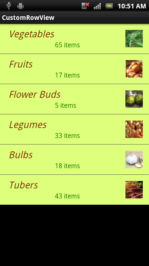
Another AXML layout file is required to contain the custom layout for each row that will appear in the list view. In this example the row will have a green background, brown text and right-aligned image. The Android XML markup to declare this layout is described in Resources/Layout/CustomView.axml:
<?xml version="1.0" encoding="utf-8"?>
<RelativeLayout  xmlns:android="http://schemas.android.com/apk/res/android"
   android:layout_width="fill_parent"
   android:layout_height="wrap_content"
   android:background="#FFDAFF7F"
   android:padding="8dp">
    <LinearLayout android:id="@+id/Text"
       android:orientation="vertical"
       android:layout_width="wrap_content"
       android:layout_height="wrap_content"
       android:paddingLeft="10dip">
        <TextView
         android:id="@+id/Text1"
         android:layout_width="wrap_content"
         android:layout_height="wrap_content"
         android:textColor="#FF7F3300"
         android:textSize="20dip"
         android:textStyle="italic"
         />
        <TextView
         android:id="@+id/Text2"
         android:layout_width="wrap_content"
         android:layout_height="wrap_content"
         android:textSize="14dip"
         android:textColor="#FF267F00"
         android:paddingLeft="100dip"
         />
    </LinearLayout>
    <ImageView
        android:id="@+id/Image"
        android:layout_width="48dp"
        android:layout_height="48dp"
        android:padding="5dp"
        android:src="@drawable/icon"
        android:layout_alignParentRight="true" />
</RelativeLayout >
While a custom row layout can contain many different controls, scrolling performance can be affected by complex designs and using images (especially if they have to be loaded over the network). See Google's article for more information on addressing scrolling performance issues.
Referencing a Custom Row View
The implementation of the custom adapter example is in
HomeScreenAdapter.cs. The key method is GetView where it loads the
custom AXML using the resource ID Resource.Layout.CustomView, and
then sets properties on each of the controls in the view before
returning it. The complete adapter class is shown:
public class HomeScreenAdapter : BaseAdapter<TableItem> {
   List<TableItem> items;
   Activity context;
   public HomeScreenAdapter(Activity context, List<TableItem> items)
       : base()
   {
       this.context = context;
       this.items = items;
   }
   public override long GetItemId(int position)
   {
       return position;
   }
   public override TableItem this[int position]
   {
       get { return items[position]; }
   }
   public override int Count
   {
       get { return items.Count; }
   }
   public override View GetView(int position, View convertView, ViewGroup parent)
   {
       var item = items[position];
       View view = convertView;
       if (view == null) // no view to re-use, create new
           view = context.LayoutInflater.Inflate(Resource.Layout.CustomView, null);
       view.FindViewById<TextView>(Resource.Id.Text1).Text = item.Heading;
       view.FindViewById<TextView>(Resource.Id.Text2).Text = item.SubHeading;
       view.FindViewById<ImageView>(Resource.Id.Image).SetImageResource(item.ImageResourceId);
       return view;
   }
}
Referencing the Custom ListView in the Activity
Because the HomeScreen class now inherits from Activity, a
ListView field is declared in the class to hold a reference to the
control declared in the AXML:
ListView listView;
The class must then load the Activity's custom layout AXML using the
SetContentView method. It can then find the ListView control in the
layout then creates and assigns the adapter and assigns the click
handler. The code for the OnCreate method is shown here:
SetContentView(Resource.Layout.HomeScreen); // loads the HomeScreen.axml as this activity's view
listView = FindViewById<ListView>(Resource.Id.List); // get reference to the ListView in the layout

// populate the listview with data
listView.Adapter = new HomeScreenAdapter(this, tableItems);
listView.ItemClick += OnListItemClick;  // to be defined
Finally the ItemClick handler must be defined; in this case it just
displays a Toast message:
void OnListItemClick(object sender, AdapterView.ItemClickEventArgs e)
{
   var listView = sender as ListView;
   var t = tableItems[e.Position];
   Android.Widget.Toast.MakeText(this, t.Heading, Android.Widget.ToastLength.Short).Show();
}
The resulting screen looks like this:
Customizing the Row Selector Color
When a row is touched it should be highlighted for user feedback. When a custom view specifies as background color as CustomView.axml does, it also overrides the selection highlight. This line of code in CustomView.axml sets the background to light green, but it also means there is no visual indicator when the row is touched:
android:background="#FFDAFF7F"
To re-enable the highlight behavior, and also to customize the color that is used, set the background attribute to a custom selector instead. The selector will declare both the default background color as well as the highlight color. The file Resources/Drawable/CustomSelector.xml contains the following declaration:
<?xml version="1.0" encoding="utf-8"?>
<selector xmlns:android="http://schemas.android.com/apk/res/android">
<item android:state_pressed="false"
  android:state_selected="false"
  android:drawable="@color/cellback" />
<item android:state_pressed="true" >
  <shape>
     <gradient
      android:startColor="#E77A26"
        android:endColor="#E77A26"
        android:angle="270" />
  </shape>
</item>
<item android:state_selected="true"
  android:state_pressed="false"
  android:drawable="@color/cellback" />
</selector>
To reference the custom selector, change the background attribute in CustomView.axml to:
android:background="@drawable/CustomSelector"
A selected row and the corresponding Toast message now looks like
this:
Preventing Flickering on Custom Layouts
Android attempts to improve the performance of ListView scrolling by
caching layout information. If you have long scrolling lists of data
you should also set the android:cacheColorHint property on the
ListView declaration in the Activity's AXML definition (to the same
color value as your custom row layout's background). Failure to
include this hint could result in a 'flicker' as the user scrolls
through a list with custom row background colors.
