Designing lightbox for your Microsoft Teams app
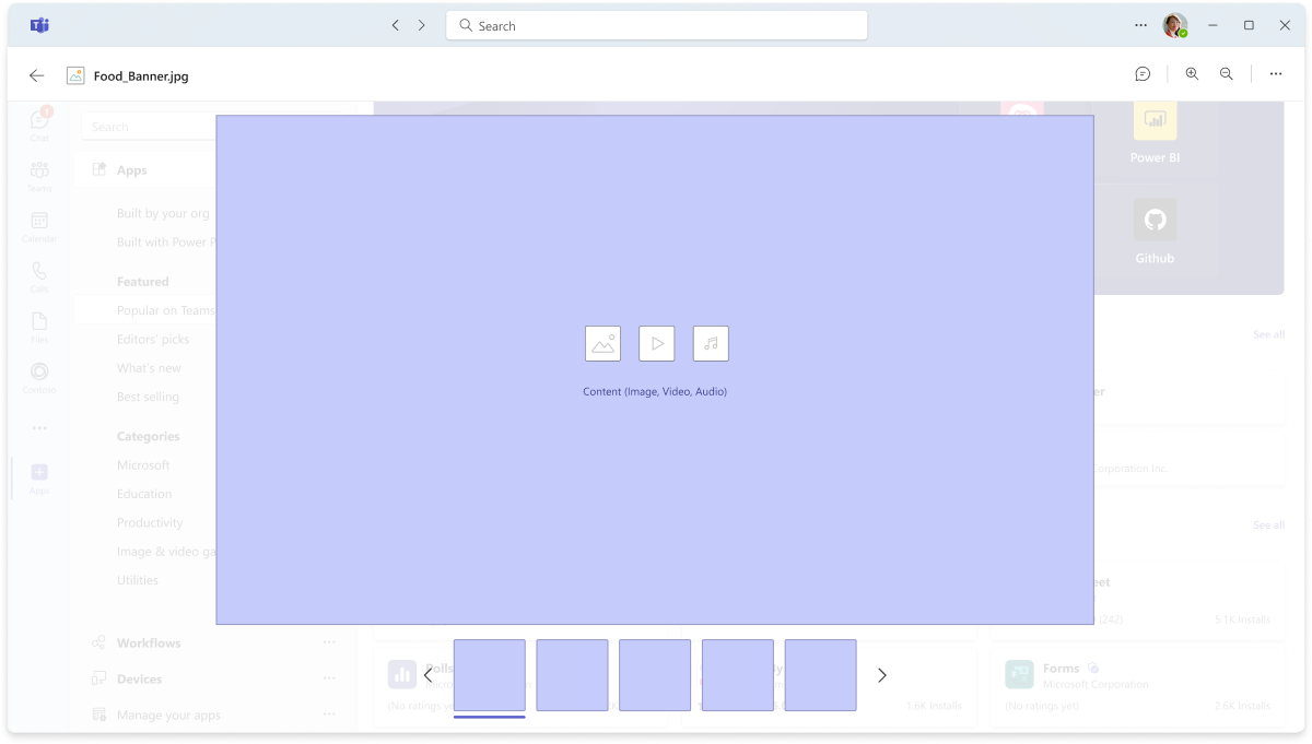
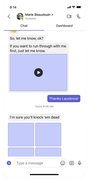
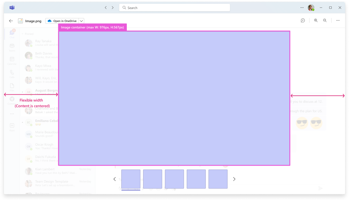
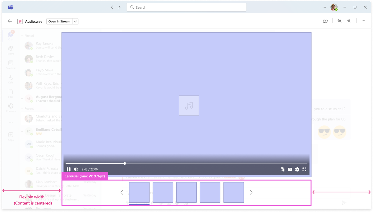
The lightbox is a display component that emphasizes important information by deactivating the page layout behind it. Information in the lightbox is noneditable and non-interactive. The lightbox view enables users to preview media content, including images, videos, audio files on a large surface over the main Teams window.
The lightbox component is designed for quick reviews, understanding, or verification. It doesn't support actions for editing or collaboration. Users can initiate the lightbox in a new Teams window or open it directly in a native app or browser.
Anatomy
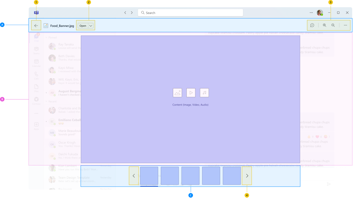
The lightbox view includes a header, center stage, and carousel.
| Counter | Description |
|---|---|
| 1 | Back: Button to navigate to the previoius screen |
| 2 | Open in: Button (basic or split) to navigate to the external window |
| 3 | Buttons with content actions: Zoom in or out, Share, Download, or open chat panel |
| 4 | Chevrons for slide show |
| A | Lightbox header: Actionable |
| B | Center stage: Main content container |
| C | Carousel: Actionable |
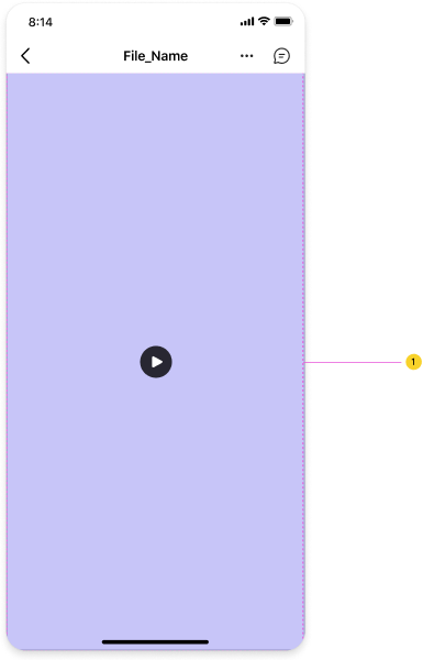
Sizing of the components
Following is the default sizing for the container with the main content:
Best practices
Recommended best practices for Lightbox
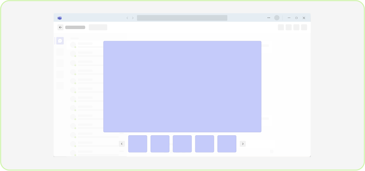
Do: Use a lightbox component to preview files that present media such an image, video, audio in a full-screen view
Help to save time during file opening. Opening on top of the main content. With easy navigation through the files and fast soft dismiss.
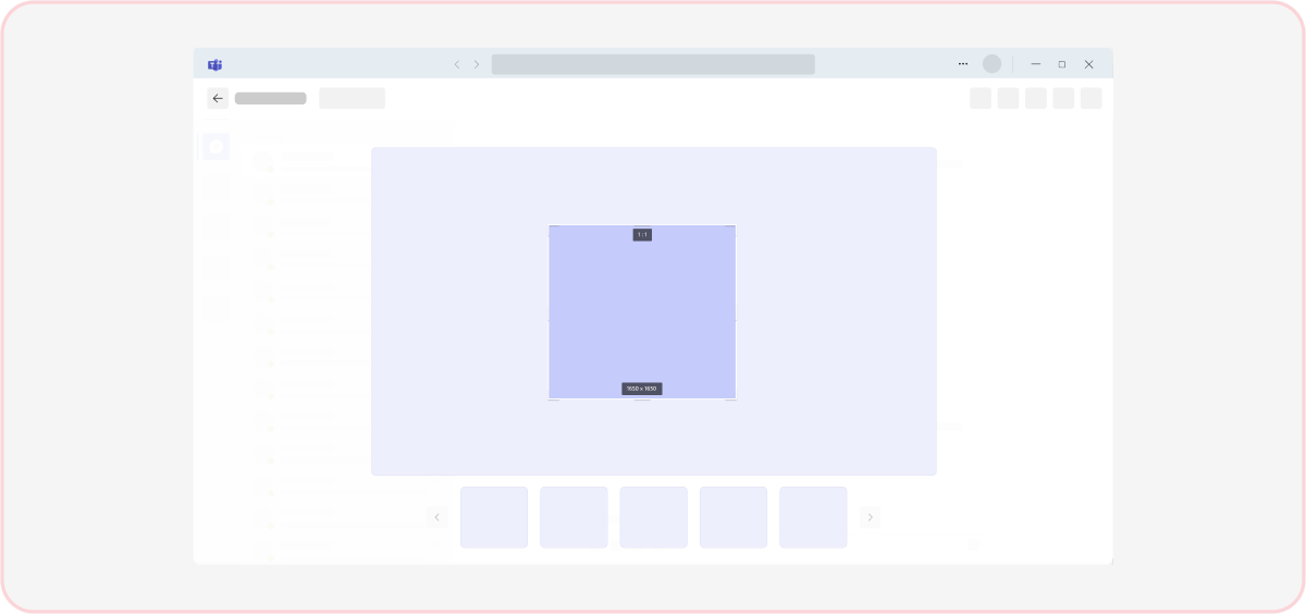
Don't: Use a lightbox for content editing or interaction
Information in the lightbox is noneditable and non-interactive. Provide clear options in Open in menu, where users can start to interact with content.
Do: Use a Lightbox component to preview documents
Documents, which are intended just for the preview option or have Preview option from More option.
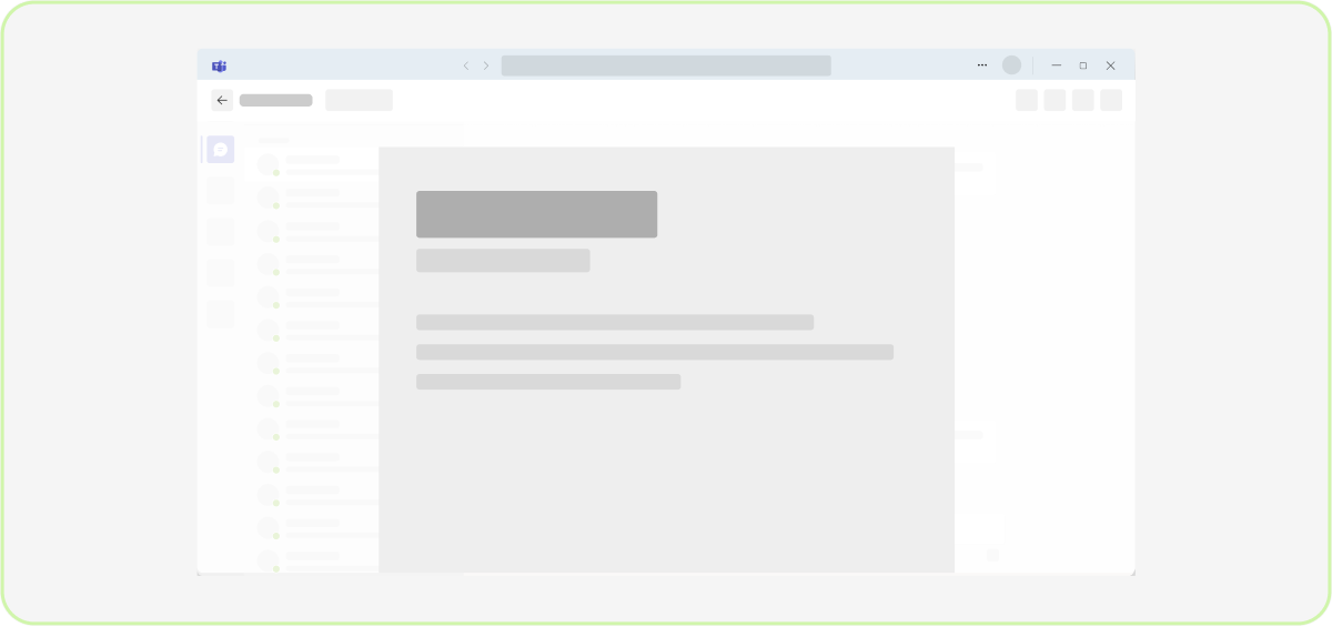
Don't: Use a lightbox in collaborative environments where it’s helpful to see live presence
Users won’t be able to see who else is in the file and making changes from the lightbox.
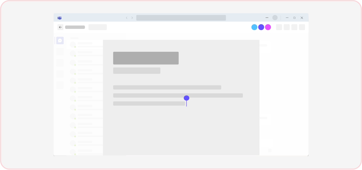
Do: Back button in the header will take to the previous screen and close the lightbox or clicking on the sides from the main content
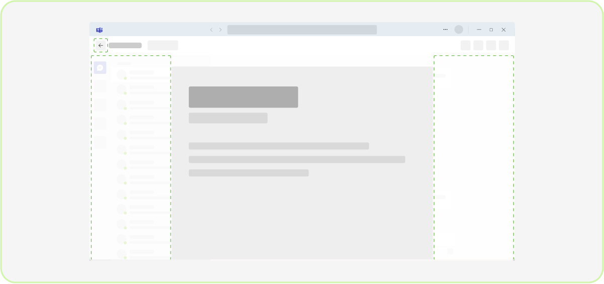
Don't use more button to close the lightbox
You can exit the lightbox by either going back to the previous screen or tapping outside of it.
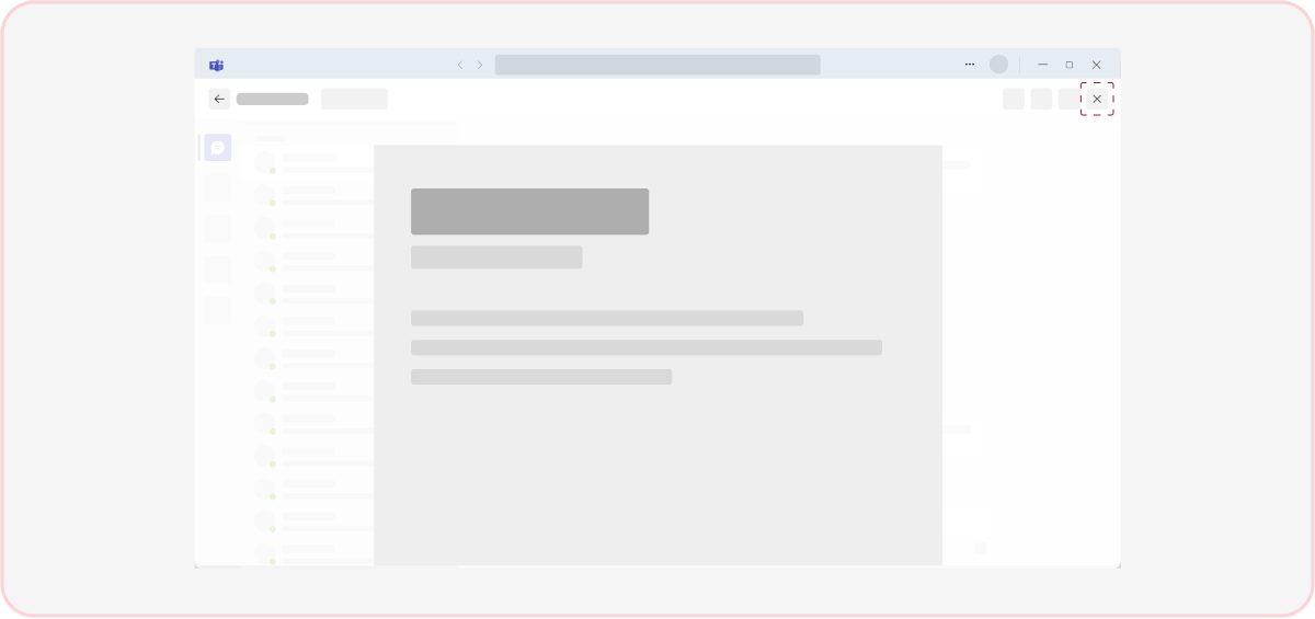
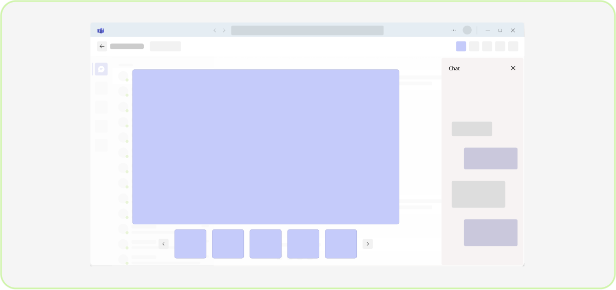
Do: Highlight the chat panel to communicate about the previewed file
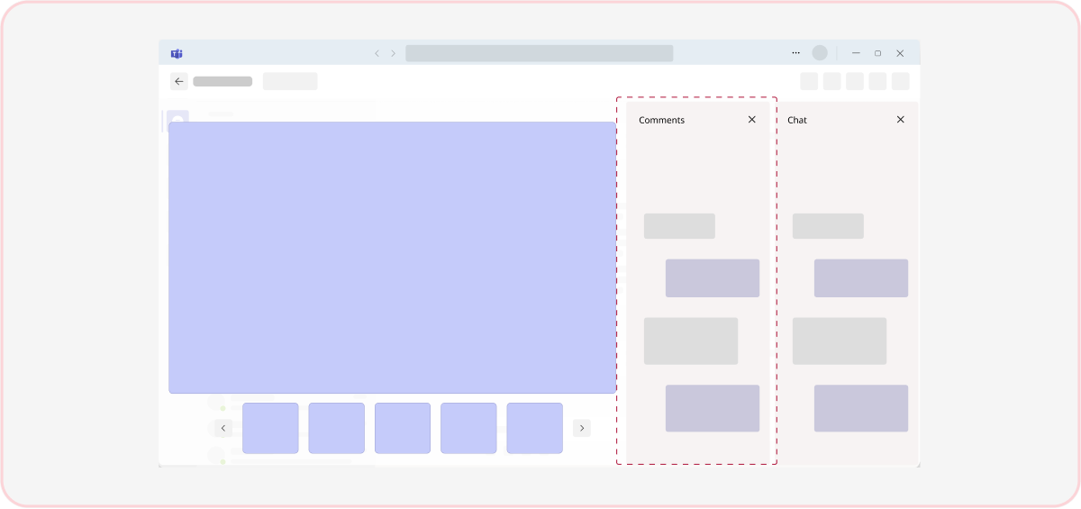
Don't: Refer to commenting in a lightbox experience
Users can’t comment in lightbox files.
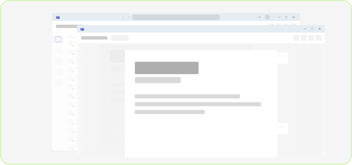
Do: Open the file in a new window if the file requires more time to focus and is editable
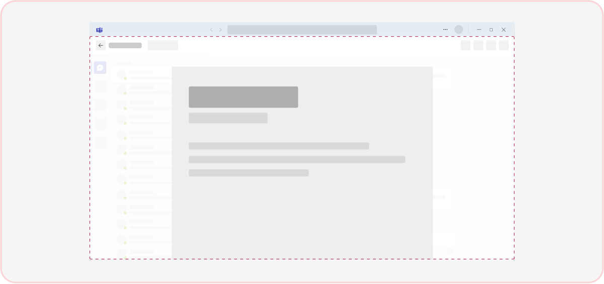
Don't: Use lightbox for files as Word, Excel, PowerPoint, and PDF. Lightbox is a good component for content preview
Platform Docs
