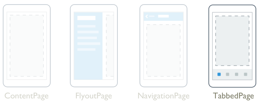
TabbedPage

The .NET Multi-platform App UI (.NET MAUI) TabbedPage maintains a collection of children of type Page, only one of which is fully visible at a time. Each child is identified by a series of tabs across the top or bottom of the page. Typically, each child will be a ContentPage and when its tab is selected the page content is displayed.
TabbedPage defines the following properties:
BarBackground, of type Brush, defines the background of the tab bar.BarBackgroundColor, of type Color, defines the background color of the tab bar.BarTextColor, of type Color, represents the color of the text on the tab bar.SelectedTabColor, of type Color, indicates the color of a tab when it's selected.UnselectedTabColor, of type Color, represents the color of a tab when it's unselected.
These properties are backed by BindableProperty objects, which means that they can be targets of data bindings, and styled.
The title of a tab is defined by the Page.Title property of the child page, and the tab icon is defined by the Page.IconImageSource property of the child page.
In a TabbedPage, each Page object is created when the TabbedPage is constructed. This can lead to a poor user experience, particularly if the TabbedPage is the root page of your app. However, .NET MAUI Shell enables pages accessed through a tab bar to be created on demand, in response to navigation. For more information about Shell apps, see Shell.
Warning
TabbedPage is incompatible with .NET MAUI Shell apps, and an exception will be thrown if you attempt to use TabbedPage in a Shell app.
Create a TabbedPage
Two approaches can be used to create a TabbedPage:
- Populate the TabbedPage with a collection of child Page objects, such as a collection of ContentPage objects. For more information, see Populate a TabbedPage with a Page collection.
- Assign a collection to the
ItemsSourceproperty and assign a DataTemplate to theItemTemplateproperty to return pages for objects in the collection. For more information, see Populate a TabbedPage with a DataTemplate.
Important
A TabbedPage should only be populated with NavigationPage and ContentPage objects.
Regardless of the approach taken, the location of the tab bar in a TabbedPage is platform-dependent:
- On iOS, the list of tabs appears at the bottom of the screen, and the page content is above. Each tab consists of a title and an icon. In portrait orientation, tab bar icons appear above tab titles. In landscape orientation, icons and titles appear side by side. In addition, a regular or compact tab bar may be displayed, depending on the device and orientation. If there are more than five tabs, a More tab will appear, which can be used to access the additional tabs.
- On Android, the list of tabs appears at the top of the screen, and the page content is below. Each tab consists of a title and an icon. However, the tabs can be moved to the bottom of the screen with a platform-specific. If there are more than five tabs, and the tab list is at the bottom of the screen, a More tab will appear that can be used to access the additional tabs. For information about moving the tabs to the bottom of the screen, see TabbedPage toolbar placement on Android.
- On Windows, the list of tabs appears at the top of the screen, and the page content is below. Each tab consists of a title.
Populate a TabbedPage with a Page collection
A TabbedPage can be populated with a collection of child Page objects, which will typically be ContentPage objects. This is achieved by adding ContentPage objects as children of the TabbedPage:
<TabbedPage xmlns="http://schemas.microsoft.com/dotnet/2021/maui"
            xmlns:x="http://schemas.microsoft.com/winfx/2009/xaml"
            xmlns:local="clr-namespace:TabbedPageWithNavigationPage"
            x:Class="TabbedPageWithNavigationPage.MainPage">
    <local:TodayPage />
    <local:SchedulePage />
    <local:SettingsPage />
</TabbedPage>
Page objects that are added as child elements of TabbedPage are added to the Children collection. The Children property of the MultiPage<T> class, from which TabbedPage derives, is the ContentProperty of MultiPage<T>. Therefore, in XAML it's not necessary to explicitly assign the Page objects to the Children property.
The following screenshot shows the appearance of the resulting tab bar on the TabbedPage:

The page content for a tab appears when the tab is selected.
Populate a TabbedPage with a DataTemplate
TabbedPage inherits ItemsSource, ItemTemplate, and SelectedItem bindable properties from the MultiPage<T> class. These properties enable you to generate TabbedPage children dynamically, by setting the ItemsSource property to an IEnumerable collection of objects with public properties suitable for data bindings, and by setting the ItemTemplate property to a DataTemplate with a page type as the root element.
The following example shows generating TabbedPage children dynamically:
<TabbedPage xmlns="http://schemas.microsoft.com/dotnet/2021/maui"
            xmlns:x="http://schemas.microsoft.com/winfx/2009/xaml"
            xmlns:local="clr-namespace:TabbedPageDemo"
            x:Class="TabbedPageDemo.MainPage"
            ItemsSource="{x:Static local:MonkeyDataModel.All}">
    <TabbedPage.ItemTemplate>
        <DataTemplate>
            <ContentPage Title="{Binding Name}"
                         IconImageSource="monkeyicon.png">
                <StackLayout Padding="5, 25">
                    <Label Text="{Binding Name}"
                           FontAttributes="Bold"
                           FontSize="18"
                           HorizontalOptions="Center" />
                    <Image Source="{Binding PhotoUrl}"
                           HorizontalOptions="Center"
                           WidthRequest="200"
                           HeightRequest="200" />
                    <StackLayout Padding="50, 10">
                        <StackLayout Orientation="Horizontal">
                            <Label Text="Family: "
                                   FontAttributes="Bold" />
                            <Label Text="{Binding Family}" />
                        </StackLayout>
                        ...
                    </StackLayout>
                </StackLayout>
            </ContentPage>
        </DataTemplate>
    </TabbedPage.ItemTemplate>
</TabbedPage>
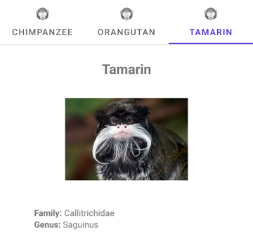
In this example, each tab consists of a ContentPage object that uses Image and Label objects to display data for the tab:

Navigate within a tab
Navigation can be performed within a tab, provided that the ContentPage object is wrapped in a NavigationPage object:
<TabbedPage xmlns="http://schemas.microsoft.com/dotnet/2021/maui"
            xmlns:x="http://schemas.microsoft.com/winfx/2009/xaml"
            xmlns:local="clr-namespace:TabbedPageWithNavigationPage"
            x:Class="TabbedPageWithNavigationPage.MainPage">
    <local:TodayPage />
    <NavigationPage Title="Schedule"
                    IconImageSource="schedule.png">
        <x:Arguments>
            <local:SchedulePage />
        </x:Arguments>
    </NavigationPage>
</TabbedPage>
In this example, the TabbedPage is populated with two Page objects. The first child is a ContentPage object, and the second child is a NavigationPage object containing a ContentPage object.
When a ContentPage is wrapped in a NavigationPage, forwards page navigation can be performed by calling the PushAsync method on the Navigation property of the ContentPage object:
await Navigation.PushAsync(new UpcomingAppointmentsPage());
For more information about performing navigation using the NavigationPage class, see NavigationPage.
Warning
While a NavigationPage can be placed in a TabbedPage, it's not recommended to place a TabbedPage into a NavigationPage.
