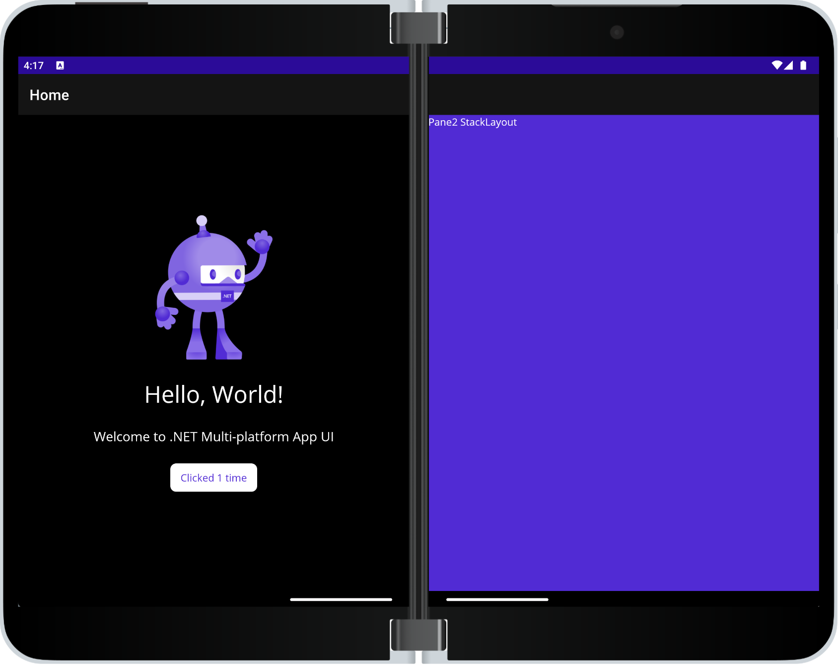
.NET MAUI TwoPaneView layout
The TwoPaneView class represents a container with two views that size and position content in the available space, either side-by-side or top-to-bottom. TwoPaneView inherits from Grid so the easiest way to think about these properties is as if they are being applied to a grid.

The layout control is provided by the Microsoft.Maui.Controls.Foldable NuGet package.
Foldable device support overview
Foldable devices include the Microsoft Surface Duo and Android devices from other manufacturers. They bridge the gap between phones and larger screens like tablets and desktops because apps might need to adjust to a variety of screen sizes and orientations on the same device, including adapting to a hinge or fold in the screen.
Visit the dual-screen developer docs for more information about building apps that target foldable devices, including design patterns and user experiences. There is also a Surface Duo emulator you can download for Windows, Mac, and Linux.
Important
The TwoPaneView control only adapts to Android foldable devices that support the Jetpack Window Manager API provided by Google (such as Microsoft Surface Duo).
On all other platforms and devices (i.e. other Android devices, iOS, macOS, Windows) it acts like a configurable and responsive split view that can dynamically show one or two panes, proportionally sized on the screen.
Add and configure the Foldable support NuGet
Open the NuGet Package Manager dialog for your solution.
Under the Browse tab, search for
Microsoft.Maui.Controls.Foldable.Install the
Microsoft.Maui.Controls.Foldablepackage to your solution.Add the
UseFoldable()initialization method (and namespace) call to the project'sMauiAppclass, in theCreateMauiAppmethod:using Microsoft.Maui.Foldable; // ADD THIS NAMESPACE ... public static MauiApp CreateMauiApp() { var builder = MauiApp.CreateBuilder(); ... builder.UseFoldable(); // ADD THIS LINE TO THE TEMPLATE return builder.Build(); }The
UseFoldable()initialization is required for the app to be able to detect changes in the app's state, such as being spanned across a fold.Update the
[Activity(...)]attribute on theMainActivityclass in Platforms/Android, so that it includes all theseConfigurationChangesoptions:ConfigurationChanges = ConfigChanges.Orientation | ConfigChanges.ScreenSize | ConfigChanges.ScreenLayout | ConfigChanges.SmallestScreenSize | ConfigChanges.UiModeThese values are required so that configuration changes and span state can be more reliably reported for reliable dual-screen support.
Set up TwoPaneView
To add the TwoPaneView layout to your page:
Add a
foldablenamespace alias for the Foldable NuGet:xmlns:foldable="clr-namespace:Microsoft.Maui.Controls.Foldable;assembly=Microsoft.Maui.Controls.Foldable"Add the TwoPaneView as the root element on the page, and add controls to
Pane1andPane2:<foldable:TwoPaneView x:Name="twoPaneView"> <foldable:TwoPaneView.Pane1 BackgroundColor="#dddddd"> <Label Text="Hello, .NET MAUI!" SemanticProperties.HeadingLevel="Level1" FontSize="32" HorizontalOptions="Center" /> </foldable:TwoPaneView.Pane1> <foldable:TwoPaneView.Pane2> <StackLayout BackgroundColor="{AppThemeBinding Light={StaticResource Secondary}, Dark={StaticResource Primary}}"> <Label Text="Pane2 StackLayout"/> </StackLayout> </foldable:TwoPaneView.Pane2> </foldable:TwoPaneView>
Understand TwoPaneView modes
Only one of these modes can be active:
SinglePaneonly one pane is currently visible.Widethe two panes are laid out horizontally. One pane is on the left and the other is on the right. When on two screens this is the mode when the device is portrait.Tallthe two panes are laid out vertically. One pane is on top and the other is on bottom. When on two screens this is the mode when the device is landscape.
Control TwoPaneView when it's only on one screen
The following properties apply when the TwoPaneView is occupying a single screen:
MinTallModeHeightindicates the minimum height the control must be to enterTallmode.MinWideModeWidthindicates the minimum width the control must be to enterWidemode.Pane1Lengthsets the width of Pane1 inWidemode, the height ofPane1inTallmode, and has no effect inSinglePanemode.Pane2Lengthsets the width ofPane2inWidemode, the height ofPane2inTallmode, and has no effect inSinglePanemode.
Important
If the TwoPaneView is spanned across a hinge or fold these properties have no effect.
Properties that apply when on one screen or two
The following properties apply when the TwoPaneView is occupying a single screen or two screens:
TallModeConfigurationindicates, when inTallmode, the Top/Bottom arrangement or if you only want a single pane visible as defined by theTwoPaneViewPriority.WideModeConfigurationindicates, when inWidemode, the Left/Right arrangement or if you only want a single pane visible as defined by theTwoPaneViewPriority.PanePrioritydetermines whether to showPane1orPane2if inSinglePanemode.
Troubleshooting
If the TwoPaneView layout isn't working as expected, double-check the set-up instructions on this page. Omitting or misconfiguring the UseFoldable() method or the ConfigurationChanges attribute values are common causes of errors.
 Browse the sample