Rectangle
The .NET Multi-platform App UI (.NET MAUI) Rectangle class derives from the Shape class, and can be used to draw rectangles and squares. For information on the properties that the Rectangle class inherits from the Shape class, see .NET MAUI Shapes.
Rectangle defines the following properties:
- RadiusX, of type
double, which is the x-axis radius that's used to round the corners of the rectangle. The default value of this property is 0.0. - RadiusY, of type
double, which is the y-axis radius that's used to round the corners of the rectangle. The default value of this property is 0.0.
These properties are backed by BindableProperty objects, which means that they can be targets of data bindings, and styled.
The Rectangle class sets the Aspect property, inherited from the Shape class, to Stretch.Fill. For more information about the Aspect property, see Stretch shapes.
Create a Rectangle
To draw a rectangle, create a Rectangle object and sets its WidthRequest and HeightRequest properties. To paint the inside of the rectangle, set its Fill property to a Brush-derived object. To give the rectangle an outline, set its Stroke property to a Brush-derived object. The StrokeThickness property specifies the thickness of the rectangle outline. For more information about Brush objects, see Brushes.
To give the rectangle rounded corners, set its RadiusX and RadiusY properties. These properties set the x-axis and y-axis radii that's used to round the corners of the rectangle.
Note
There's also a RoundRectangle class, that has a CornerRadius BindableProperty, which can be used to draw rectangles with rounded corners.
To draw a square, make the WidthRequest and HeightRequest properties of the Rectangle object equal.
The following XAML example shows how to draw a filled rectangle:
<Rectangle Fill="Red"
           WidthRequest="150"
           HeightRequest="50"
           HorizontalOptions="Start" />
In this example, a red filled rectangle with dimensions 150x50 (device-independent units) is drawn:

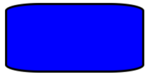
The following XAML example shows how to draw a filled rectangle, with rounded corners:
<Rectangle Fill="Blue"
           Stroke="Black"
           StrokeThickness="3"
           RadiusX="50"
           RadiusY="10"
           WidthRequest="200"
           HeightRequest="100"
           HorizontalOptions="Start" />
In this example, a blue filled rectangle with rounded corners is drawn:

For information about drawing a dashed rectangle, see Draw dashed shapes.
 Browse the sample