How to: Use a Grid for Automatic Layout
This example describes how to use a grid in the automatic layout approach to creating a localizable application.
Localization of a user interface (UI) can be a time consuming process. Often localizers need to re-size and reposition elements in addition to translating text. In the past each language that a UI was adapted for required adjustment. Now with the capabilities of Windows Presentation Foundation (WPF) you can design elements that reduce the need for adjustment. The approach to writing applications that can be more easily re-sized and repositioned is called auto layout.
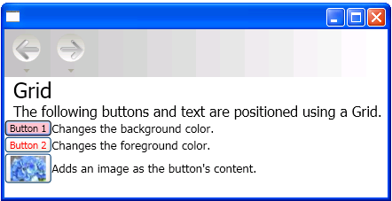
The following Extensible Application Markup Language (XAML) example demonstrates using a grid to position some buttons and text. Notice that the height and width of the cells are set to Auto; therefore the cell that contains the button with an image adjusts to fit the image. Because the Grid element can adjust to its content it can be useful when taking the automatic layout approach to designing applications that can be localized.
Example
The following example shows how to use a grid.
<Grid Name="grid" ShowGridLines ="false">
<Grid.ColumnDefinitions>
<ColumnDefinition Width="Auto"/>
<ColumnDefinition Width="*"/>
</Grid.ColumnDefinitions>
<Grid.RowDefinitions>
<RowDefinition Height="Auto"/>
<RowDefinition Height="Auto"/>
<RowDefinition Height="Auto"/>
<RowDefinition Height="Auto"/>
<RowDefinition Height="Auto"/>
</Grid.RowDefinitions>

<TextBlock Margin="10, 10, 5, 5" Grid.Column="0" Grid.Row="0" FontSize="24">Grid
</TextBlock>
<TextBlock Margin="10, 10, 5, 5" Grid.Column="0" Grid.Row="1" FontSize="12"
    Grid.ColumnSpan="2">The following buttons and text are positioned using a Grid.
</TextBlock>
<Button Margin="10, 10, 5, 5" Grid.Column="0" Grid.Row="2" Background="Pink"
    BorderBrush="Black" BorderThickness="10">Button 1
</Button>
<TextBlock Margin="10, 10, 5, 5" Grid.Column="1" Grid.Row="2" FontSize="12"
   VerticalAlignment="Center" TextWrapping="WrapWithOverflow">Sets the background
   color.
</TextBlock>
<Button Margin="10, 10, 5, 5" Grid.Column="0" Grid.Row="3" Foreground="Red">
   Button 2
</Button>
<TextBlock Margin="10, 10, 5, 5" Grid.Column="1" Grid.Row="3" FontSize="12"
   VerticalAlignment="Center" TextWrapping="WrapWithOverflow">Sets the foreground
   color.
</TextBlock>
<Button Margin="10, 10, 5, 5" Grid.Column="0" Grid.Row="4">
   <Image Source="data\flower.jpg"></Image>
</Button>
<TextBlock Margin="10, 10, 5, 5" Grid.Column="1" Grid.Row="4" FontSize="12"
   VerticalAlignment="Center" TextWrapping="WrapWithOverflow">Adds an image as
   the button's content.
</TextBlock>
</Grid>
The following graphic shows the output of the code sample.

Grid
See also
.NET Desktop feedback
