Theme the UI Library in an application

The Azure Communication Services UI Library is a set of components, icons, and composites that make it easier for you to build high-quality user interfaces for your projects. The UI Library uses components and icons from Fluent UI, the cross-platform design system that Microsoft uses. As a result, the components are built with usability, accessibility, and localization in mind.
In this article, you learn how to change the theme for UI Library components as you configure an application.
The UI Library is fully documented for developers on a separate site. The documentation is interactive and helps you understand how the APIs work by giving you the ability to try them directly from a webpage. For more information, see the UI Library documentation.
Prerequisites
- An Azure account with an active subscription. Create an account for free.
- A deployed Communication Services resource. Create a Communication Services resource.
- A user access token to enable the call client. Get a user access token.
- Optional: Completion of the quickstart for getting started with the UI Library composites.
Set up theming
For detailed documentation and quickstarts about the Web UI Library, see the Web UI Library Storybook.
To learn more, see Theming in the Web UI Library.
For more information, see the open-source Android UI Library and the sample application code.
Defining a theme
Theming on Android is handled via XML resource files. We expose the following resource IDs to the public scope:
<resources>
    <public name="AzureCommunicationUICalling.Theme" type="style" />
    <public name="azure_communication_ui_calling_primary_color" type="attr" />
    <public name="azure_communication_ui_calling_primary_color_tint10" type="attr" />
    <public name="azure_communication_ui_calling_primary_color_tint20" type="attr" />
    <public name="azure_communication_ui_calling_primary_color_tint30" type="attr" />
    <public name="azure_communication_ui_calling_foreground_on_primary_color" type="attr" />
</resources>
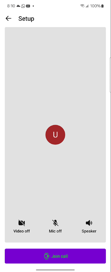
You can implement a theme like the following one in your apps to supply the primary color and tints:
<style name="MyCompany.CallComposite" parent="AzureCommunicationUICalling.Theme">
    <item name="azure_communication_ui_calling_primary_color">#7800D4</item>
    <item name="azure_communication_ui_calling_primary_color_tint10">#882BD8</item>
    <item name="azure_communication_ui_calling_primary_color_tint20">#E0C7F4</item>
    <item name="azure_communication_ui_calling_primary_color_tint30">#ECDEF9</item>
    <item name="azure_communication_ui_calling_foreground_on_primary_color">#00FF00</item>
</style>
The preceding example affects the following UI elements:
- PrimaryColor:
- Avatar/Video - Border - Speaking Indication
- Join Call Button - Background
- PrimaryColorTint10 Color:
- Join Call Button - Background - Highlighted - Light Mode
- Join Call Button - Border - Light/Dark Mode
- PrimaryColorTint20 Color:
- Join Call Button - Background - Highlighted - Dark Mode
- PrimaryColorTint30 Color:
- Join Call Button - Border - Highlighted - Light/Dark Mode
Applying a theme
The theme style is applied to pass the theme resource ID to ThemeConfiguration/Theme in CallCompositeBuilder.
val callComposite: CallComposite =
        CallCompositeBuilder()
            .theme(R.style.MyCompany_CallComposite)
            .build()
Light and dark modes
The Android resource system handles the night theme. Night mode on Android is a system-wide configuration. When you enable night mode, Android gives preference to resources in the -night/ folders. To specify night mode colors, add a second theme.xml file to values-night/.
To enable night mode programmatically, Android provides the following function. However, this configuration applies globally to the application. There's no reliable way to set night mode for a single activity. To enforce a dark theme, use the following setting in your applications:
AppCompatDelegate.setDefaultNightMode(AppCompatDelegate.MODE_NIGHT_YES)
Font color
The azure_communication_ui_calling_foreground_on_primary_color allows you to configure the font color that appears on elements using the primary color. You can use this setting when you want to match a specific theme or brand guidelines. By changing azure_communication_ui_calling_foreground_on_primary_color, you should ensure that the text remains legible and visually appealing by selecting an appropriate contrasting font color for the primary-colored components.
For more information, see the open-source iOS UI Library and the sample application code.
Defining a theme
You can customize the theme by changing the primary color and its associated tints. You also have the option of overriding the light and dark modes in the color scheme.
Affected UI
- PrimaryColor:
- Avatar/Video - Border - Speaking Indication
- Join Call Button - Background
- PrimaryColorTint10 Color:
- Join Call Button - Background - Highlighted - Light Mode
- Join Call Button - Border - Light/Dark Mode
- PrimaryColorTint20 Color:
- Join Call Button - Background - Highlighted - Dark Mode
- PrimaryColorTint30 Color:
- Join Call Button - Border - Highlighted - Light/Dark Mode
Implementation
You can create custom theme options that implement the ThemeOptions protocol. You need to include an instance of that new class in CallCompositeOptions.
class CustomThemeOptions: ThemeOptions {

 var primaryColor: UIColor {
  return UIColor(named: "primaryColor")
 }

 var primaryColorTint10: UIColor {
  return UIColor(named: "primaryColorTint10")
 }

 var primaryColorTint20: UIColor {
  return UIColor(named: "primaryColorTint20")
 }

 var primaryColorTint30: UIColor {
  return UIColor(named: "primaryColorTint30")
 }

 var colorSchemeOverride: UIUserInterfaceStyle {
  return UIUserInterfaceStyle.dark
 }
}

let callCompositeOptions = CallCompositeOptions(theme: CustomThemeOptions())
Font color
The foregroundOnPrimaryColor allows you to programmatically update the font color that appears on elements using the primary color. You can use this method when you want to match a specific theme or brand guidelines. By invoking foregroundOnPrimaryColor, you should ensure that the text remains legible and visually appealing by selecting an appropriate contrasting font color for the primary-colored components.
struct CustomColorTheming: ThemeOptions {

    private var envConfigSubject: EnvConfigSubject

    init(envConfigSubject: EnvConfigSubject) {
        self.envConfigSubject = envConfigSubject
    }

    var primaryColor: UIColor {
        return UIColor(envConfigSubject.primaryColor)
    }

    var primaryColorTint10: UIColor {
        return UIColor(envConfigSubject.tint10)
    }

    var primaryColorTint20: UIColor {
        return UIColor(envConfigSubject.tint20)
    }

    var primaryColorTint30: UIColor {
        return UIColor(envConfigSubject.tint30)
    }

    var foregroundOnPrimaryColor: UIColor {
        return UIColor(envConfigSubject.foregroundOnPrimaryColor)
    }

    var colorSchemeOverride: UIUserInterfaceStyle {
        return envConfigSubject.colorSchemeOverride
    }
}


let callCompositeOptions = CallCompositeOptions(theme: CustomColorTheming())
Defining color assets
Define each color in the assets, with a shade for the light and dark modes. The following reference image shows how to configure the assets on an Xcode project.
