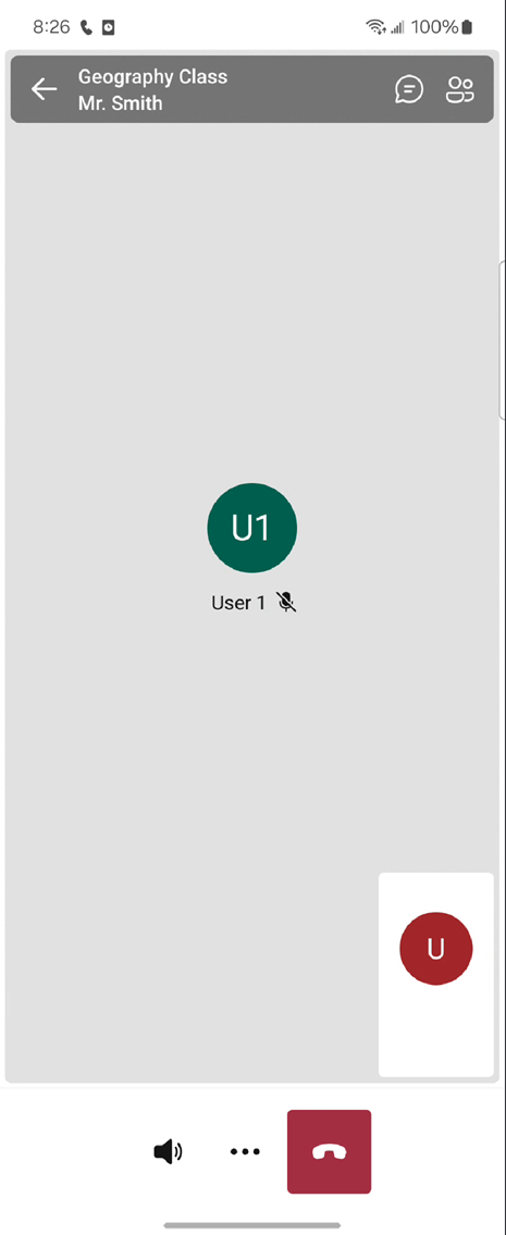
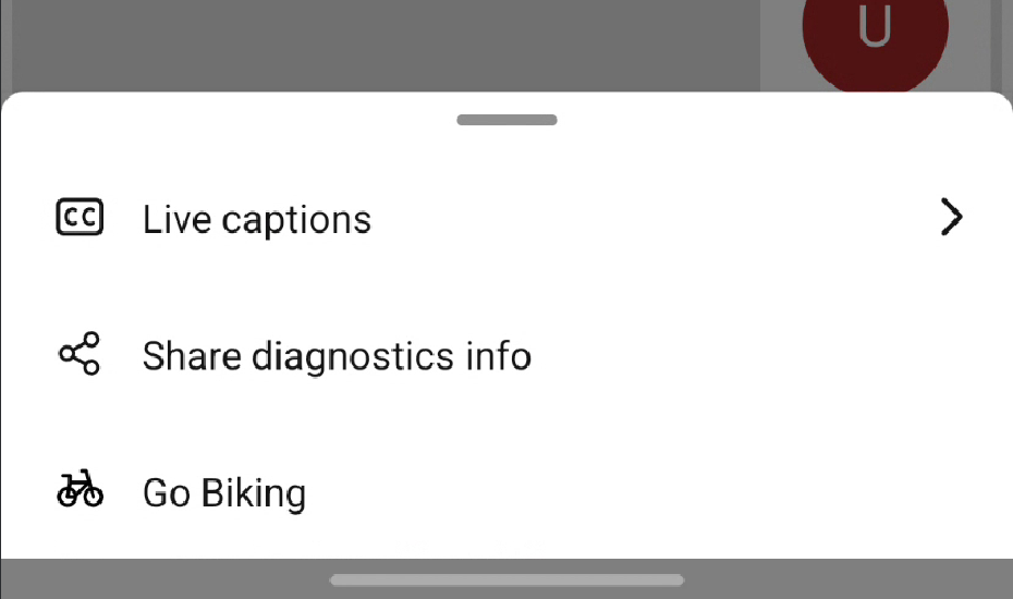
Customize buttons
To implement custom actions or modify the current button layout, you can interact with the Native UI Library's API. This API involves defining custom button configurations, specifying actions, and managing the button bar's current actions. The API provides methods for adding custom actions, and removing existing buttons, all of which are accessible via straightforward function calls.
This functionality provides a high degree of customization, and ensures that the user interface remains cohesive and consistent with the application's overall design.
Prerequisites
- An Azure account with an active subscription. Create an account for free.
- A deployed Communication Services resource. Create a Communication Services resource.
- A user access token to enable the call client. Get a user access token.
- Optional: Completion of the quickstart for getting started with the UI Library composites.
Set up the feature
Remove buttons
CallCompositeCallScreenControlBarOptions, allow the flexibility to customize buttons by removing specific buttons such as camera, microphone, and audio controls. This API allows you to tailor the user interface according to their specific application requirements and user experience design. Just set the visible or enabled to false for the CallCompositeButtonViewData to hide or disable button.

val controlBarOptions = CallCompositeCallScreenControlBarOptions()

val cameraButton = CallCompositeButtonViewData()
    .setVisible(false)

controlBarOptions.setCameraButton(cameraButton)

val callScreenOptions = CallCompositeCallScreenOptions()
    .setControlBarOptions(controlBarOptions)

val localOptions = CallCompositeLocalOptions()
    .setCallScreenOptions(callScreenOptions)

val callComposite = CallCompositeBuilder()
    .build()

callComposite.launch(context, locator, localOptions)
Button can be updated after launching call composite.
Add custom actions
Call composite is using Fluent UI icons. You can download the icons directly from the Fluent UI GitHub repository and incorporate them into your project as needed. This approach guarantees visual consistency across all user interface elements, enhancing the overall user experience.

// Custom header button
val headerCustomButton =
    CallCompositeCustomButtonViewData(
        "headerCustomButton",
        R.drawable.my_header_button_icon,
        "My header button",
        fun(it: CallCompositeCustomButtonClickEvent) {
            // process my button onClick
        }
    )

val headerOptions = CallCompositeCallScreenHeaderViewData()
    .setCustomButtons(listOf(headerCustomButton))

// Custom control bar button
val controlBarOptions = CallCompositeCallScreenControlBarOptions()

controlBarOptions.setCustomButtons(
    listOf(
        CallCompositeCustomButtonViewData(
            "customButtonId",
            R.drawable.my_button_image,
            "My button",
            fun(it: CallCompositeCustomButtonClickEvent) {
                // Process my button onClick
            },
        )
    )
)

val callScreenOptions = CallCompositeCallScreenOptions()
    .setHeaderViewData(headerOptions)
    .setControlBarOptions(controlBarOptions)

val localOptions = CallCompositeLocalOptions()
    .setCallScreenOptions(callScreenOptions)

val callComposite = CallCompositeBuilder()
    .build()

callComposite.launch(context, locator, localOptions)
Similar to Call composite provided buttons, custom buttons are updatable after the launch.
Remove or disable buttons
CallScreenControlBarOptions, allow the flexibility to customize buttons by removing specific buttons such as camera, microphone, and audio controls. This API allows you to tailor the user interface according to their specific application requirements and user experience design. Just set the visible or enabled to false for the ButtonViewData to hide or disable button.

let cameraButton = ButtonViewData(visible: false)

let callScreenControlBarOptions = CallScreenControlBarOptions(
    cameraButton: cameraButton
)

let callScreenOptions = CallScreenOptions(controlBarOptions: callScreenControlBarOptions)
let localOptions = LocalOptions(callScreenOptions: callScreenOptions)

let callComposite = CallComposite(credential: credential)
callComposite.launch(locator: .roomCall(roomId: "..."), localOptions: localOptions)
Button can be updated after launching call composite.
cameraButton.visible = true
Add custom actions
Call composite is using Fluent UI icons. You can download the icons directly from the Fluent UI GitHub repository and incorporate them into your project as needed. This approach guarantees visual consistency across all user interface elements, enhancing the overall user experience.

// Custom header button
let headerCustomButton = CustomButtonViewData(image: UIImage(named: "...")!,
                                              title: "My header button") {_ in
    // Process my button onClick
}
let callScreenHeaderViewData = CallScreenHeaderViewData(
    customButtons: [headerCustomButton]
)

// Custom control bar button
let customButton = CustomButtonViewData(image: UIImage(named: "...")!,
                                        title: "My button") {_ in
    // Process my button onClick
}

let callScreenControlBarOptions = CallScreenControlBarOptions(
    customButtons: [customButton]
)

let callScreenOptions = CallScreenOptions(
    controlBarOptions: callScreenControlBarOptions, headerViewData: callScreenHeaderViewData)

let localOptions = LocalOptions(callScreenOptions: callScreenOptions)

let callComposite = CallComposite(credential: credential)
callComposite.launch(locator: .roomCall(roomId: "..."), localOptions: localOptions)
Similar to Call composite provided buttons, custom buttons are updatable after the launch.
customButton.enabled = true