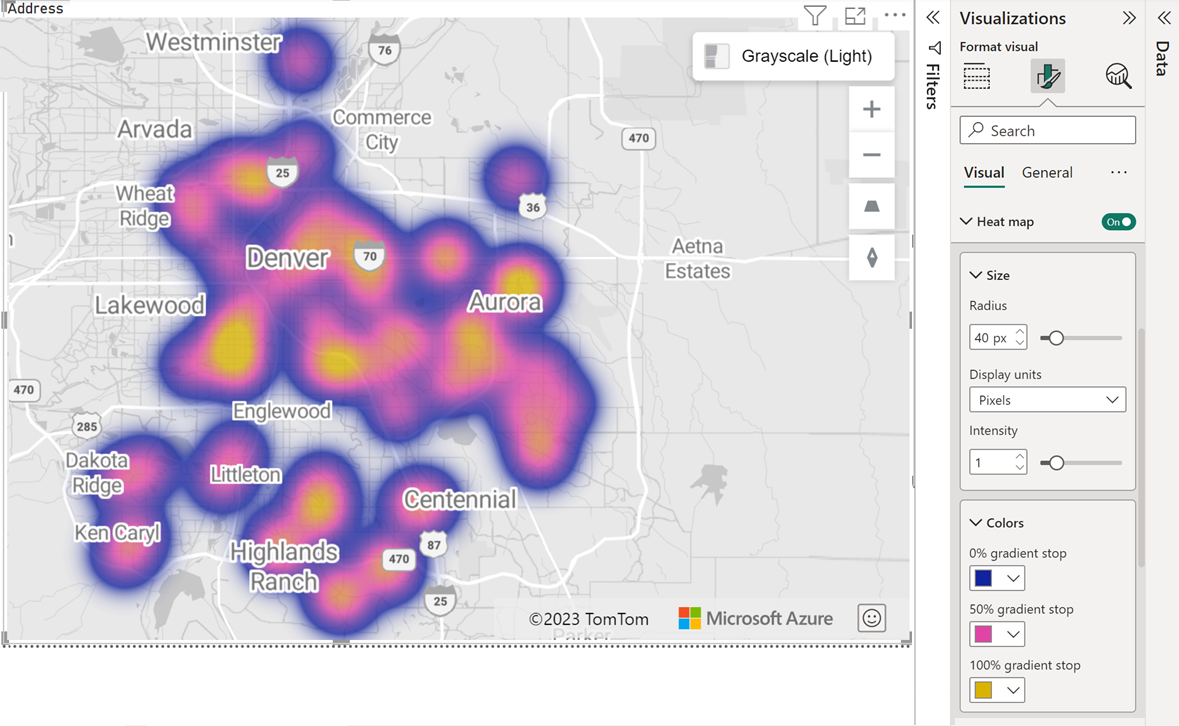
Add a heat map layer
This article describes how to add a heat map layer to an Azure Maps Power BI visual.
Heat maps, also known as density maps, are a type of overlay on a map used to represent the density of data using different colors. Heat maps are often used to show the data "hot spots" on a map. Heat maps are a great way to render datasets with large number of points. Displaying a large number of data points on a map results in a degradation in performance and can cover it with overlapping symbols, making it unusable. Rendering the data as a heat map results not only in better performance, it helps you make better sense of the data by making it easy to see the relative density of each data point.
A heat map is useful when users want to visualize vast comparative data:
- Comparing customer satisfaction rates or shop performance among countries/regions.
- Measuring the frequency which customers visit shopping malls in different locations.
- Visualizing vast statistical and geographical data sets.
Prerequisites
Add the heat map layer
- In Power BI Desktop, select the Azure map that you created.
- In the Format pane, switch the Heat map toggle to On.
Now you can adjust all the Heat map layer settings to suit your report.
Heat map layer settings
The Heat map section of the Format pane provides flexibility to customize and design the heat map visualizations to meet your specific requirements. The Heat map section enables you to:
- Configure the radius of each data point using either pixels or meters as unit of measurement.
- Customize the opacity and intensity of the heat map layer.
- Specify if the value in size field should be used as the weight of each data point.
- Pick different colors from color pickers.
- Set the minimum and maximum zoom level for heat map layer to be visible.
- Decide the heat map layer position among different layers, such as the 3D column and bubble layer.
The following table shows the primary settings that are available in the Heat map section of the Format pane:
| Setting | Description |
|---|---|
| Size | The radius of each data point in the heat map. Valid values when Unit = ‘pixels’: 1 - 200. Default: 20 Valid values when Unit = ‘meters’: 1 - 4,000,000 |
| Setting | Description |
|---|---|
| Radius | The radius of each data point in the heat map. Valid values when Unit = ‘pixels’: 1 - 200. Default: 20 Valid values when Unit = ‘meters’: 1 - 4,000,000 |
| Units | The distance units of the radius. Possible values are: pixels. When set to pixels the size of each data point is the same, regardless of zoom level. meters. When set to meters, the size of the data points scale based on zoom level based on the equivalent pixel distance at the equator, providing better relativity between neighboring points. However, due to the Mercator projection, the actual radius of coverage in meters at a given latitude are smaller than this specified radius. Default: pixels |
| Transparency | Sets the Transparency of the heat map layer. Default: 1 Value should be from 0% to 100%. |
| Intensity | The intensity of each heat point. Intensity is a decimal value between 0 and 1, used to specify how "hot" a single data point should be. Default: 0.5 |
| Use size as weight | A boolean value that determines if the size field value should be used as the weight of each data point. When On, the layer renders as a weighted heat map. Default: Off |
| Gradient | A color picker for users to pick three colors for low (0%), center (50%) and high (100%) gradient colors. |
| Min zoom | Minimum zoom level the layer is visible at. Valid values are 1 to 22. Default: 0 |
| Max zoom | Maximum zoom level the layer is visible at. Valid values are 1 to 22. Default: 22 |
| Layer position | Specify the position of the layer relative to other map layers. Valid values include Above labels, Below labels and Below roads |
Next steps
Change how your data is displayed on the map:
Add more context to the map:
Customize the visual:
