Extend the developer portal with custom widgets
APPLIES TO: Developer | Basic | Standard | Premium
The API Management developer portal features a visual editor and built-in widgets so that you can customize and style the portal's appearance. However, you may need to customize the developer portal further with custom functionality. For example, you might want to integrate your developer portal with a support system that involves adding a custom interface. This article explains ways to add custom functionality such as custom widgets to your API Management developer portal.
The following table summarizes two options, with links to more detail.
| Method | Description |
|---|---|
| Custom HTML code widget | - Lightweight solution for API publishers to add custom logic for basic use cases - Copy and paste custom HTML code into a form, and developer portal renders it in an iframe |
| Create and upload custom widget | - Developer solution for more advanced widget use cases - Requires local implementation in React, Vue, or plain TypeScript - Widget scaffold and tools provided to help developers create widget and upload to developer portal - Widget creation, testing, and deployment can be scripted through open source React Component Toolkit - Supports workflows for source control, versioning, and code reuse |
Note
Self-hosting the developer portal is an extensibility option for customers who need to customize the source code of the entire portal core. It gives complete flexibility for customizing portal experience, but requires advanced configuration. With self-hosting, you're responsible for managing complete code lifecycle: fork code base, develop, deploy, host, patch, and upgrade.
Tip
Another option to customize the developer portal is to use an open-source developer portal plugin for Wordpress. Take advantage of site capabilities in WordPress to localize content, customize menus, apply custom stylesheets, and more in your developer portal.
Use Custom HTML code widget
The managed developer portal includes a Custom HTML code widget where you can insert HTML code for small portal customizations. For example, use custom HTML to embed a video or to add a form. The portal renders the custom widget in an inline frame (iframe).
In the administrative interface for the developer portal, go to the page or section where you want to insert the widget.
Select the grey "plus" (+) icon that appears when you hover the pointer over the page.
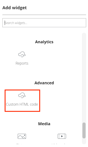
In the Add widget window, select Custom HTML code.

Select the "pencil" icon to customize the widget.
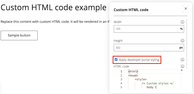
Enter a Width and Height (in pixels) for the widget.
To inherit styles from the developer portal (recommended), select Apply developer portal styling.
Note
If this setting isn't selected, the embedded elements will be plain HTML controls, without the styles of the developer portal.

Replace the sample HTML code with your custom content.
When configuration is complete, close the window.
Save your changes, and republish the portal.
Note
Microsoft does not support the HTML code you add in the Custom HTML Code widget.
Create and upload custom widget
For more advanced use cases, you can create and upload a custom widget to the developer portal. API Management provides a code scaffold for developers to create custom widgets in React, Vue, or plain TypeScript. The scaffold includes tools to help you develop and deploy your widget to the developer portal.
Prerequisites
- Install Node.js runtime locally
- Basic knowledge of programming and web development
Create widget
Warning
Your custom widget code is stored in public Azure blob storage that's associated with your API Management instance. When you add a custom widget to the developer portal, code is read from this storage via an endpoint that doesn't require authentication, even if the developer portal or a page with the custom widget is only accessible to authenticated users. Don't include sensitive information or secrets in the custom widget code.
In the administrative interface for the developer portal, select Custom widgets > Create new custom widget.
Enter a widget name and choose a Technology. For more information, see Widget templates, later in this article.
Select Create widget.
Open a terminal, navigate to the location where you want to save the widget code, and run the following command to download the code scaffold:
npx @azure/api-management-custom-widgets-scaffolderNavigate to the newly created folder containing the widget's code scaffold.
cd <name-of-widget>Open the folder in your code editor of choice, such as VS Code.
Install the dependencies and start the project:
npm install
npm start
Your browser should open a new tab with your developer portal connected to your widget in development mode.
Note
If the tab doesn't open, do the following:
- Make sure the development server started. To do that, check output on the console where you started the server in the previous step. It should display the port the server is running on (for example,
http://127.0.0.1:3001). - Go to your API Management service in the Azure portal and open your developer portal with the administrative interface.
- Append
/?MS_APIM_CW_localhost_port=3001to the URL. Change the port number if your server runs on a different port.
- Make sure the development server started. To do that, check output on the console where you started the server in the previous step. It should display the port the server is running on (for example,
Implement the code of the widget and test it locally. The code of the widget is located in the
srcfolder, in the following subfolders:app- Code for the widget component that visitors to the published developer portal see and interact witheditor- Code for the widget component that you use in the administrative interface of the developer portal to edit widget settings
The
values.tsfile contains the default values and types of the widget's custom properties you can enable for editing.
Custom properties let you adjust values in the custom widget's instance from the administrative user interface of the developer portal, without changing the code or redeploying the custom widget. This object needs to be passed to some of the widgets' helper functions.
Deploy the custom widget to the developer portal
Specify the following values in the
deploy.jsfile located in the root of your project:resourceId- Resource ID of your API Management service, in the following format:subscriptions/<subscription-id>/resourceGroups/<resource-group-name>/providers/Microsoft.ApiManagement/service/<api-management service-name>managementApiEndpoint- Azure Management API endpoint (depends on your environment, typicallymanagement.azure.com)apiVersion- Optional, use to override the default management API version
Run the following command:
npm run deployIf prompted, sign in to your Azure account.
Note
When prompted to sign in, you must use a member account from the Microsoft Entra ID tenant that's associated with the Azure subscription where your API Management service resides. The account must not be a guest or a federated account and must have the appropriate permission to access the portal's administrative interface.
The custom widget is now deployed to your developer portal. Using the portal's administrative interface, you can add it on pages in the developer portal and set values for any custom properties configured in the widget.
Publish the developer portal
After you configure the widget in the administrative interface, republish the portal to make the widget available in production.
Note
- If you deploy updated widget code at a later date, the widget used in production doesn't update until you republish the developer portal.
- The widget's compiled code is associated with a specific portal revision. If you make a previous portal revision current, the custom widget associated with that revision is used.
Widget templates
We provide templates for the following technologies you can use for the widget:
- TypeScript (pure implementation without any framework)
- React
- Vue
All templates are based on the TypeScript programming language.
The React template contains prepared custom hooks in the hooks.ts file and established providers for sharing context through the component tree with dedicated useSecrets, useValues, and useEditorValues hooks.
Use the @azure/api-management-custom-widgets-tools package
This npm package contains the following functions to help you develop your custom widget and provides features including communication between the developer portal and your widget:
| Function | Description |
|---|---|
| getValues | Returns a JSON object containing values set in the widget editor combined with default values |
| getEditorValues | Returns a JSON object containing only values set in the widget editor |
| buildOnChange | Accepts a TypeScript type and returns a function to update the widget values. The returned function takes as parameter a JSON object with updated values and doesn't return anything. Used internally in widget editor |
| askForSecrets | Returns a JavaScript promise, which after resolution returns a JSON object of data needed to communicate with backend |
| deployNodeJs | Deploys widget to blob storage |
| getWidgetData | Returns all data passed to your custom widget from the developer portal Used internally in templates |
@azure/api-management-custom-widgets-tools/getValues
Function that returns a JSON object containing the values you've set in the widget editor combined with default values, passed as an argument.
Import {getValues} from "@azure/api-management-custom-widgets-tools/getValues"
import {valuesDefault} from "./values"
const values = getValues(valuesDefault)
It's intended to be used in the runtime (app) part of your widget.
@azure/api-management-custom-widgets-tools/getEditorValues
Function that works the same way as getValues, but returns only values you've set in the editor.
It's intended to be used in the editor of your widget but also works in runtime.
@azure/api-management-custom-widgets-tools/buildOnChange
Note
This function is intended to be used only in the widget editor.
Accepts a TypeScript type and returns a function to update the widget values. The returned function takes as parameter a JSON object with updated values and doesn't return anything.
import {Values} from "./values"
const onChange = buildOnChange<Values>()
onChange({fieldKey: 'newValue'})
@azure/api-management-custom-widgets-tools/askForSecrets
This function returns a JavaScript promise, which after resolution returns a JSON object of data needed to communicate with backend. token is needed for authentication. userId is needed to query user-specific resources. Those values might be undefined when the portal is viewed by an anonymous user. The Secrets object also contains managementApiUrl, which is the URL of your portal's backend, and apiVersion, which is the apiVersion currently used by the developer portal.
Caution
Manage and use the token carefully. Anyone who has it can access data in your API Management service.
@azure/api-management-custom-widgets-tools/deployNodeJs
This function deploys your widget to your blob storage. In all templates, it's preconfigured in the deploy.js file.
It accepts three arguments by default:
serviceInformation– Information about your Azure service:resourceId- Resource ID of your API Management service, in the following format:subscriptions/<subscription-id>/resourceGroups/<resource-group-name>/providers/Microsoft.ApiManagement/service/<api-management service-name>managementApiEndpoint- Azure management API endpoint (depends on your environment, typicallymanagement.azure.com)
ID of your widget – Name of your widget in "PC-friendly" format (Latin alphanumeric lowercase characters and dashes;
Contoso widgetbecomescontoso-widget). You can find it in thepackage.jsonunder thenamekey.fallbackConfigPath– Path for the localconfig.msapim.jsonfile, for example,./static/config.msapim.json
@azure/api-management-custom-widgets-tools/getWidgetData
Note
This function is used internally in templates. In most implementations you shouldn't need it otherwise.
This function returns all data passed to your custom widget from the developer portal. It contains other data that might be useful in debugging or in more advanced scenarios. This API is expected to change with potential breaking changes. It returns a JSON object that contains the following keys:
values- All the values you've set in the editor, the same object that is returned bygetEditorData
instanceId- ID of this instance of the widget
Add or remove custom properties
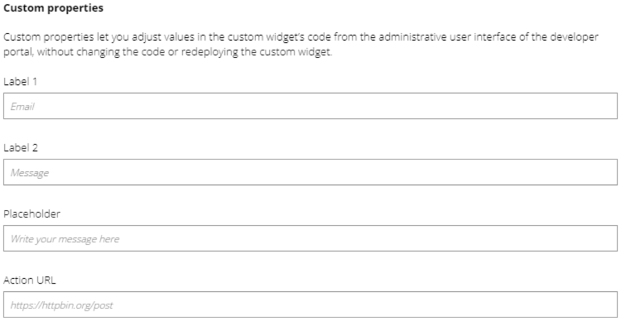
Custom properties let you adjust values in the custom widget's code from the administrative user interface of the developer portal, without changing the code or redeploying the custom widget. By default, input fields for four custom properties are defined. You can add or remove other custom properties as needed.
Warning
Don't store secret or sensitive values in custom properties.
To add a custom property:
- In the file
src/values.ts, add to theValuestype the name of the property and type of the data it will save. - In the same file, add a default value for it.
- Navigate to the
editor.htmloreditor/indexfile (exact location depends on the framework you've chosen) and duplicate an existing input or add one yourself. - Make sure the input field reports the changed value to the
onChangefunction, which you can get frombuildOnChange.
(Optional) Use another framework
To implement your widget using another JavaScript UI framework and libraries, you need to set up the project yourself with the following guidelines:
- In most cases, we recommend that you start from the TypeScript template.
- Install dependencies as in any other npm project.
- If your framework of choice isn't compatible with Vite build tool, configure it so that it outputs compiled files to the
./distfolder. Optionally, redefine where the compiled files are located by providing a relative path as the fourth argument for thedeployNodeJsfunction. - For local development, the
config.msapim.jsonfile must be accessible at the URLlocalhost:<port>/config.msapim.jsonwhen the server is running.
Create custom widgets using open source React Component Toolkit
The open source React Component Toolkit provides a suite of npm package scripts to help you convert a React application to the custom widget framework, test it, and deploy the custom widget to the developer portal. If you have access to an Azure OpenAI service, the toolkit can also create a widget from a text description that you provide.
Currently, you can use the toolkit in two ways to deploy a custom widget:
- Manually, by installing the toolkit and running the npm package scripts locally. You run the scripts sequentially to create, test, and deploy a React component as a custom widget to the developer portal.
- Using an Azure Developer CLI (azd) template for an end-to-end deployment. The
azdtemplate deploys an Azure API Management instance and an Azure OpenAI instance. After resources are provisioned, an interactive script helps you create, test, and deploy a custom widget to the developer portal from a description that you provide.
Note
The React Component Toolkit and Azure Developer CLI sample template are open source projects. Support is provided only through GitHub issues in the respective repositories.
Related content
Learn more about the developer portal: