How-to: Build a metrics graph to analyze related metrics
Important
Starting on the 20th of September, 2023 you won’t be able to create new Metrics Advisor resources. The Metrics Advisor service is being retired on the 1st of October, 2026.
Each time series in Metrics Advisor is monitored separately by a model that learns from historical data to predict future trends. Anomalies will be detected if any data point falls out of the historical pattern. In some cases, however, several metrics may relate to each other, and anomalies need to be analyzed across multiple metrics. Metrics graph is just the tool that helps with this.
For example, if you have several metrics that monitor your business from different perspectives, anomaly detection will be applied respectively. However, in the real business case, anomalies detected on multiple metrics may have a relation with each other, discovering those relations and analyzing root cause base on that would be helpful when addressing real issues. The metrics graph helps automatically correlate anomalies detected on related metrics to accelerate the troubleshooting process.
Select a metric to put the first node to the graph
Select the Metrics graph tab in the navigation bar. The first step for building a metrics graph is to put a node onto the graph. Select a data feed and a metric at the top of the page. A node will appear in the bottom panel.

Add a node/relation on existing node
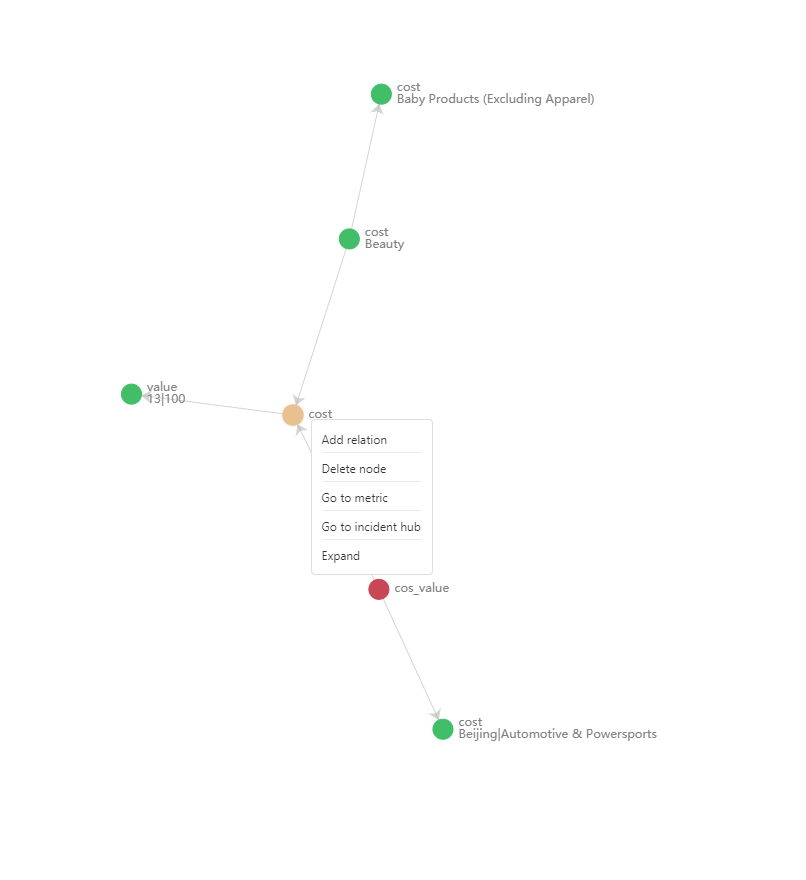
Next, you need to add another node and specify a relation to an existing node(s). Select an existing node and right-click on it. A context menu will appear with several options.
Select Add relation, and you will be able to choose another metric and specify the relation type between the two nodes. You can also apply specific dimension filters.

After repeating the above steps, you will have a metrics graph describing the relations between all related metrics.
There're other actions you can take on the graph:
- Delete a node
- Go to metrics
- Go to Incident Hub
- Expand
- Delete relation
Legend of metrics graph
Each node on the graph represents a metric. There are four kinds of nodes in the metrics graph:
- Green node: The node that represents current metric incident severity is low.
- Orange node: The node that represents current metric incident severity is medium.
- Red node: The node that represents current metric incident severity is high.
- Blue node: The node which doesn't have anomaly severity.
View related metrics anomaly status in incident hub
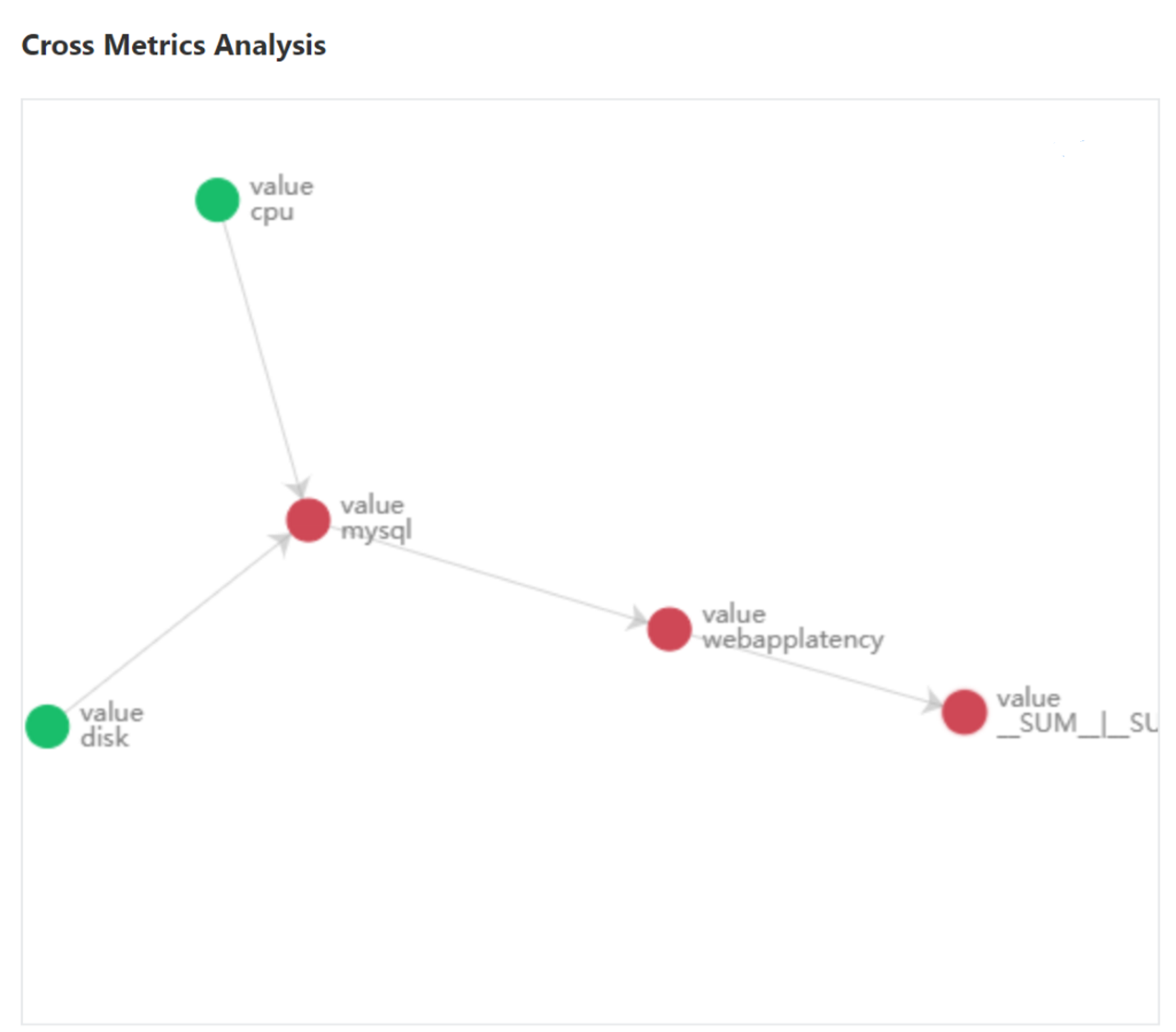
When the metrics graph is built, whenever an anomaly is detected on metrics within the graph, you will able to view related anomaly statuses and get a high-level view of the incident.
Select into an incident within the graph and scroll down to cross metrics analysis, below the diagnostic information.
