Taming the WPF Expander Control
The WPF Expander control has a header and a collapsible window that developers can use in several different ways. One technique is to place multiple Expander controls in a StackPanel to create a UI region of expanding sections, Another technique is to use the Expander as a way of hiding less important information on the UI, creating an on-demand region for the end user to view if needed. Outlook uses an Expander to provide the UI for its query builder. A while back, I wrote about a technique for having the Expander control popup overtop of other controls without moving them in this blog post.
This short post will help you to have a successful experience with the Expander control at design-time and run-time.
Known Issue Please Read
Unfortunately, a design-time bug was introduced in the 5/13/2010 release of Silverlight 4 Tools for Visual Studio download that negatively impacts the Expander control’s design-time experience.
The Expander once expanded can’t be collapsed on the design surface unless you close the form and reopen it. This bug will be corrected in a future release of Silverlight Tools or service pack.
Table of Contents

Adding an Expander to the Design Surface
When you drag and drop an Expander control from the Toolbox to the design surface the below XAML will be created for you.
 <Expander Grid.Column="1" Grid.Row="2" Header="expander3" Height="100" HorizontalAlignment="Left"
          Margin="25,25,0,0" Name="expander3" VerticalAlignment="Top">
  <Grid />
</Expander>
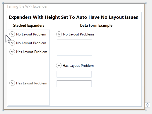
If you look at the above image, you’ll notice some expanders have been named, “Has Layout Problem.” The above default XAML actually causes the layout problem because the Expander control has been assigned Height property.
Below is an Expander with the Height set to auto (Height removed) and the inner child Grid Height set to 100. The inner child Grid will be displayed when the Expander is expanded. This Expander will not have any design-time issues.
 <Expander Panel.ZIndex="99" Header="No Layout Problems" HorizontalAlignment="Left"
          Margin="17,7,0,0" Name="expander2" VerticalAlignment="Top" Width="225"
          Grid.Column="1" Grid.Row="2">
  <Grid Background="Maroon" Height="100" />
</Expander>
Stacked Expanders
If you look at stacked Expanders in the above image you’ll notice the bottom two Expanders are taking up much more vertical space than the top two Expanders even though all four Expanders are in a collapsed state. This is because the the bottom two expanders have their Height set on the Expander control and not the inner child Grid.
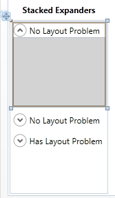
The below image pictures the desired Expander design-time experience. When the Expander is selected on the design surface, it expands, exposing the inner child Grid that can now be designed. Controls can be dragged to it from the Toolbox, etc.
However, if you want to drag another control from the design surface to the Expander, a slightly different technique is required. When you select any control not inside the Expander, the Expander will close. To drag another control into the Expander, select the other control, dragging the mouse over the header portion of the Expander and the Expander will automatically expand for you so you can drop your control as required.

Data Form Example

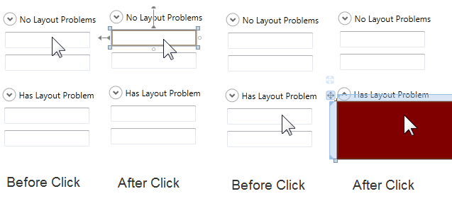
The above image shows what happens when the two TextBoxes are selected on the design surface.
When the TextBox below the No Layout Problems Expander is clicked (first column), normal control selection takes place.
When the TextBox below the Has Layout Problem Expander is clicked (third column), the Expander expands and the Expander’s child Grid is selected and not the TextBox. This occurs because the mouse is performing an action within the Expanders region. In reality the Expander is actually doing what it is supposed to do.
Since the lower Expander in column 3 and 4 has a height of 100, when any control is dragged or clicked within the Expanders size, the Expander expands. This is the same behavior we had above when the Expander had an Auto Sized Height, except the region that triggers the auto expansion was much smaller and did not interfere with other design-time gestures.
Solution
Setting the Expander control’s Height to Auto will provide the best design-time experience. The height of the Expander will then be determined by the content of the Expander’s Header.
The inner child Grid (or other Panel or control) can either be Auto Sized or have a fixed size. However, if the inner child Grid is Auto Sized and does not have any content, its design-time size will be very small until child controls are added.
You can download the above sample solution using the link at the bottom of this post.
Comments
Microsoft values your opinion about our products and documentation. In addition to your general feedback it is very helpful to understand:
- How the above features enable your workflow
- What is missing from the above feature that would be helpful to you
Thank you for your feedback and have a great day,
Karl Shifflett
Visual Studio Cider Team