Setting Up Visual Studio for WPF and Silverlight Development
This article has a corresponding video that can be viewed here.
This important information will enable you to be successful in discovering the toolset and setting up Visual Studio 2010 for WPF and Silverlight development.
Table of Contents
- Visual Studio Tool Window Layout
- Design View
- Split View Bar
- XAML Editor
- Tag Navigator
- Properties Window
- XAML Text Editor Options
- Video
- Comments
Visual Studio Tool Window Layout
In order to customize the layout of Visual Studio we will open a new project. Opening a new project makes all tool windows available.
Start Visual Studio 2010.
From the File menu hover over New, then select New Project…

Figure 1 New Project Menu Selection
New Project Dialog will be displayed.
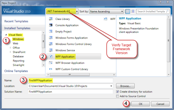
Figure 2 New Project Dialog
| Note |
| The Target Framework Version ComboBox value defaults to the last selection made. When creating a new project, verify the desired Target Framework Version is selected. |
- Step 1 – Select language; Visual Basic or C# then select Windows.
- Step 2 – Select WPF Application.
- Step 3 – Enter project name.
| Tip |
| While it is permissible to have spaces in the project name this practice discouraged. |
- Step 4 – Click OK to create your new WPF Application.
Suggested Visual Studio Layout
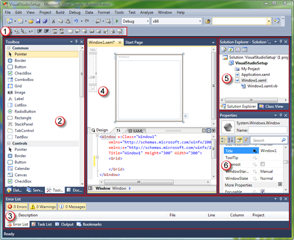
Visual Studio provides a feature rich and powerful development environment for developers to create a wide range of application types. Figure 3 below pictures a suggested layout for WPF and Silverlight application development.
Figure 3 Visual Studio Layout
- Text Editor Toolbar – gives quick access to commonly used features like indenting, commenting and bookmarks. To add the Text Editor Toolbar, right click on the on the Toolbar, then select Text Editor from the drop down menu.
- Left Tool Windows
DataSources Window – Allows dragging of database or objects onto the design view. Used to quickly create data bound forms. To add the DataSources window, click on the Data menu and select Show Data Sources.
Server Explorer – Allows setting up database connections and browsing available servers. Is displayed by default.
Toolbox – Allows dragging installed controls or solution controls onto the design view or XAML editor. Is displayed by default.
Document Outline – Allows navigating the structure of your application. Used to single or multi-select objects. Provides thumbnail preview ToolTip of an object as the mouse hovers over it. To add the Document Outline, click on the View menu, click on Other Windows and select Document Outline.
- Some developers like to have the Document Outline visible at all times, so they position the Document Outline tool window below the above three tool windows group as in Figure 4 below.
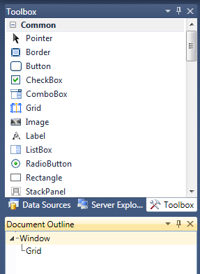
Figure 4 Alternate Document Outline Position
Tip For developers new to WPF or Silverlight, the Document Outline is an invaluable tool for understanding the sometimes deeply nested control tree. The Document Outline tree view makes it very easy to navigate and select objects in your application. - Bottom Tool Windows. These windows are not unique to the XAML editing environment.
- Error List – Displays build errors and XAML errors in design view or XAML editor. To add the Error List, click on the View menu and select Error List. The Error List is also displayed by default when an error is detected.
- Task List – Displays code Comments and User Tasks. To add the Task List, click on the View menu and select Task List.
- Output – Displays build output, debug messages and runtime diagnostic output. To add the Output tool window, click on the View menu and select Output. The Output tool window is also brought into view when compiling or debugging.
- Bookmarks – Displays bookmarks. Used to manage and navigate bookmarks. To add the Bookmarks tool window, click on the View menu and select Bookmarks.
Tip Bookmarks are available in XAML files as well as code files. This feature makes it very easy to switch between files. - Designer region – contains Design View, Split View Bar, XAML View, Tag Navigator and Code View. This region is where most of the developers time is spent designing layouts and writing application code. Each of these areas will be covered below.
- Top right Tool Windows
- Solution Explorer – used to open files for editing in various Visual Studio editors. Displays all solution projects and project items. Is displayed by default.
- Class View – used to view the types and referenced types in the solution. Is displayed by default.
- Properties Window – used to edit properties for the selected object. Object selection can be initiated from the Solution Explorer, Class View, Document Outline, Design View, XAML View or the Tag Navigator. Is displayed by default. The Properties Window will be covered below.
Design View
Design view provides true WYSIWYG (What You See Is What You Get) application design experience. Developers use this view to layout their applications.
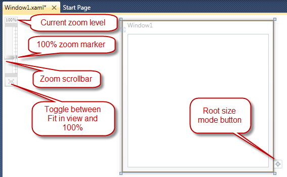
Figure 5 Design View
Zoom Control
Design view provides a Zoom control in the upper left corner to allow the developer to zoom design view in and out. See Figure 5 above. At the bottom of the zoom control is a toggle button. This button toggles between, "Fit in view" and "100% zoom level."
Pan Tool
The Pan tool is available when the design view is displaying horizontal and or vertical scrollbars. When the designer has focus and you press the SPACE BAR, the mouse cursor will change to the hand cursor indicating that you can pan the design surface. Click and drag the design surface to reposition it.
The Pan tool will only allow movement of the design surface if the scrollbar for the direction of movement is visible. When both horizontal and vertical scrollbars are visible the design surface can be repositioned in all directions.
Root Size Mode Button
The root size mode button toggles between a Fixed Size root and an Auto Sized root. The root is the outmost control. In Figure 5 the root control or container is a Window.
When set to Fixed Size, the root container will have the same height and width at design time and run time.
When set to Auto Size, the root container will have a fixed design time height and width and but will auto size itself at run time. See the Auto Size UserControl root in Figure 6 below.
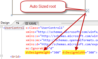
Figure 6 Auto Sized Root
| Note |
| The root sizing becomes very important when designing UserControls. Typically UserControls consume the available space given to them by their hosting control and auto sizing is desirable. However, at design time if the UserControl was auto sized and had no content, it would shrink to size 0, 0. Auto Size root allows the UserControl to have a design time height and width and but also have auto size behavior at run time. |
Information Bar
After building a solution, when you select another tab that has a XAML file and the designer is visible, you'll see the below Information bar. Click the Information bar to reload design view.

Figure 7 Information Bar
| Note |
| The Information bar is only shown for XAML files that were not the active Visual Studio document when the solution was built. If the current document is the XAML file, that document will automatically be reloaded during the build process. |
After building the solution, attempting to use Design View when an error exists will cause the below Information bar to appear at the top of Design View. You need to correct the errors and this Information bar will disappear, making Design View usable again.

Figure 8 Information Bar
Split View Bar
The Split View Bar gives the developer powerful tools for controlling and sizing the design and XAML views.

Figure 9 Split View Bar
- Design is a tab header. When clicked it will bring the Design view into view. This feature is used when the Design and XAML views consume all of the space and one is hidden from view. Double clicking the Design tab will cause you to enter full Design view mode.
- The Switch Panes button will swap the positions of the Design and XAML views. This button is only visible when the Design and XAML views are both visible.
- XAML is a tab header. When clicked will bring the XAML view into view. This feature is used when the Design and XAML views consume all of the space and one is hidden from view. Double clicking the XAML tab will cause you to enter full XAML view mode. Full XAML view mode is described later.
- Dragging the resize bar up and down will resize the Design and XAML views.
- Split Buttons
- The left button is the Vertical Split button. When clicked will split the Design and XAML views vertically instead of the default, horizontally.
- The middle button is the Horizontal Split button. When clicked will split the Design and XAML views horizontally. This is the default.
- The right button is the Collapse Pane, Expand Pane toggle button.
- If the designer region is displaying both Design and XAML views, when clicked will cause the top pane to consume all the space of the designer region.
- If the designer region is consumed by either the Design or XAML view, when click will return the designer region back to split view.
XAML View
XAML view provides a complete editing experience for XAML documents, that includes IntelliSense, auto-formatting, syntax highlighting, and tag navigation. When you edit XAML, Design view updates to reflect your changes.
To easily navigate through your XAML document, you can either select elements on the design surface or use Document Outline to change your selection.
Visual Studio 2010 supports Markup Extension IntelliSense. IntelliSense options will appear as a dropdown list after typing a "{" to begin an element. Navigate IntelliSense with the arrow keys and press tab to select a value.
XAML errors are marked in the XAML editor with a blue squiggle underline, which can be hovered over to produce a tooltip with error information. Those same errors are also listed in the Error List as in Figure 10 below.

Figure 10 XAML Editor Error
| Note |
| Notice the yellow bar to the left of the <Button tag in Figure 10 above. This indicates this line of XAML has changed since the last time the file was saved. If the bar was green, this would indicate this line of XAML was changed and saved since the file was opened. |
Full XAML View Limitations
If you open a XAML file in full XAML view the Properties Window for selected objects will not be available. The Properties Window depends on Design View being loaded. If you switch to Design View and click the displayed link to reload the designer, you can then switch back to full XAML view and the Properties Window will display the selected object.
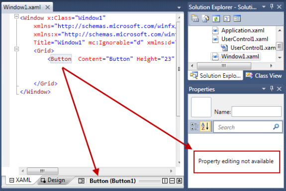
Tag Navigator
The Tag Navigator allows easy navigation of the current leaf of the XAML document.

Figure 11 Tag Navigator
- Document Outline button. Click this to bring the Document Outline into view.
- Currently selected control type and control name.
- Click on any of the parent controls of the currently selected control to select that control.
- Click this right arrow button to select any children of the currently selected control.
Properties Window
The Properties Window provides rich property editing for the selected object's properties.
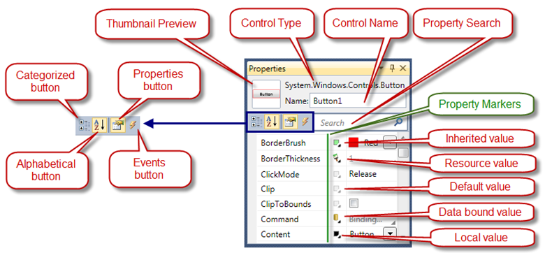
Figure 12 Properties Window
Thumbnail Preview displays a thumbnail image of the selected control.
Control Type is the full type name of the selected control.
Control Name is the name of the selected control.
Property Search Textbox provides quick access to properties. The search algorithm finds all properties that contain the characters entered in the Search Textbox.
Categorized button changes the property listing to group properties by categories.
Properties button changes the list to list properties instead of events.
Alphabetical button changes the property listing to list properties alphabetically.
Events button changes the list to list events instead of properties.
Property Markers indicate where the value is coming from. In Figure 12 above you see 5 different Property Marker icons.
- Clicking or right clicking on the Property Marker brings up the Property Marker content menu as in Figure 13 below.

Figure 13 Property Marker Content Menu
Reset Value will reset the property value back to its default value.
Apply Data Binding will open the Data Binding Builder and enables a data binding expression to be assigned to this property. This will be covered in a future article.
Apply Resource will open the Resource picker and allow a resource to be assigned to this property. This will be covered in a future article.
Extract value to resource will open the Create resource dialog enabling the current property value to be assigned to a new resource and that new resource assigned to the property value. This will be covered in a future article.
XAML Text Editor Options
There are a number of configurable XAML text editor options that can be set using the Visual Studio Options dialog. To open the Options dialog, click the Tools menu and select Options. When the Options dialog is displayed find Text Editor in the left TreeView and expand it. Then expand XAML and finally expand Formatting and click on Spacing.
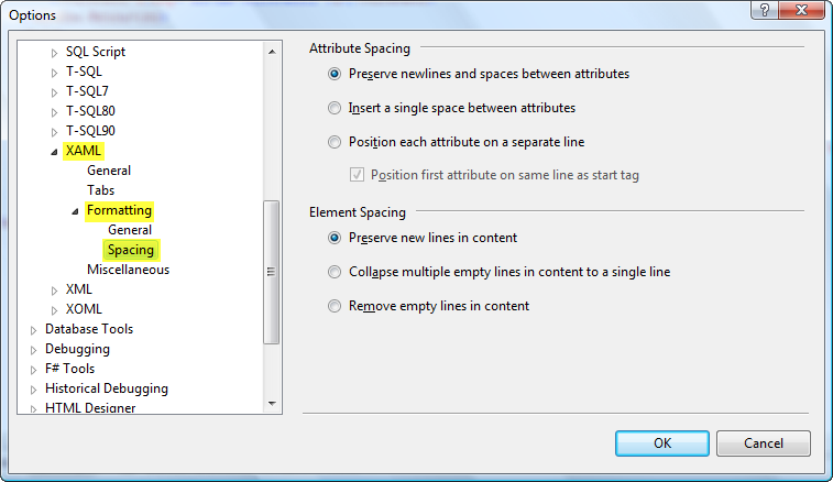
Figure 14 XAML Editor Options
- The Attribute Spacing section in Figure 14 determines how XAML element attributes are formatted when XAML is pasted in the document or when the document is formatted with the Format Document command (CTRL+K, CTRL+D.) You can also run the Format Document command from the menu by clicking on the Edit menu, clicking on Advanced and selecting Format Document.
If "Preserve newlines and spaces between attributes" is selected, document format will not be changed.
If "Insert a single space between attributes" is selected, element attributes will be collapsed to a single line with a single space between attributes.

Figure 15 Attribute Single Space Formatting
If "Position each attribute on a separate line" is selected, element attributes will be expanded and each attribute will be on a separate line.
- Position of the first attribute is controlled by the "Position first attribute on same line as start tag" Checkbox.
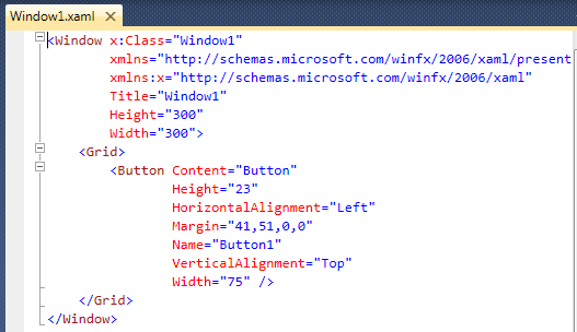
Figure 16 Attribute Multi-Line Formatting
- The Element Spacing section in Figure 14 determines how XAML elements are formatted when the XAML is pasted in the document or when the document is formatted with the Format Document command.
- If "Preserve new lines in content" is selected, document format will not be changed.
- If "Collapse multiple empty lines in content to a single line" is selected, multiple empty lines will be collapsed to a single line.
- If "Remove empty lines in content" is selected, all empty lines in the document will be removed.
Take a few minutes to change the above settings with the simple XAML document you have loaded. After making a settings change, use the Format Document command and reformat the XAML to view how the command changes your XAML document formatting.
Reopen the Options dialog and navigate to the XAML, Miscellaneous tab.
Figure 17 XAML Editor Options
If "Closing tags" is selected, when editing XAML and you enter the close tag for the element, a matching end element tag will automatically be inserted. In Figure 18 below, <Button> was typed, </Button> was automatically inserted by Visual Studio.

Figure 18 Close Tag
If "Attribute quotes" is selected, when editing XAML and you enter a property name, both the closing and ending double quote will automatically be inserted after the equals sign for you.
If "Closing braces for MarkupExtensions" is selected, when editing a property value in XAML and you type "{" a corresponding "}" will be inserted for you.
If "Commas to separate MarkupExtension parameters" is selected, when editing a MarkupExtension in XAML, pressing the SPACE BAR will automatically insert a comma for you. After typing FirstName, pressing the SPACE BAR causes a comma to be inserted, and the insertion point moved one space to the right of the comma.

Figure 19 MarkupExtension Comma Insertion
If "Always open documents in full XAML view" is selected, when a XAML document is opened, XAML view will consume the designer region. When using this feature keep in mind the limitations discussed in the above section, "Full XAML View Limitations."
Automatically Populate Toolbox Items
By default, in Visual Studio 2010, each time you build a WPF and Silverlight project, any types that derive from FrameworkElement or higher will be automatically added to the Toolbox. The types that are added are grouped into Toolbox tab by assembly. The purpose of this feature is to make it easy for developers to consume the UserControls and CustomControls they create on a form.
To you enable/disable this feature by checking or un-checking the CheckBox Automatically populate toolbox items in Figure 17 above. The red arrow points to this CheckBox.
comments
Microsoft values your opinion about our products and documentation. In addition to your general feedback it is very helpful to understand:
- How the above feature enables your workflow
- What is missing from the above feature that would be helpful to you
Thank you for your feedback and have a great day,
Karl Shifflett
Visual Studio Cider Team
Comments
- Anonymous
December 20, 2010
Hi Karl, this post has been really useful for me. Thanks very much.
