Create WPF Master – Detail UI Using Data Sources Window Object DataSource
 This article has a corresponding video that can be viewed here.
Master – Detail layouts are the bread and butter of Line of Business (LOB) applications. This walkthrough will show you how to drag & drop from the Data Sources Window to create the UI that is sourced from an Object DataSource.
This article has a C# and VB.NET download that includes both a completed solution and a starter solution. The starter solution includes the data entity classes and a static (Shared) data source class.
This walkthrough assumes that you'll be starting with the starter solution.
Table of Contents
- Completed Application
- Starter Solution
- Adding a Title to the Form
- Adding the ComboBox Used for Record Selection
- Adding the Details Form
- Adding the DataGrid
- How does it Work?
- Comments
Completed Application

Figure 1 Completed Application
Starter Solution
Open the accompanying (C# or VB.NET) starter solution.

Figure 2 Starter Solution
The Data class provides two static (Shared) properties that expose an ObserveableCollection that the application will use as its data source. The Data class takes the place of a data layer that would be used to populate CLR classes from a database.
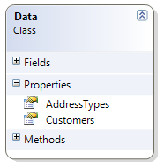
Figure 3 Data Class Diagram
The Customer class can contain one or more Addresses. Each Address has an associated AddressType.
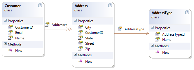
Figure 4 Entity Class Diagram
Adding a Title to the Form
Step One

Figure 5 Draw Border
- Build the solution
- Open ApplicationMainWindow.xaml
- Select the root Grid by clicking inside the Window
- Create a new Grid Row that takes up about 25% of the Window by
- Click the Grid rail on the left to create a new row
- Draw a Border control inside the new row
- Select the Border control in the Toolbox then draw the Border as pictured in Figure 5 above
Step Two
Draw a TextBlock control inside the Border
Multi-select the TextBlock and Border controls using either the Document Outline or by CTRL + clicking each control
-
- Right click, select Reset Layout, All
- This will reset the Width, Height, HorizontalAlignment and VerticalAlignment properties to their default values
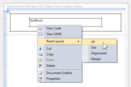
Figure 6 Reseting Values
- After properties are reset your Window should look like Figure 7 below

Figure 7 Title Step Two
Step Three
Using the Document Outline, select the Border control
Using the Properties Window set the following properties:
- CornerRadius to 30
- Margin to 11
- Padding to 7
- BorderThickness to 2
- Background to formTitleBackgroundBrush
- Use Resource Picker, see Figure 8 below. After opening Resource Picker, select formTitleBackgroundBrush.
- BorderBrush to formTitleBorderBrush
- Use Resource Picker, see Figure 8 below. After opening Resource Picker, select formTitleBorderBrush.
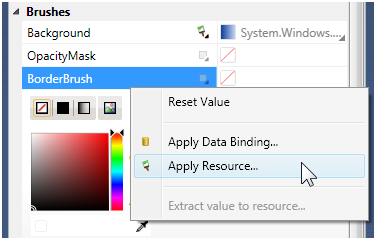
Figure 8 Applying Resource
Using the Document Outline, select the TextBlock
Using the Properties Window set the following properties
- Text to Customer
- VerticalAlignment to Center
- FontSize to 18
- FontWeight to Bold
- Foreground to formTitleForegroundBrush
- Use Resource Picker
Select the Grid
Hover cursor over the left Grid rail for the top row. Set top row to Auto sizing as in Figure 9 below
The bottom image in Figure 9 shows the completed form title

Figure 9 Auto Sizing Row
Adding the ComboBox Used for Record Selection
Step One
- Select the root Grid by clicking inside the Window
- Create a new Grid Row that takes up about 25% of the Window
- Click the Grid rail on the left to create a new row
- Draw a StackPanel inside the new row
- Add a TextBlock to the StackPanel by double clicking the TextBlock icon in the Toolbox
- Add a ComboBox to the StackPanel by double clicking the ComboBox icon in the Toolbox
- Form should now look like Figure 10 below

Figure 10 StackPanel
Step Two
Select the StackPanel
Right click on the StackPanel, choose Reset Layout, All
Using the Properties Window set the following properties:
- Margin to 11
- Orientation to Horizontal
Multi-select the TextBlock and ComboBox
Right click on the TextBlock and choose Reset Layout, All
Using the Properties Window set the following property:
- VerticalAlignment to Center
Form should now look like Figure 11 below
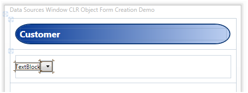
Figure 11 StackPanel
Step Three
Select the TextBlock
Using the Properties Window set the Text property to Select Customer
Select the ComboBox
Using the Properties Window set the following properties:
- Margin to 7, 0
- Width to 175
Form should now look like Figure 12 below
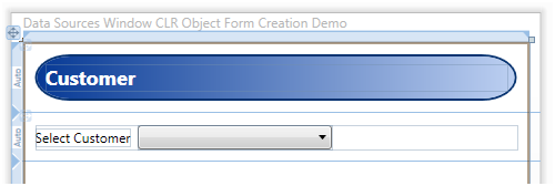
Figure 12 Record Selector Completed
Step Four
From the Data menu, select Show Data Sources.

Figure 13 Data Menu

Figure 14 Data Sources Window
| Important |
Before clicking the Add New Data Source link, you must have built your solution. The Data Sources Window uses reflection to discover types in your solution. If the type has not been built yet, it will not appear in the Data Sources Window. |
- Add a new Data Source by clicking on the "Add New Data Source…" link pictured in Figure 14 above
- When the Data Source Configuration Wizard is displayed select the Object icon and click the Next button

Figure 15 Select Data Objects
- Drill down to the Customer object and select it, then press the Finish button
- Figure 16 below shows the newly created Object Data Source
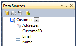
Figure 16 New Data Source
Step Five
The ComboBox will provide Customer selection. To wire up the ComboBox drag the Customer object and drop it on the ComboBox as pictured in Figure 17.
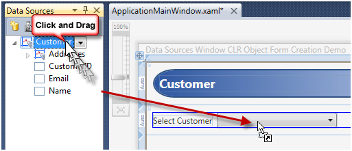
Figure 17 Binding ComboBox
- Select the ComboBox
- Using the Properties Window set the DisplayMemberPath to Name
- Run application. You should be able to view data as pictured in Figure 18.
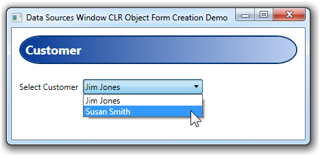
Figure 18 Run Application
| Note |
As part of the Solution Starter, the ApplicationMainWindow Loaded event has code that populates the CollectionViewSource for the application. This is code that developers would normally have to write as the Object Source drag and drop from the Data Sources Window does not add code to your projects. |
Adding the Details Form
The details form in this application plays the role of the Master in our Master-Details application.
Step One
Customize the Customer object output.

Figure 19 Change Layout Type
- Change the Customer object layout to Details as pictured in Figure 19 above
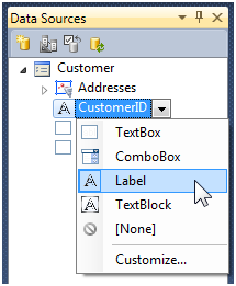
Figure 20 Change CustomerID Control
- Change the CustomerID field to use the Label control when rendered as pictured in Figure 20 above
Step Two

Figure 21 Adding New Row
- Select the Grid and add a new row as pictured in Figure 21 above.

Figure 22 Details Form Generation
- Drag and drop the Customer object to the Grid Row below the ComboBox
- With the Details Grid selected, use the Properties Window and reset the following properties:
- Height
- Width
- Using the Properties Window set the following properties:
- VerticalAlignment to Top
- Margin to 11
- Select the outer Grid and change the Details Form row to use Auto sizing
- The application should now look like Figure 23 below
- Run the application and select different Customers

Figure 23 Details Form Completed
Adding the DataGrid
Step One
Customize the Addresses object output.

- Expand the Address node
- Set the CustomerID field control to None
Step Two

Figure 24 Add Grid to Bottom Row
- Add a Grid control to the bottom row
- With Grid selected, right click, select Reset Layout, All
- Using the Properties Window set the following property:
- Margin to 11
Step Three

Figure 25 Drag and Drop DataGrid
- Drag and drop the Addresses object from the Data Sources Window to the Grid control added in Step Two above
- With DataGrid selected, right click, select Reset Layout, All
- The DataGrid should now look like Figure 26 below
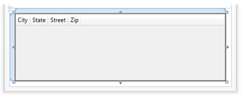
Figure 26 Data Grid Resized
Step Four
Edit DataGrid columns using the XAML Editor.

Figure 27 DataGrid Columns
- Insert a DataGridComboBoxColumn as pictured in Figure 27 above by copying the below XAML:
<DataGridComboBoxColumn SelectedValueBinding="{Binding Path=AddressType.AddressTypeId, Mode=TwoWay}" ItemsSource="{x:Static local:Data.AddressTypes}" DisplayMemberPath="Name" Header="Address Type" SelectedValuePath="AddressTypeId" />
- Cut and Paste the Street column so that it is above the City column as pictured in Figure 27 above.
- Run you application
- You can add, edit and delete rows in the DataGrid
- Notice that the ComboBox in the DataGrid provides selection for the Address, AddressType.
| Note |
See How does it Work section below for an explanation of the DataGrid ComboBox. |
How does it Work?
The CollectionViewSource is a powerful class that provides a wrapper around a data source, adding sorting, grouping and filtering functionality without changing the source data.
The CollectionViewSource is a proxy class to the underlying CollectionView that provides navigation of collection items.
| Information |
MSDN CollectionViewSource documentation can be viewed here: https://msdn.microsoft.com/en-us/library/system.windows.data.collectionviewsource.aspx |

Figure 28 Data Object Relationships
- The Data.Customers ObservableCollection is the source for the CustomerViewSource. This data is wired up in the ApplicationMainWindow.Loaded event.
- When the ComboBox selection changes it sets the CurrentItem on the underlying CollectionView.
- The Details Form is bound to the CurrentItem. When selection changes, the Details Form DataContext changes and the selected Customer is displayed.
- The CustomerAddressesViewSource is bound to the CurrentItem (current Customer) Addresses property.
- The DataGrid is bound to the CustomerAddressesViewSource and displays all items in this collection.
DataGrid ComboBox
The DataGrid ComboBox displays the AddressType.Name for the Address and provides selection of an AddressType.

Figure 29 DataGrid ComboBox
- SelectedValueBinding property gets and sets the AddressTypeId for the Address in the row
- ItemsSource is set to the static (Shared) property AddressTypes exposed by the Data class. AddressTypes is a collection of AddressType.
- DisplayMemberPath is the Name property of the AddressType
- Header is the column header displayed in the DataGrid
- SelectedValuePath is the AddressTypeId of the AddressType
| Information |
MSDN DataGridComboBoxColumn documentation can be viewed here:https://msdn.microsoft.com/en-us/library/system.windows.controls.datagridcomboboxcolumn(VS.100).aspx |
Comments
Microsoft values your opinion about our products and documentation. In addition to your general feedback it is very helpful to understand:
- How the above feature enables your workflow
- What is missing from the above feature that would be helpful to you
Thank you for your feedback and have a great day,
Karl Shifflett
Visual Studio Cider Team
MasterDetailDataSourcesWindowSource.zip
Comments
Anonymous
January 22, 2010
Awesome post Karl. The approach of this post and those that precede it are exactly what is needed for me to get started using Visual Studio 2010, WPF, and Silverlight. Keep them coming!Anonymous
January 23, 2010
Hey Karl, Great article. One question: Where did the resources like "formTitleBackgroundBrush" come from? Thanks ... billAnonymous
March 11, 2010
Bill, formTitleBackgroundBrush is in Application.xaml. Have a great day, KarlAnonymous
July 12, 2010
Thanks for the article. But I got an error message "Error 1 Unknown build error, 'The specified path, file name, or both are too long. The fully qualified file name must be less than 260 characters, and the directory name must be less than 248 characters.' MasterDetailDataSourcesWindowDemo " What does mean here? The properties of Window in XMAL is too long?Anonymous
August 18, 2010
Hi Karl, I can use only my:Data.AddressTypes instead of local:Data.AddressTypes in this statement <DataGridComboBoxColumn SelectedValueBinding="{Binding Path=AddressType.AddressTypeId, Mode=TwoWay}" ItemsSource="{x:Static local:Data.AddressTypes}" DisplayMemberPath="Name" Header="Address Type" SelectedValuePath="AddressTypeId" /> Why???Anonymous
August 18, 2010
The The Aye, my: and local: are just alias's to the assembly that the types are in. my: is what the WPF Designer uses when it adds an alias. local: is what I typically use for the main assembly. You can change the alias at the top of the XAML file if you want. Cheers, KarlAnonymous
October 12, 2010
Great article. Thanks.Anonymous
December 29, 2010
Karl Shifflett has a training module called MVVMTraining.vsix. This add-on does not install or run with Visual Studio 2010 Express. Supposedly Karl can change the manifest for MVVMTraining.vsix and make it run in VS 2010 Express. I don't know how to contact Karl and get this problem fixed. I have to purchase VS 2010 Professional to run his add-on. Is there a better way?Anonymous
September 19, 2015
Good article .Karl Thanks..Can you share your mail Id