Understanding CPU Performance Counters on Cross Platform Monitors
I recently saw a bug submitted to our team about CPU usage statistics being reported by the cross platform agents and MP. The explanation from the customer was that our performance numbers weren’t the same as what they were seeing in tools like vmstat and mpstat and it was a bit confusing. It seemed like our CPU calculations were just wrong. In this article, I’ll discuss how the calculations are made and why the performance numbers might not match up to some other tools.
First of all, it’s important to understand how the agent gathers the data and how it gets to the OpsMgr server. The agent doesn’t gather the data every second – to do so would put an undue burden on the system just to monitor things burdening the system (recursive monitoring?). The agent collects the performance data once every 60 seconds. It’s a snapshot of what is occurring in that split second when it captured the data, just like if you looked at the current temperature outside. You know what it is now, but not what it has been during the day. This snapshot of data is then combined with the previous four snapshots and averaged into a rolling five-minute window of performance. This window shows the average CPU utilization over the previous five minutes and goes up and down with each 60-second data collection interval. Based on how often your OpsMgr server polls the agent for data (for CPU utilization the interval is 5 minutes), you will see some point along that trend line. The confusion occurs when people think the data they see in the monitor is real-time or actual data, when what they are actually seeing is this rolling average.
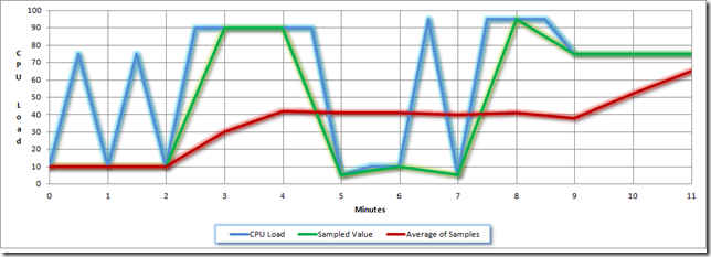
To demonstrate how this works, let me show you a graph of hypothetical CPU data:
This first chart shows some CPU utilization over a period of 11 minutes.
Next, we’ll overlay the values taken at the sampling interval (at the top of every minute), shown in green. Note that the performance data from the sampling is not the same as the overall CPU utilization – it only matches at the one-minute intervals. If a spike happens between the collection intervals but then returns to normal when the interval hits, you won’t see the spike. This filters out some of the noise of the ups and downs.
Next, we’ll overlay the rolling 5-minute average, which is essentially a trend line. Note that it is drastically different than the other values. This further smoothes out the data, and I’ll explain later how all this makes sense for the admin.
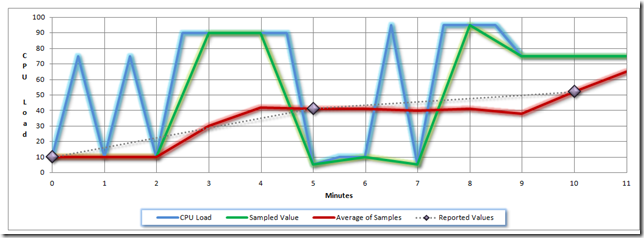
This next chart shows what the actual values will be when the data is collected from the agent at its 5-minute interval. The data points occur at minutes 0, 5 and 10. I put a dashed line between them just so you can see the trending. When viewing the performance data in the Operations Manager “Processor Performance” view, OpsMgr will “connect the dots” and show you the trend line.
Just looking at the chart above, you might begin to think that CPU utilization is always underestimated by this rolling average, but it’s not. You’ll note at the end of the chart that the red average line is going upward and will meet the other two lines (possibly at the next interval).
The thing about this rolling average is that it smoothes out the spikes in load values to show what is true utilization. We all know that when apps start or perform some operation that it’s going to use more CPU than when it’s just sitting there. What every admin wants to know is how much their server is being utilized on average so that when average utilization gets too high they can plan on making resource modifications. Spikes aren’t that worrisome because the system generally absorbs those spikes and it doesn’t affect the users to any great degree. It’s when average utilization gets high that every spike becomes a problem for users. By using this rolling average for calculating utilization, you also avoid getting lots of “noise” type alerts from OpsMgr. Let’s face it, you really don’t want to have alerts hitting you every time the CPU hits full utilization – you want to know when it’s been at full utilization for some time. This rolling average gives you that.
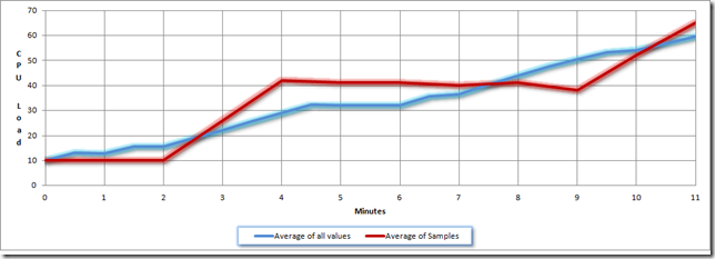
I know what you’re saying… if having an average utilization is good, why not just have total average utilization? The reason is that this rolling 5-minute window gives the performance data “more responsiveness”. By that I mean that it can show fluctuation more rapidly than an ongoing average of all data. Here’s one last chart to demonstrate this point. I’ve plotted the 5-minute average of the 1-minute samples in red and an ongoing average of all samples in blue:
For this example, I estimated that the CPU utilization was a constant 10% for the previous 10 minutes and that the continuous averaging method only went back to the previous 10 minutes. This means the chart shows a total of 20 minutes of averaged activity. The biggest thing you notice about these two lines is that the constant average line is very steady. It doesn’t move up or down very fast. The red line, showing the 5-minute average, moves up a lot in a couple of places. The benefit here is that while smoothing out the data, the 5-minute average can still give you evidence of high utilization without having to be sustained for a long time. It takes a lot more for the blue line to move up or down, which means that the reaction time to major issues could be a lot longer. If your CPU was at 10% utilization for a long period of time and suddenly went to 100%, You’d see it right away with the 5-minute average, but the continuous average would take a lot longer.
I hope this article clears up a little mystery surrounding CPU performance data. I’ll be writing a lot more of these types of articles in the future.
Comments
- Anonymous
August 29, 2010
Hi Roberto, This was the article i was looking for, for the sampaling intervals for the CPU performance reports in SCOM !! Thanks Thanks a lot for the clear writings.


