Analytic charts & grids in PerformancePoint Services
Analytic charts & grids are interactive visualizations rendered by PerformancePoint Services for SharePoint 2010. They let users drill down, across, and through any hierarchy in the model: hook it up to an Analysis Services database or PowerPivot model, define the initial layout, and you’re done. There’s nothing more to do to enable this interactivity.
Here’s an analytic chart in a SharePoint dashboard… what happened on the 11th?
The chart shows its true colors when you use the context (right-click) menu; to learn more about the 11th we might right-click then drill into Flight or Destination. We could also use Decomposition Tree or drill down to the tabular source data using “Show Details”.
Analytic charts & grids are always exportable to Excel or PowerPoint for re-modeling or presentation.
What’s new in SharePoint 2010?
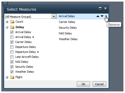
Comparing additional measures: In the analytic chart above, we might wonder about different types of delay. The new “Select Measures…” option lets us bring in additional measures from the model to augment or replace the current measure.
Here we’ve added a few specific delay type measures, and are removing the original measure “Arrival Delay”:
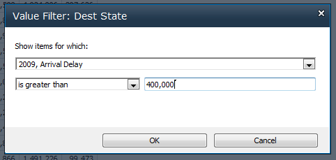
Turning on simple inline filters: The new “Value” and “Top 10” filters support simple scenarios such as “show only hospitals in the top 20% in terms of number of unoccupied beds” and “show only homes with gas bills over $500 in December.” These are in addition to “non-empty” and show/hide item filters.
Working with the chart’s bottom axis: Most elements in analytic charts are clickable; the only elements that weren’t clickable in PerformancePoint Server 2007 were those on the bottom axis. Now these labels are clickable too.
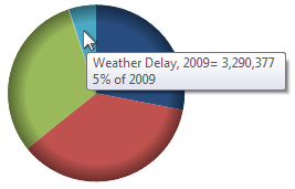
Comparing values angularly: Regardless of the dangers of pie charts, now possible to switch to this popular kind of chart. (Keep in mind you can always switch to 100% stacked bar or any of the other chart types.)
The improvements discussed so far are accessible in SharePoint dashboards, but enable dashboard designers too, as you create reports using the dashboard-user features right in Dashboard Designer.
Here are a few additional new things for dashboard designers:
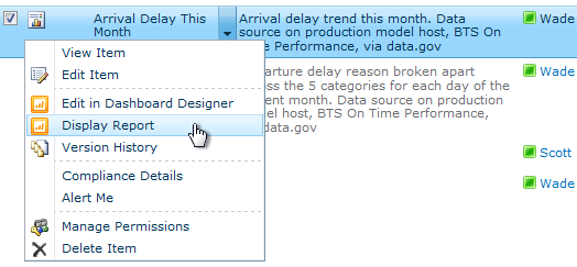
Delivering interactive reports doesn’t require deploying a dashboard or even configuring web parts: Analytic charts & grids, as well as scorecards and strategy maps, are directly accessible from the SharePoint list they’re stored in. On any PerformancePoint Content list view, select a report and choose “View Report.”
You can use SharePoint list views to build the “briefing book” you want your users to see. (For example, you might add a filter to the list view to show only reports with a particular tag.)
Using conditional formatting defined in the model: If you’re using an Analysis Services model that contains rules for cell coloring or fonts, that formatting is honored by analytic grids. This is on by default; you’ll find the checkbox to turn it off under Edit > View > Settings within Dashboard Designer.
Overriding model measure formatting: Though we recommend default formats defined in model, for cases where you can’t touch the model, or you need different format for specific reporting (for example to shorten “2,113,535.35” to “2.1M”, you can now override format per-measure. In the analytic grid, select a cell then select one of the format buttons from the Edit ribbon, or Edit > Format Numbers. In an analytic chart just use the Edit > Format Numbers dialog
Wade Dorrell, Program Manager
Comments
Anonymous
June 16, 2010
Is there a way to format the axis? For example, we have data that is between 800k and 900k, and I would like to set a minimum of 700k on the axis. Thanks!Anonymous
June 19, 2010
Are you planning to support custom colors / formatting for diagrams? We have a lot of customers needing this feature before implementing PPS? Thanks for your feedback!Anonymous
July 08, 2010
Anyone? We've been really wanting to move over to performance point, however it seems that customizing charts has some real limitations. Is there anyway to format the axis for example?Anonymous
July 09, 2010
Hi Jesse. There isn't a way to set min-value on the axis as of PerformancePoint Services for SharePoint 2010. The min/max values are selected automatically by the system as the user of the dashboard directly interacts with the report (in one case a min of 700k might make sense, but when a user drills down to a lower level, which they can do directly in the charts, a min of 700k might no longer be reasonable.) The charts try to keep things reasonable automatically so the person using the dashboard doesn't have to do it themselves. But yes, we get formatting requests often, more than any other request for analytic charts... and we are keeping it in mind for next. For highly formatted charts Excel Services and Reporting Services are currently the much stronger options (but they currently have less direct-surface interactivity.) Both run in SharePoint 2010 & can be used in dashboards.Anonymous
August 16, 2010
Can I know if any one hav eidea about triangle reports using perofrmancepointAnonymous
August 17, 2010
Hi There Is there any way we can use Label filters inside analytical grids or chart inside performance point service as we do inside excel 2007/2010 pivot table while using analyses services cube Regards Syed QazafiAnonymous
August 17, 2010
Hi There Is there any way we can use Label filters inside analytical grids or chart inside performance point service as we do inside excel 2007/2010 pivot table while using analyses services cube Regards Syed QazafiAnonymous
August 18, 2010
Can we slice the One Measure into 4 subMeasures and keep all the remaining measures same?Anonymous
September 26, 2010
It will clutter the cubes if we have to create every possible calculated member in the cube. It will not be practical to create simple measures like Sales*1.1 or Ratio of two different types of products in the cube. Is there any way we can create calculated members in the dashboard (presentation layer)? This is the limitation that is stopping us from moving to PPS from ProClarity.Anonymous
October 29, 2010
Hello.. Can I manipulate this charts programmatically? I can not find documentation about it .. :SAnonymous
November 09, 2010
Hi, I need to change the color palette of a PerformancePoint Services Analytic Chart. Is this possible somehow? Thanks for help.Anonymous
December 07, 2010
Bar charts? Change colour pallete?Anonymous
December 13, 2010
Hi Kieran, a PPS Chart has default colors for its value-series. The first three bars are green, red and blue for example. I want to change that colors to my own palette. (green, blue, yellow) How? But it seems that nobody can answer these questions because PPS has absolutely no ability for own manipulation... Yours desparately... =(Anonymous
February 12, 2011
The comment has been removedAnonymous
February 17, 2011
Hi! Is it possible to directly drill down (in a bar chart) if i only click the LEFT mouse-button? Or is the "right-button-click" the only possibility to drill down? Mostly there are too many options... :(Anonymous
February 20, 2011
Mark, if your chart is based on hierarchy, simple click will work as a drill downAnonymous
March 03, 2011
The comment has been removedAnonymous
May 16, 2011
We have very long dimension descriptions - is there anyway of being able to display the complete legend text in PerformancePoint Charts - this is more of a problem when we export the charts to Excel or PowerPoint format. Please let me know if there is any work around to do this? Thanks for you help.Anonymous
May 16, 2011
We have very long Dimension Descriptions is there any way to increase the numer of characters in the PerformancePoint report Legend - it is more of a problem when we have to export the report to PowerPoint or Excel format - any workaround to this would be greatly appreciated. Thanks for your helpAnonymous
May 17, 2011
Bob/John, there isn't a way to set the legend width maximum on PerformancePoint Services analytic chart legend. One dashboard-user tip is prior to export, change report type to grid (right-click in the background and choose Report Type->Grid), THEN export to Excel. In Excel you can add the chart and do all things formatting (including customization of the legend) and move on to PowerPoint if desired. The downside of course is additional complexity in 'export', but this unlocks a lot of formatting options on the Excel side while still having PerformancePoint analytic chart exploration capabilities. My other tip is if the exploratory capabilities of the analytic charts aren't critical, you could use Excel Services charts in the dashboard and again have options about legend.Anonymous
November 22, 2011
The comment has been removedAnonymous
November 22, 2011
The comment has been removedAnonymous
December 01, 2011
The comment has been removedAnonymous
April 08, 2013
Hi MSFT, Is that possible that can i rename the column. If yes then how or any article or links suggestion for me is very valueable and appreciateable. Thanks M Ahsan


