Control Styling Tips: ScrollViewer
Hello!
In this article, I’d like to provide you with some information and tips that you’ll find useful when styling a Silverlight 3 ScrollViewer.
Visual states. None
Template parts.
HorizontalScrollBar (ScrollBar)
ScrollContentPresenter (ScrollContentPresenter)
VerticalScrollBar (ScrollBar)
The following tips will help you out a bit:
- A ScrollViewer consists of scrollable content controlled by a horizontal and a vertical ScrollBar. The ScrollBars can be set to always be shown, always be hidden, or to be shown only when needed.
- The ScrollContentPresenter part is mandatory and its purpose is to display the scrollable content.
- The HorizontalScrollBar part is optional. Template bind this part’s Visibility property to ComputedHorizontalScrollBarVisibility, its Maximum property to ScrollableWidth, its Value property to HorizontalOffset and its ViewportSize property to ViewportWidth.
- The VerticalScrollBar part is optional. Template bind this part’s Visibility property to ComputedVerticalScrollBarVisibility, its Maximum property to ScrollableHeight, its Value to VerticalOffset and its ViewportSize property to ViewportHeight.
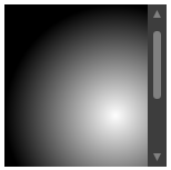
Here’s some artwork you might want to try turning into a ScrollViewer:

The XAML that resembles the artwork is:
<Grid x:Name="root" Height="146" Width="146">
<Rectangle Fill="#FF333333" RadiusX="3" RadiusY="3" />
<Rectangle x:Name="content" Stroke="Black" Width="200" Height="200">
<Rectangle.Fill>
<RadialGradientBrush>
<GradientStop Color="White"/>
<GradientStop Color="Black" Offset="1"/>
</RadialGradientBrush>
</Rectangle.Fill>
</Rectangle>
<Grid x:Name="verticalscrollbar" Width="17" Height="146" HorizontalAlignment="Right" >
<Rectangle x:Name="track" Fill="#FF3D3D3D" StrokeThickness="0" />
<Path x:Name="smalldecrease" Fill="Gray" Stretch="Fill" Width="7" Height="7" Data="M196.89876,311.82065 L204.06047,311.82065 L200.42426,304.87872 z" Margin="0,5,0,0" VerticalAlignment="Top"/>
<Rectangle x:Name="thumb" Fill="Gray" RadiusX="3" RadiusY="3" Height="61" Width="7" Margin="0,24,0,0" VerticalAlignment="Top"/>
<Path x:Name="smallincrease" Fill="Gray" Stretch="Fill" Width="7" Height="7" Data="M196.89876,304.83246 L200.52762,312.02783 L204.07646,304.83078 z" Margin="0,0,0,5" VerticalAlignment="Bottom" />
</Grid>
</Grid>
To create a real ScrollViewer out of your artwork, perform the following steps:
- Paste the XAML into a new Silverlight 3 Application (or Web Site) project.
- Select root and click Tools > Make Into Control > ScrollViewer > OK. In this step, Blend removed root (and everything inside it) and put a new ScrollViewer in its place. Next, it turned root into the template of a new ScrollViewer style and applied that new style to the new ScrollViewer.
- We don’t need [ContentPresenter] , so delete it.
- We do need a ScrollContentPresenter part though, and this part is not in the template yet. So select root and, in the Parts panel, double-click ScrollContentPresenter to create that part as a child of root.
- We also need a VerticalScrollBar part, and this part is not in the template yet either. We do have the artwork for this part though, and it is contained in the Grid named verticalscrollbar. So we can use the Make Into Part command (which is a variation of the Make Into Control command) to make verticalscrollbar into the VerticalScrollBar part, which is of type ScrollBar. Select verticalscrollbar and click Tools > Make Into Part of ScrollViewer > VerticalScrollBar > OK. To style VerticalScrollBar you’ll need to see the ScrollBar control styling tips topic.
- Return scope to ScrollViewerStyle1 (ScrollViewer template) .
- So that VerticalScrollBar can scroll the viewport of the scrollable area, we need to wire it up to some of the ScrollViewer’s properties using template binding. Select VerticalScrollBar. Using the Custom Expression option on the Advanced property options menu in the property inspector, set Visibility to {TemplateBinding ComputedVerticalScrollBarVisibility}, Maximum to {TemplateBinding ScrollableHeight}, Value to {TemplateBinding VerticalOffset} and ViewportSize to {TemplateBinding ViewportHeight}. Or paste the following into the XAML:
Visibility="{TemplateBinding ComputedVerticalScrollBarVisibility}" Maximum="{TemplateBinding ScrollableHeight}" Value="{TemplateBinding VerticalOffset}" ViewportSize="{TemplateBinding ViewportHeight}"
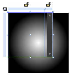
- ScrollContentPresenter and VerticalScrollBar need to be laid out side-by-side each in its own column. Click the blue ruler above root to add a new column divider as shown:

- Click the second column’s icon twice to make the column auto-sized, and reset its MinWidth.
- Select ScrollContentPresenter and reset ColumnSpan.
- Select VerticalScrollBar and reset Margin.
- The object named content is still in the template. This object is the 200-pixel-square Rectangle over which the 146-pixel-square ScrollViewer is meant to scroll. So we need to cut it out of the template and paste it into the Content property of the ScrollViewer itself. ScrollContentPresenter will then display it. Select content and Cut. Return scope to [UserControl] and Paste.
- Build and run your application and test your ScrollViewer.
After you have done this, you should now have a working ScrollViewer!
- Steve
Comments
Anonymous
December 17, 2009
These tips are great for Silverlight apps, but most of the tools are missing for WPF apps - there's no Parts panel, "Make into Part" command, etc. Are there any plans to post the equivalent steps for WPF apps, or to update Blend to fully support WPF?Anonymous
January 22, 2012
Examples you show can be found in MS documentation: msdn.microsoft.com/.../ee341456(v=expression.40).aspx