Building a Windows 8.1 app–Step 4: UI design
Just to recap, we’ve made it through step 4.
- Create a “best at” statement
- Decide what user activities to support
- Decide what features to include
- Decide if and how to monetize the app
- Design the UI of the app
- Design tiles, the splash screen, the first launch, and the home page
- Prototype and validate the app
In this post we’ll go through the UI design, and the design of tiles, etc.
Design the UI of the app
Remember how we watched that video in step 2? Less is more: Commanding, Information Architecture & Navigation We’re going to go back to that, specifically starting at 00:12:00.
The first thing we have to think about is our navigation patterns. When you start up visual studio, you have a few different options
But what we really want to think about is how a user is going to interact with your application.
The main philosophy we should try to follow is “focus on where you are, not where you can go” meaning that we’re not adding buttons/icons/etc. about where the user might want to go next. Semantic zoom is our friend here, because users can “zoom out” and see all the categories possible, without forcing the user to see them in an initial view.
A hub/hierarchical view is the most common view for an app. It’s an easy way for a user to peruse categories and drill down into the sections they find relevant. It’s what I’ve decided to use for my app.
NOTE: I did all the diagramming below in PowerPoint using the storyboarding shapes tab. Here are some directions
My initial thought was just to track by month, and using the hub view, I came up with this simplistic view, where we’d sort the achievements by date. You would then be able to click into the month, and see the items there. You would be able to able to add an item as well, in a simple editor.
Another of the Microsoft design principles is to take pride in your work, and I realized I didn’t feel very proud about the way my app looked. It was exactly a template app, and there was nothing that was special to me other than the idea.
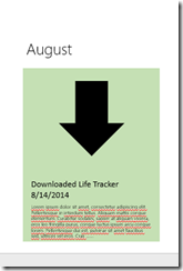
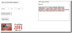
After some thinking, I came up with the idea of having trading-card style accomplishments in my app, and interact with them that way, which brought me to this second design, again all designed in PowerPoint. I really liked the look of rounded rectangles in my Windows 8.1 app, and thought that that was a way I could distinguish myself.


Once I created all the different views a user might see in my app, it was time to create the information architecture, i.e. how everything flowed together for my Windows 8.1 App. My process, which probably wasn’t the most efficient was to create all the views in PowerPoint, then string them all together in Visio. It turned out pretty well. You can check out all my designs in the album below:
 UI Design & Information Architecture
|
Design tiles, the splash screen, the first launch, and the home page
Earlier this year, I went to an internal Microsoft presentation titled “designing Windows 8 apps to look and feel awesome: implementing a brand in Blend.” One of the greatest things I got out of it was a set of links on how to create a great design custom, a way to transform a template to something unique.
| Icons | www.thenounproject.com |
| Colors | www.kuler.adobe.com |
| Patterns | www.dinpattern.com |
| Fonts | www.fontsquirrel.com |
| Guidance | www.design.windows.com |
Probably one of the most important things to your app is your logo. Since I have a lack of artistic skills, and have absolutely no adobe skills – I decided to use inscape to do all my artwork. You can download it here: https://inkscape.org/
Our four to-dos are: choose an icon, choose a color scheme, choose a font, combine them together to create your visual assets.
Choose an icon for your Windows app
www.thenounproject.com is the place to go! All you really need is a simple icon which communicates what your app does. All the images are either free for public use or are really cheap (like $1.99), so it’s a great place if you don’t feel like designing one yourself.
In my case, the Life Tracker app is a way to keep track of your accomplishments or awards. I searched for track, because that would have been witty… no luck. I also tried achievement, award, life, win, and a few more with lackluster results. I eventually ended up going up with an award ribbon because it conveyed my message of achievements.
Choose a color scheme for your Windows app
The cool thing about www.kuler.adobe.com is that brilliant and design-oriented people have already created color schemes which look great. You can freely use these for your app. You can search by keyword, by popular, by newest, etc. and find one to your liking.
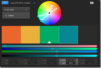
One of the suggestions given to me was to choose a color scheme with at least two dark and one light color to create good accenting. I ended up choosing one called fresh and creative, because it was fun and kind of made you happy looking at it.
NOTICE: They RGB values are at the bottom of the page. You’ll use these in Inskscape to create your logo.
Choose a font for your Windows app
You first question might be: shouldn’t I be using Segoe UI? Only if you want to be a square, there are plenty of great unique options out there. How to choose a great one, I’m not an expert, I just chose one that I thought looked good next to my logo. Trial and error was my method of choice. Feel free to comment if you have more knowledge on the subject.
This is what the website looks like. I used a font called High Tower Text, which I can no longer find… I promise you it was there at some point
Create your Logo for your Windows app
When you go to create your logo, you’ll going to want to create multiple things. Visual Studio specifically asks for the following, which you should keep in mind while you create your visual assets.
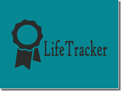
My strategy when creating the logo: stick my icon next to my title, format my font, and color everything to match my color scheme. We can do all that and we get the following:
Sweet! Look how easy that was! We've got our logo which we can use for our tiles, our splash screen, our home page, and much more.
Soon we’ll be coding out way to a successful app.
Comments
- Anonymous
September 26, 2013
Windows 8 step by step app design strategy is very informatics and interesting, through this blog i got till now best information and feel glad to read it.Thanks,Christine for sharing your knowledge with us. - Anonymous
September 27, 2013
@pacificappdesignHappy to share, glad that you found it useful :) Stay tuned for more learning.-Christine


