Content
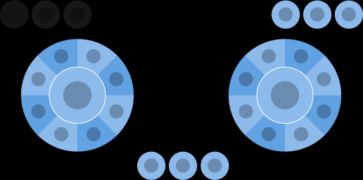
Defines the actual content of the layout. Content on the layout is organized into containers based on where it is located on the display, like lower. Within each container are a set of controls, like a button, that can, can either be directly specified or placed into sub-containers based on named properties or sub-arrays.
Properties
center - object, optional. Wheel of controls that is displayed in the center of the screen.
layers - object, optional. A set of layer definitions that allow a set of controls to be displayed based on a layer action.
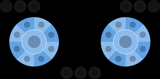
left - object, optional. Wheel of controls that is by default displayed under the player's left hand/thumb.
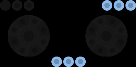
lower - object, optional. An object that lets you place controls in any of the three leftCenter, center or rightCenter slots in the lower row of controls.
right - object, optional. Wheel of controls that is by default displayed under the player's right hand/thumb.
sensors - array, optional. A list of sensor controls that should be enabled on this layout.
upper - object, optional. An object that lets you place an array of controls in right slots in the upper row of controls.
Remarks
The available location for controls on a layout are:

By convention, the left wheel is primarily used for movement and the right wheel for the most common actions.

Consider placing infrequently used tasks in the upperRight or the lower slots.

Note
The center wheel slot is not positioned well ergonomically for landscape usage. Should only be used when orientation is portrait for phones.
The orientation only affects the touch layouts being displayed. Using something other than the default of landscape should only be done if the game is making an explicit change in rendering to match the layout's orientation.
Samples
Please see our GitHub for complete layout samples for a variety of game genres. These samples also demonstrate more advanced features like using custom assets for a tailored look and feel.
Requirements
The version of the layout is specified by the $schema attribute in the layout json file. This specifies the specific set of controls and capabilities that are available in the layout.
The properties described here are valid for layout versions 4.0 and above.
See Also
Touch Adaptation Kit Reference
Getting started with sample layouts