Throttle
A specialized version of a Y-axis only joystick. Designed for driving games.
Properties
type - "throttle"
axisUp - string. Which trigger the upper part of the control maps to. Must be either "leftTrigger" or "rightTrigger".
axisDown - string. Which trigger the lower part of the control maps to. Must be either "leftTrigger" or "rightTrigger".
relative - boolean, optional. Controls how the throttle calculates its value. If true, the value will be based on where the user's initial touch was located. If false, the value will be based on the center point of the control. Defaults to true.
sticky - boolean, optional. Controls what happens when the user stops touching the control. If true, the throttle will stay at the last value. If false, it will reset to 0. Defaults to false.
enabled - boolean, optional. Defaults to true. Sets the visual state of the control to enabled/disabled. A disabled control will still receive input from the player, but NOT change the visual style based on the input.
visible - boolean, optional. Defaults to true. Determines whether the control is displayed to the player to interact with. To change during game play see Changing touch layouts using game state.
styles - object, optional. Customization of the visual representation of the control. The styles are represented as an object per state that can be styled.
The throttle control can have the following states styled:
default- The base style.activated- Applied when the player is touching the knob and it exactly at the 0 value along the axis.activatedDown- Applied when the player is touching the knob and has moved the knob such that it is in the negative (lower) section of the throttle axis.activatedUp- Applied when the player is touching the knob and has moved the knob such that it is in the positive (upper) section of the throttle axis.idle- Applied when the player is NOT interacting with the control and the knob is also notstickyin the upper section of the axis.idleUp- Applied when the player is NOT interacting with the control and the knob has been moved to the upper section andstickyhas been set totrue.
Styling properties per state
opacity - number, optional. The opacity to be applied to the control. Default to 1.0 for all states but disabled.
axisUp - object, optional. An axis object that specifies the styling for the positive (upper) portion of the throttle.
axisDown - object, optional. An axis object that specifies the styling for the negative (lower) portion of the throttle.
knob - object, optional. The knob object specifies the styling of the knob portion of the throttle.
indicator - object, optional. A stroke that specifies the styling to apply ot the component connecting the knob to the current position on the axis.
Asset dimensions
For each of the style objects that accept image assets, a given asset is provided at a base resolution and at 1.5x, 2.0x, 3.0x, and 4.0x scales of that base resolution. The resolution of a given image must be less or equal to the following maximum resolutions:
| Object | @1.0x | @1.5x | @2.0x | @3.0x | @4.0x |
|---|---|---|---|---|---|
| knob.faceImage | 60x60 | 90x90 | 120x120 | 180x180 | 240x240 |
| knob.background | 60x60 | 90x90 | 120x120 | 180x180 | 240x240 |
Remarks
The throttle control allows for the player to provide the variable pressure of a trigger using a touch control.
The throttle control is designed to be placed in the center spot of the wheel -- and to be the only control between that spot and the side of the screen.
Set sticky to true if the player will likely want to have a constant pressure applied to the trigger to allow them to set the value and then use their fingers for different actions.
Styling remarks
Warning
When streaming via the Windows version of the Content Test Application, not all styling will display correctly.
Sample
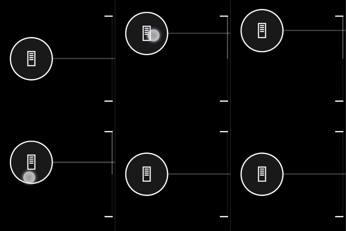
Example 1: Basic throttle
Figure 1. Throttle Control

This uses the default styling.
{
    "type": "throttle",
    "axisUp": "rightTrigger",
    "axisDown": "leftTrigger",
    "sticky": true
}
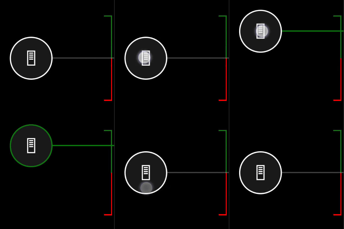
Example 2: Throttle with styled outline and explicity defined icons
Figure 1. Customized Throttle Control

{
    "type": "throttle",
    "axisUp": "rightTrigger",
    "axisDown": "leftTrigger",
    "sticky": true,
    "styles": {
        "default": {
            "knob" : {
                "faceImage" : {
                    "type": "icon",
                    "value": "gasPedal"
                }
            },
            "axisUp": {
                "stroke" : {
                    "type": "solid",
                    "color":  "#107C10"
                },
                "cap" : {
                    "type": "color",
                    "value": "#107C10"
                }
            },
            "axisDown": {
                "stroke" : {
                    "type": "solid",
                    "color":  "#ff0000"
                },
                "cap" : {
                    "type": "color",
                    "value": "#ff0000"
                }
            }
        },
        "idleUp" : {
            "knob" : {
                "stroke" : {
                    "type": "solid",
                    "color":  "#107C10"
                }
            },
            "indicator" : {
                "type": "solid",
                "color":  "#107C10"
            }
        },
        "activatedUp" : {
            "indicator" : {
                "type": "solid",
                "color":  "#107C10"
            }
        },
        "activatedDown": {
            "knob" : {
                "faceImage" : {
                    "type": "icon",
                    "value": "brakePedal"
                }
            },
            "indicator" : {
                "type": "solid",
                "color":  "#ff0000"
            }
        }
    }
}
Requirements
Layout Version: 1.0+ (Styling available from layout version 3.2+)