Joystick
An analog control that behaves like a joystick.
Properties
type - "joystick"
axis - object or array. A single axis or array of axes that describe the mapping of this joystick control.
action - object, optional. An action(s) to invoke in addition to the axis mapping.
actionThreshold - number, optional.Normalized minimum joystick value (radial) required to invoke the action. Default value of 0.
enabled - boolean, optional. Defaults to true. Sets the visual state of the control to enabled/disabled. A disabled control will still receive input from the player, but NOT change the visual style based on the input.
expand - boolean, optional. Default value of true. Expand joystick range to match user ergonomic preferences when placed in a center control socket. Set to false to use a standardized fixed joystick size.
relative - boolean, optional.
By default (true), the joystick will calculate its value using a relative calculation based on user's initial touch. Setting this value to false will instead calculate its value based on the center point of the control.
visible - boolean, optional. Defaults to true. Determines whether the control is displayed to the player to interact with. To change during game play see Changing touch layouts using game state.
styles - object, optional. Customization of the visual representation of the control. The styles are represented as an object per state that can be styled.
The button control can have the following states styled:
default- The base style.disabled- The style when the control is disabled. If not specfied, then when the control is disabled, a transformation will be applied to the default style to make it appear disabled.idle- Applied when the player is NOT interacting with the control.moving- Applied when the when the joystick knob is being interacted withregardless of the deadzone defined.activated- Applied when anactionis defined and the knob is moved outside the threshold to execute the action.
Styling properties per state
opacity - number, optional. The opacity to be applied to the control. Default to 1.0 for all states but disabled.
background - object, optional. Can either be a color or image asset.
knob - object, optional. The knob object specifies the styling for the button-like portion of the joystick that can be interacted with by the player.
outline - object, optional. The outline object specifies the styling of the outline and indicator that are presented when the joystick is being interacted with.
Asset dimensions
For each of the style objects that accept image assets, a given asset is provided at a base resolution and at 1.5x, 2.0x, 3.0x, and 4.0x scales of that base resolution. The resolution of a given image must be less or equal to the following maximum resolutions:
| Object | @1.0x | @1.5x | @2.0x | @3.0x | @4.0x |
|---|---|---|---|---|---|
| background | 120x120 | 90x90 | 240x240 | 360x360 | 480x480 |
| knob.faceImage | 60x60 | 90x90 | 120x120 | 180x180 | 240x240 |
| knob.background | 60x60 | 90x90 | 120x120 | 180x180 | 240x240 |
Remarks
The joystick control can be used to provide analog control that maps to the different physical controller joysticks.
If the joystick is the main method of movement, it is recommended to play in the left center slot and set expand to true to provide the best experience for the player.
Consider customizing the faceImage to provide a hint to the player around what the joystick will control (this is especially important if your game utilizes more than one joystick).
For motions that only rely on 1 axis, utilize a single axis joystick to maximize playability.
Styling remarks
If using a background asset and expand is true, the background asset will NOT be scaled to the full center socket size.
By default, the outline is only displayed while the player is interacting with the control.
If using a custom background asset and expand is set to true, note that the asset will NOT expand with the player's control customization.
Warning
When streaming via the Windows version of the Content Test Application, not all styling will display correctly.
Samples
Example 1: Simple joystick
A basic 1:1 mapping to a joystick with a slight deadzone. Thumbsticks on the physical controller calculate their value via rotation.
Figure 1. Joystick Control

{

    "type": "joystick",
    "axis": {
        "input": "axisXY",
        "output": "leftJoystick",
        "deadzone": {
            "threshold": 0.05,
            "radial": true
        }
    }
}
Example 2: Joystick that switches from walk to sprint when threshold is passed.
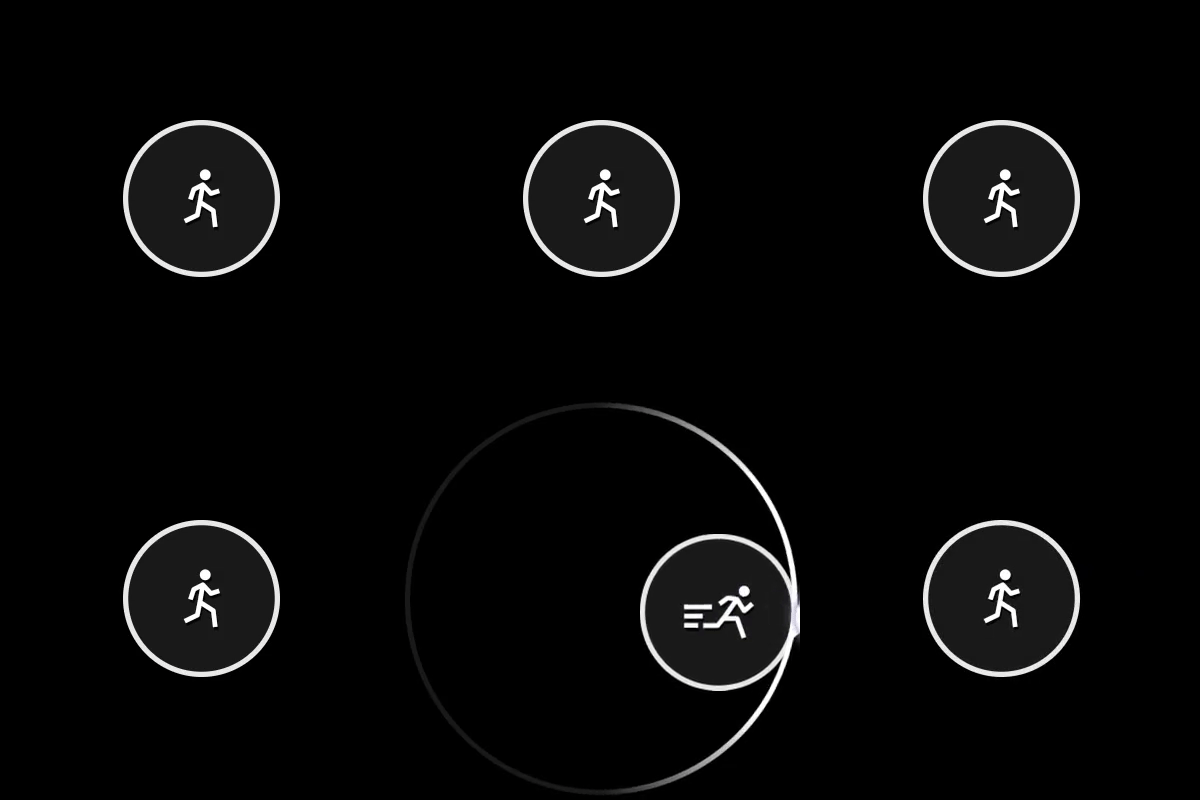
When the threshold (0.75) is passed, the leftTrigger will be sent along with the joystick movement. The icon will change from the 'walk' to 'sprint'
Figure 1. Joystick Control with Action Threshold

{
    "type": "joystick",
    "action": "leftTrigger",
    "actionThreshold":0.75,
    "axis": {
        "input": "axisXY",
        "output": "leftJoystick",
        "deadzone": {
            "threshold": 0.05,
            "radial": true
        }
    },
    "styles": {
        "default": {
            "knob": {
                "faceImage": {
                    "type": "icon",
                    "value": "walk"
                }
            }
        },
        "activated": {
            "knob": {
                "faceImage": {
                    "type": "icon",
                    "value": "sprint"
                },
                "background" : {
                    "type": "color",
                    "value": "#0e7a0d"
                }
            }
        }
    }
}
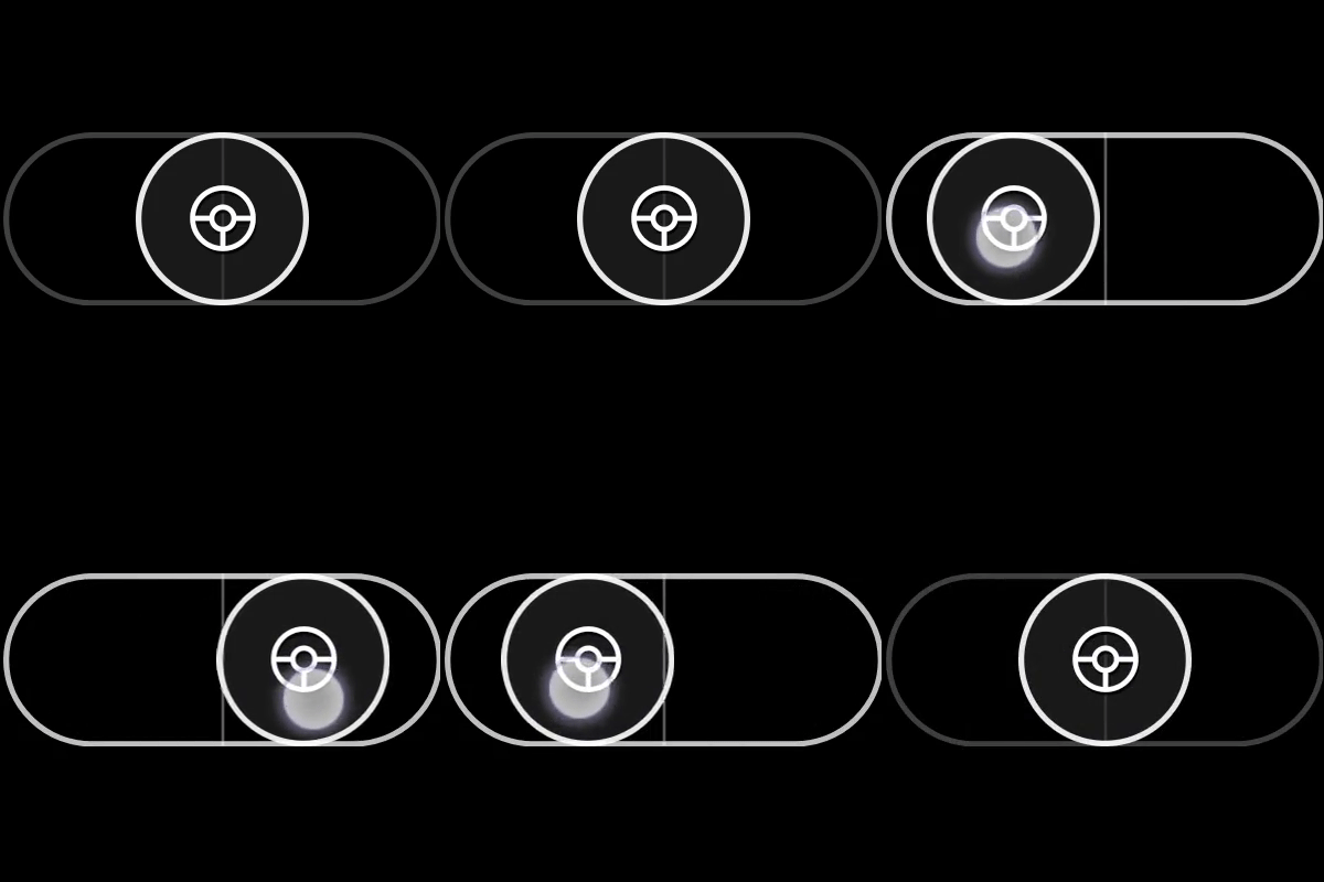
Example 3: Single-axis (horizontal) joystick that looks like a steering wheel
Figure 1. Horizontal Steering Wheel Joystick Control

{
    "type": "joystick",
    "axis": {
        "input": "axisX",
        "output": "leftJoystickX",
        "deadzone": {
            "threshold": 0.35
        }
    },
    "relative": false,
    "styles": {
        "default": {
            "knob": {
                "faceImage": {
                    "type": "icon",
                    "value": "steering"
                }
            }
        }
    }
}
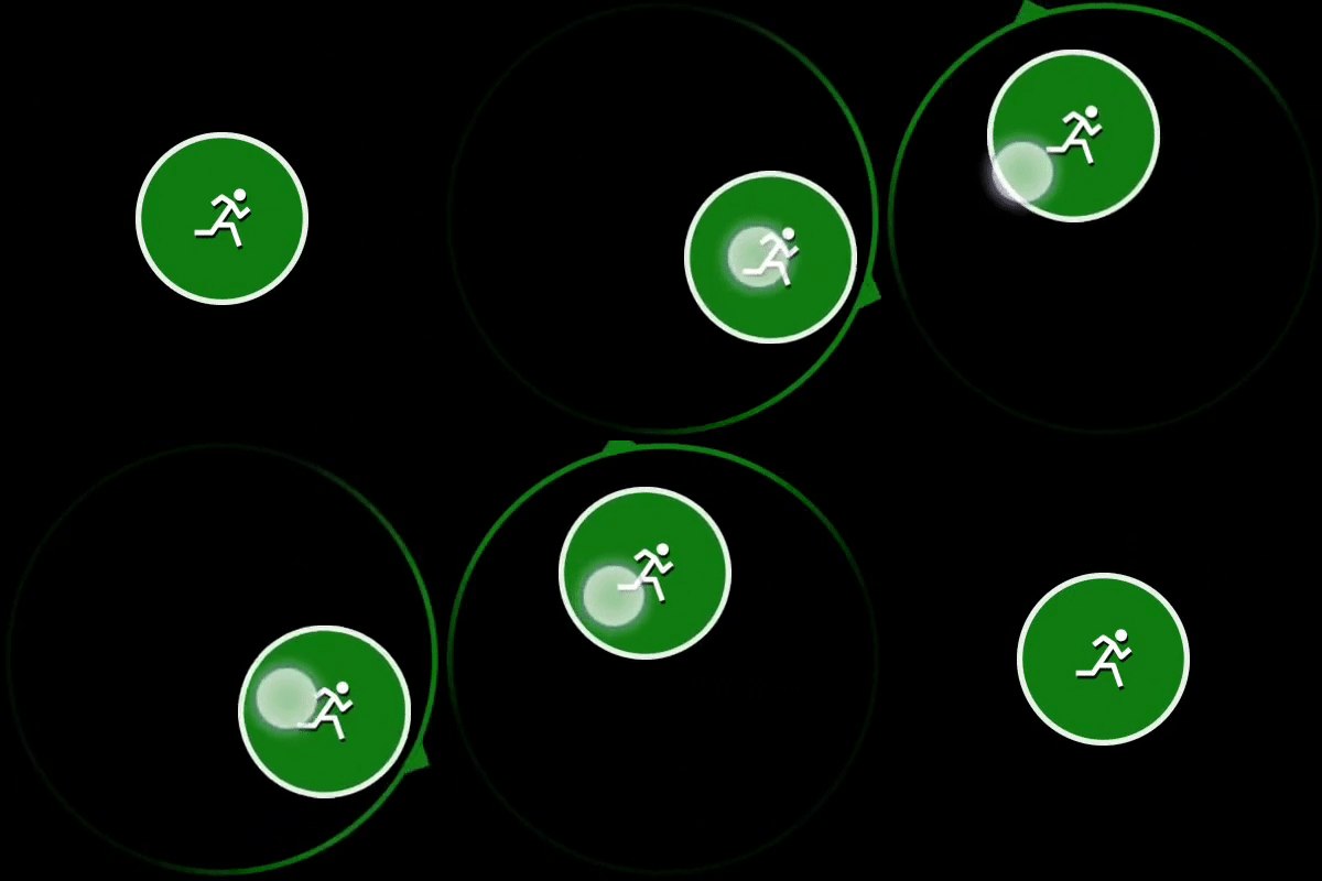
Example 4: Joystick with customized colors
Figure 1. Customized Joystick Control

{

    "type": "joystick",
    "axis": {
        "input": "axisXY",
        "output": "leftJoystick",
        "deadzone": {
            "threshold": 0.05,
            "radial": true
        }
    },
    "styles": {
        "default": {
            "outline" : {
                "stroke" : {
                    "type": "solid",
                    "color": "#107C10"
                }
            }
        }
    }
}
Requirements
Layout Version: 1.0+ (Styling capabilities from layout version 3.0+)