I’ll say this only once - Your customers need an efficient experience
This post describes a simple step that you can take to help your customers who are blind, such that they avoid having information repeated unnecessarily as they interact with your UI.
The programmatic interface you’re shipping
You ship at least two interfaces in your UI. There’s the super-cool visual one, and there’s the programmatic one. This programmatic interface can be leveraged by your customers who are blind or have low vision, in order for them to interact with the controls, text and images in your app through screen readers like Narrator.
The programmatic interface is created by the UI framework that you used to build your app, based on how you define your UI. The UI framework will expose the interface through the UI Automation API (UIA), and SDK tools like Inspect can show you what data’s being exposed through that interface. Both the Inspect SDK tool and the Narrator screen reader are UIA client apps.
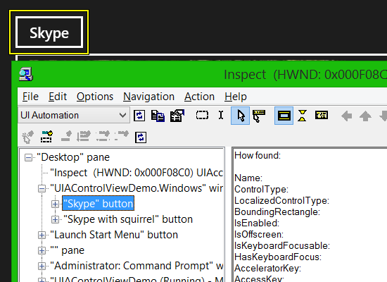
The XAML UI framework does a lot of work on your behalf to map your XAML UI into an interface exposed via UIA. For example, say I create a XAML Button labelled “Skype”. When this is exposed through UIA, I get a Button whose accessible name is “Skype”. This means my customers who use Narrator, would encounter the button and know it’s the Skype button.
Figure 1: The Inspect SDK tool reporting that a Button has an accessible name of “Skype”.
The “Views” of the UI Automation tree
The Inspect SDK tool shows me that my UI is exposed programmatically as a hierarchy of elements. (This hierarchy is not the same as the XAML hierarchy of UI objects.) UIA has three “Views” of the element hierarchy.
The “Raw” view shows the entire set of elements being exposed by your UI. The “Control” view is a subset of the Raw view, whose purpose is to contain only the elements of interest to your customer. So the Control view will contain all interactable controls, and all text and images that convey useful information. But the Control view would not contain such things as elements relating to visual layout.
The XAML UI framework works to keep elements of no interest to your customers out of the UIA Control view, but it doesn’t want to risk leaving out some elements which really are of interest. The end result is that depending on how you created your UI, you may find that the UIA Control view contains some elements that are superfluous to your customer, and could be a distraction when they get announced by a screen reader like Narrator.
So – the good news here is that there’s a very simple step that you can take to move elements out of the Control view, and so leave them only in the Raw view. You know the intent of your UI better than the XAML framework can know, and so you know exactly where to tune the UIA hierarchy. This simple step can make a big difference in allowing your customers to have an efficient experience at your UI.
(By the way, the third view of the UIA tree is the “Content” view. I’ve never had reason to do anything specific with that view yet.)
Make sure you know which view Inspect is presenting
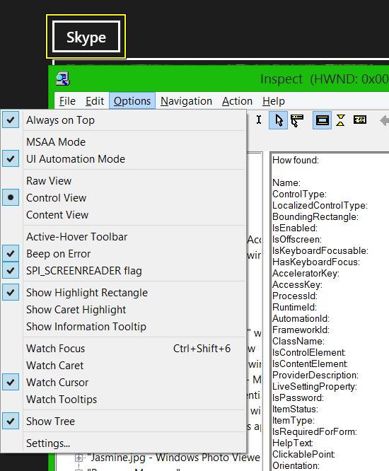
You can set Inspect to show you the Raw view or the Control view of the UIA tree exposed by your UI. It’s really important that you know which view you’re looking at. A couple of times I’ve got really confused when trying to learn how my UI was being exposed through UIA, because I thought I was looking at a particular view of the tree when I wasn’t.
Figure 2: The Inspect SDK tool’s Options menu, allowing me to select a specific view of the UIA tree.
It’s also helpful that UIA elements have an IsControlElement property, and this lets you know whether the element is in the Control view of the UIA tree. If the property is true, then the element is in the Control view.
Figure 3: The Inspect SDK tool showing that the Skype Button is in the Control view of the UIA tree.
Tuning an SDK sample to expose a more efficient experience to your customers who are blind
I just downloaded the “XAML ListView and GridView essential controls” SDK sample, and pointed Inspect to its UI.
Figure 4: The Inspect SDK tool reporting the accessible name of a list item and the item’s contents.
Unfortunately, before I can get to the change relating to this blog post, I can immediately spot some big problems with the programmatic interface being exposed by this UI.
1. The list element has no accessible name. So what is this a list of?
2. The list items have an accessible name of the C# view model class associated with the items. That’s meaningless to the customer.
3. The image in the list item has no accessible name, so the customer will wonder if they’re missing out on some useful information being conveyed visually through the image.
Your shipping app will want all elements that are exposed through the UIA Control view to have helpful accessible names. So I’ll first make a quick change to add the missing accessible names to the list and list items, using the techniques described at Giving your XAML element an accessible name.
Figure 5: The Inspect SDK tool reporting helpful accessible name for the list and list items.
By giving the list items a name that’s built up from all the useful content contained within the item, your customers who are blind only have to reach the list item to know if it’s of interest to them.
But now we’re getting to the whole point of this article. If your customer only has to encounter the list item, you don’t want them to waste time encountering all the contents of the item too, when they’re not going to learn anything interesting by doing that. You know that the list item is interesting, but the contents are now not interesting. And what do we want to be exposed through the UIA Control view? That’s right – only things of interest to your customers.
By setting the Inspect tool’s Options to show the Control view of the UIA tree, I can learn that all the list items’ content is exposed in the Control view. As such, I’ll take action to move that content out of the Control view.
To move an element out of the Control view through XAML, use the following markup:
AutomationProperties.AccessibilityView="Raw"
So say you have an element that’s exposed through both the Control view and the Raw view of the UIA tree. (Remember that the Raw view is the entire set of elements in your UI that's exposed through UIA, and the Control view is a subset of the Raw view.) By using the above markup, you’re saying that you want the element to only be exposed through the Raw view, and not through the Control view.
So I added the markup to all the elements contained in the list items in the sample app.
<StackPanel Orientation="Horizontal" Margin="10,10,0,0">
<Image
AutomationProperties.AccessibilityView="Raw"
x:Name="image" Height="60" Width="60" VerticalAlignment="Center" Margin="0,0,10,0"/>
<StackPanel Margin="0,0,0,0" Orientation="Vertical">
<TextBlock
AutomationProperties.AccessibilityView="Raw"
x:Name="titleTextBlock" TextWrapping="Wrap"
Foreground="{StaticResource ApplicationForegroundThemeBrush}"
FontSize="14.667" FontWeight="Light" Width="200"
VerticalAlignment="Center" HorizontalAlignment="Left"
FontFamily="Segoe UI"/>
<TextBlock
AutomationProperties.AccessibilityView="Raw"
x:Name="categoryTextBlock" TextWrapping="Wrap"
Foreground="{StaticResource ApplicationForegroundThemeBrush}"
FontSize="14.667" FontWeight="Light" Width="200" MaxHeight="20"
VerticalAlignment="Center" HorizontalAlignment="Left"/>
</StackPanel>
</StackPanel>
By doing this, the elements are no longer exposed through the Control view of the UIA tree.
Figure 6: The Inspect SDK tool reporting that the list items’ content is not being exposed through the Control view of the UIA tree.
By the way, I didn’t set a useful accessible name on the decorative image. The image isn’t conveying any useful information to the customer, and so it’s appropriate to move it out of the Control view of the UIA tree. If it was conveying something useful, I’d leave it in the Control view, and give it a name which conveyed that same useful information that the image conveys to my sighted customers.
It’s important to note that I moved the entire content of the list item out of the Control view, because there’s no information conveyed by that content that isn’t now being conveyed by the accessible name of the list item. If there was some additional secondary information being conveyed by elements in the list item which I’d chosen not to incorporate into the list item’s accessible name, then I would have left the related elements in the Control view. This would allow my customer to first encounter the list item, and then to encounter the elements within the list item with the secondary information.
So what practical difference does this make to my customers?
UIA client apps such as screen readers will access the programmatic interface exposed by your app, and present your UI in whatever way it feels is most helpful to your customers. The UIA client app can choose to access the elements in the Raw view or the Control view. In the case of the Narrator screen reader, it considers the contents of the Control view to be of most interest to your customers. (That’s pretty much the definition of the Control view after all.)
So say your customer’s relaxing on the sofa with their Surface, and is interacting with your app through Narrator touch gestures. They reach a list of items, and hear the accessible name of the list item. Based on that name, they quickly know whether the list item is of interest to them. Say a particular item is not of interest, so they do a right-swipe gesture and expect to move to the next item in the list.
Without the simple change to move the list items’ content out of the Control view, the right-swipe gesture would take the customer through all the contained elements in the list item. That means the customer hears text they already just heard when they encountered the list item. So this repetition is not valuable, and is irritating. By tuning the experience to move some elements out of the Control view, you provide a more efficient and pleasant experience.
Hold on – don’t I sometimes find Narrator doesn’t announce content in the Control view?
A UIA client app like Narrator might have some of its own logic to try to expose the UIA tree to your customers in the most helpful way. For example, say I create a Button containing an Image and a TextBlock. I set the accessible name of the Button to be set from the accessible name of the TextBlock.
<Button
AutomationProperties.LabeledBy="{Binding ElementName=SkypeWithGrosbeakLabelName}">
<Grid>
<Grid.ColumnDefinitions>
<ColumnDefinition Width="auto" />
<ColumnDefinition Width="auto" />
</Grid.ColumnDefinitions>
<Image
x:Uid="SkypeWithGrosbeakImage"
Source="Assets/Grosbeak.png"
Stretch="None" />
<TextBlock Grid.Column="1"
x:Uid="SkypeWithGrosbeakLabel"
Name="SkypeWithGrosbeakLabelName"
Margin="8" />
</Grid>
</Button>
If I then point Inspect to the Button, I can see the Button and all its contents exposed through the Control view of the UIA tree.
Figure 7: The Inspect SDK tool reporting that a Button and its contents are all being exposed through the UIA Control view.
I found when using Narrator’s touch gestures at the button, Narrator did not move to the button’s contents after encountering the button. I don’t know why that is, as I would have expected Narrator to move to the contents just like it moved to the list items’ contents in the sample app earlier. But this illustrates how UIA client apps can have their own logic for presenting the contents of the UIA tree. And Narrator’s logic can be different from other screen readers. So it’s good practice to make sure you’re exposing a programmatic interface that you feel will help any UIA client app present an efficient experience to your customers.
As such, I just modified my Button to move its contained TextBlock out of the UIA Control view. (I decided to leave the Image in the Control view, as it's not a purely decorative image.)
<Button
AutomationProperties.LabeledBy="{Binding ElementName=SkypeWithGrosbeakLabelName}">
<Grid>
<Grid.ColumnDefinitions>
<ColumnDefinition Width="auto" />
<ColumnDefinition Width="auto" />
</Grid.ColumnDefinitions>
<Image
x:Uid="SkypeWithGrosbeakImage"
Source="Assets/Grosbeak.png"
Width="200" Height="200" />
<TextBlock Grid.Column="1"
AutomationProperties.AccessibilityView="Raw"
x:Uid="SkypeWithGrosbeakLabel"
Name="SkypeWithGrosbeakLabelName"
Margin="8" />
</Grid>
</Button>
Figure 8: The Inspect SDK tool reporting that the Button is exposed through the UIA Control view, but the button’s contained TextBlock is not.
Summary
As devs, we all work hard to make our apps accessible. There are many reasons for doing that work, ranging from a personal desire to enable everyone to access your cool features, to knowing that your business can’t sell an inaccessible app to governments and enterprises.
But just because UI is accessible doesn’t mean it’s efficient to use. So it’s definitely worth considering whether your app provides an efficient experience for all your customers, regardless of how they interact with your UI. When you ship a really cool button which visually contains a decorative image and text, you don’t emphasize its structure to your sighted customers. Your sighted customer doesn’t look at the button and consciously think of three separate entities; a button, a decorative image and some text. Instead, they think it’s a helpful button – and that’s it. So you wouldn’t expose the button as three separate entities to your customers who consume your UI through your programmatic interface. Your customers who are blind will encounter a button or list item with a really helpful name, and they won’t want to then hear the same information repeated as they try to move to the next element of interest.
You can help provide that efficient experience with a quick tweak of your XAML markup:
AutomationProperties.AccessibilityView="Raw"
That simple change can make a very helpful difference to your customers, so please do take a look at your UI with the Inspect SDK tool and consider how your programmatic interface can be made as efficient to interact with as possible.
Thanks,
Guy


