Microsoft and Design: The New Logo
Today Microsoft has launched a new Logo and it looks like this:
(hey, if you are going to any of the logos on this page, then be sure you know and follow the legal guidelines on using logos)
The symbol on the left has actually been in use for over a year now as part of the branding of the Microsoft retail stores (coming soon to a town near you!).
The text part (known to our marketeers as the “logotype”) uses a font called Segoe, which is the new Microsoft standard… you’ve seen it on Xbox, Windows Phone, Windows 8, the Microsoft website, etc, etc.
To celebrate the launch of the new corporate logo, I thought I would assemble here some of the latest and greatest Microsoft product logos that also follow this new design philosophy
Both Window 8 and Office 2012 use perspective in their new logos
 |
 |
Xbox has its classic silver and green logo, and a “new style” white on solid version
 |
 |
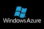
Windows Azure has the classic “glowing” blue (azure) and a newer solid version
 |
Windows Phone moved to its red stage when 7.5 (Mango) came out. There also appears to be a white on solid version
 |
Bing has had the same logo since its launch in 2009. Is it time for a change?
Finally, not a logo, but you may have seen these clouds in Microsoft literature.
There are plenty of other products and logos I did not cover here because they do not typify the new philosophy, so perhaps we are going to see updates in thee soon.
Comments
Anonymous
August 23, 2012
The Bing one looks woefully out of date. They should really just change its name while they are in this process of change, Bing is not a recognised name by anyone really.Anonymous
August 24, 2012
Why didn't they update the Azure and Phone logos to match the Windows logo? They moved away from the Flag, but only sort of...Anonymous
August 31, 2012
Walter, I have no insight on what future plans are, but the Azure and Phone logos are older than the new Company, Windows, and Office logos...so maybe something new will be on the way.....Anonymous
January 18, 2016
The new logo is simply awesome. I must say that this has been designed by some professional logo designers. https://www.logocrust.com/ if it has not been done by professionals then it couldn't be so good.


