How to create a Twitter sentiment analysis for your service
Brian Harry’s recent blogpost about a twitter sentiment analysis as a release gate impressed me a lot and I wanted to find out how complicated it is to do an analysis for my own stuff. So here’s a little tutorial how you set up things from scratch if you want to know what “the internet” thinks about your product.
I was expecting some challenges but I got up to speed very fast – actually way faster then expected. Here’s what I wanted to do and what I’m asking you to do as well:
1. Specifiy a hashtag to identify tweets related to my service
2. Create an Azure Logic App to check Twitter periodically.
3. Call the sentiment analysis service provided by Bing.
4. Write the results of the analysis into this Azure SQL Database.
5. Create a PowerBI Dashboard to display the results in a chart.
6. Publish this chart and show it on my Team Services Dashboard.
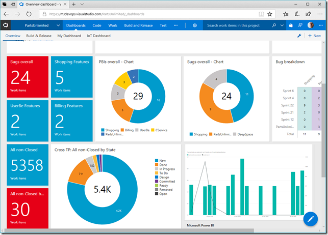
This sounds like a lot of work. In fact: It’s not. Before we dive into the details, here’s what I got:
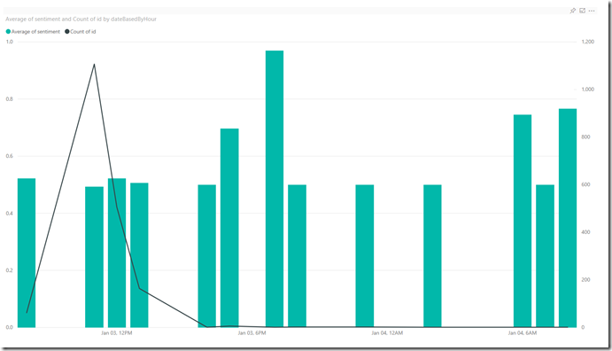
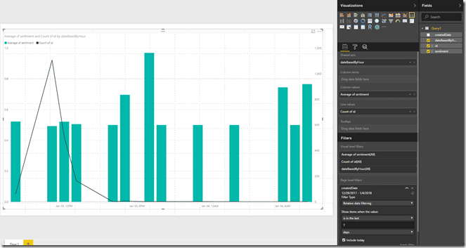
This diagram shows the average sentiment for all tweets related to my specified hashtag on a per hour basis. The closer the value to 1 (the higher the bar) the better is the mood. The black line gives an indication about how many messages have been tweeted – so you have an indication whether an increase or decline is backed by many voices or just a single tweet. I’m pretty sure you could beautify the chart a lot and integrate all kinds of colors but that’s not the focus.
As always here’s a warning: This post shows the technical aspects – I’m totally aware that an interpretation of the sentiment analysis is a totally different story. Be aware that this analysis only displays the sentiment of people who spoke up on Twitter – there might be plenty of unheard voices, though, so this should be considered as just another feedback channel. Anyway it’s an interesting metric to look at.
Here’s what I did to get there. You can follow the steps to build it yourself. Another warning: I’m working mostly with free plans here. This will limit your experience as the database size is limited and the number of free service calls is limited as well. If you’re not working on a free plan, cost might occur!
Create an Azure SQL Database
I didn’t create a new one, I just used one I had for demos anyway. You can use the free version. Here’s how you do this. Then add a new table to the database to store the Tweet Data. I ran this SQL statement to do so:
CREATE TABLE MoreTweets (
id int PRIMARY KEY IDENTITY,
createdDate datetime DEFAULT(getdate()),
tweettext varchar(512) SPARSE NULL,
sentiment Float NULL,
author VARCHAR (512) ,
);
Create a Twitter account
Surprise, surprise, you need a twitter account. Go, get it here: https://www.twitter.com You need it to be able to query Tweets from the logic app.
Get a Cognitive Services key
Microsoft provides a bunch of cognitive services to analyze images, speech and text and so on. We’ll be using this service, but you have to sign up for it. You can do a limited amount of analysis per month for free, that’s what we’ll be doing.
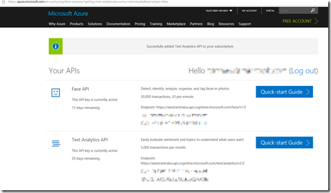
Get the key for the Text Analysis API here: https://azure.microsoft.com/en-us/try/cognitive-services/?api=text-analytics
See the screenshot below.
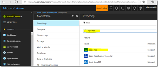
Create a Azure Logic App
We need an Azure Logic app. If you’re working on the free Azure contingent of an VS MSDN Subscription or on a free trial things are free for you as long as you did not delete the cost limit explicitly. If not and you just want to try out things make sure to disable the logic app after some experimentation as cost will occur!
Edit the workflow of the logic app in the logic app designer after the logic app has been created.
Click the “new step” button and add three actions. I was impressed when I figured out, that for everything I wanted to do there’s already a step available which means I won’t have to write a single line of code. Just search for the connectors for Twitter, Text Analytics and SQL Server. Those connectors will provide specific events and actions. Just add them as shown below.
This is what the workflow should look like.
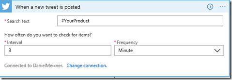
If you click the Twitter step, it will ask you to configure a connection to Twitter. Specify your credentials. Then enter the appropriate values regarding keywords and interval. I set the interval to 3 Minutes. Choose the keyword as you prefer. If you don’t have a good keyword and still want to do the sample, just search for any product name you’re interested in or check the trending hashtags on Twitter. Be warned: This might bring plenty of traffic to your workflow!
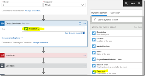
The sentiment analysis task is pretty straight forward. First you have to specify the keys you created earlier and give the new connection a name. Then you want to pass in the text of the tweet found. Just click into the text box. This will open up a menu showing “dynamic content”, which is provided based on previous tasks. In our case, of course we know all content related to a tweet containing our keyword by now. So we can just add the tweet text by clicking the Icon “Tweet text”.
This is what it should look like:
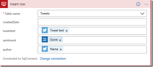
As a result of this step we will get the sentiment of this tweet. So in our last step will will write all of that into our database. Again in the SQL Server “Insert Row” step, we have to establish a connection to a specific database first. This will be very easy if you’re using an Azure SQL Database – the connections will be available already, you just have to pick the database. Then specify the table (Tweets, in my case) and pass the values – again taken from the dynamic content.
We don’t have to specify the “createdDate” – it will be filled when the value is entered to the database automatically. I also store the author. This would allow me to figure out if there might be a single person who’s affecting the metric (I didn’t implement this filter yet, however).
We’re done. Let’s run the logic app now. Just click run in the editor. Over time, this will fill your Tweets table in your database.
Create a report in Power BI
Now create a new report in Power BI. You could do the same thing in Excel, but Power BI is pretty handy when it comes to publishing stuff afterwards.
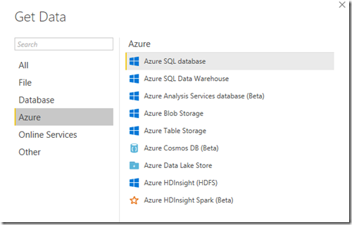
In Power BI click “Get Data” and pick “Azure SQL Database”.
Specify servername and database name and choose “Direct Query”. This way the data shown by the report is taken directly from the database (with a cache which can be updated). Now it depends on what you’re going to display. I used the “advanced options” to be able to run a T-SQL query on the data to adjust it before I’ll be using it in my report.
Here’s the query I’m using:
SELECT
Convert ([datetime],
(Convert(Varchar,DatePart(year, createdDate ))) + '-'
+ (Convert(Varchar,DatePart(month, createdDate ))) + '-'
+ (Convert(Varchar,DatePart(day, createdDate ))) +' '
+ (Convert(Varchar,DatePart(hour, createdDate )))+':00 '
) as dateBasedByHour
,
createdDate,
id, sentiment FROM tweets
The reason I’m doing this is because I want to have the tweets clustered by hour and not listed separately one by one. This seemed to be a simple way to get there – I basically just skip the minutes and set them to 00. Maybe Power BI can do this in another way as well, but that’s the path I took.
In Power BI now create a “Line and clustered column chart” as seen below. Activate the values “datebasedbyhour” and “id” and “sentiment” as shown below. Make sure you’re using “Average of sentiment” (not sum) as column value and Count of id (not sum) as a line value. I also added a relative date filter showing values from the last 7 days.
Now let’s publish this on Power BI. You can do this via the File menu.
Create a public link
After publishing you’ll get a direct link into Power BI Web. Create an “Embed code” there by choosing “publish to web” in the file menu of Power BI Web. You’ll be presented a link to your chart. Be aware that every person with this link will be able to see the chart. In our case it doesn’t matter I guess. The information is public on Twitter anyway.
Add the chart on your Team Services dashboard
Now go to your Team Services account and add an “Embedded Webpage” Widget on your dashboard. I chose the 3x2 size. Specify the embed link you got. Place the Chart on your dashboard. You’re done.
I think this is a very easy way to always keep an eye on what’s going on in public about your product. If sentiments are declining badly it might be an indicator that something is going wrong. If its increasing or if there’s just more chat about your stuff going on – you might be on the right track.
Go ahead and give it a try and let me know what you think about it.
