Customizing a ToolTip
(Special thanks to Andre Michaud and Mike Russell who showed me how to do this.)
ToolTips are quite useful for for displaying helpful information when the user hovers over a control. The way that ToolTips are usually used is by setting the ToolTipService.ToolTip property to some text. This will display the text in a rather bland rectangle, without wrapping. Here are some ways to make your ToolTips more useful and nicer looking.
ToolTip are typically defined like this:
<TextBox Height="20" Width="100" ToolTipService.ToolTip="Some helpful text"/>
The standard ToolTip looks like this:
ToolTipService.ToolTip is an attached property that defines the Content of the ToolTip. It will get put into a ContentPresenter. In this case, since it is a string, the ContentPresenter will create a TextBlock for it. The TextBlock does not wrap, however, so if you have too much text, it just looks silly. But knowing that the ToolTipService.ToolTip defines the Content of the ToolTip, you can add your own UIElements, and not rely on the ContentPresenter to do it for you.
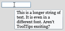
Here's some XAML that makes a ToolTip that can wrap text. It also modifies some of the font properties:
 <TextBox Height="20" Width="100">
    <ToolTipService.ToolTip>
        <TextBlock MaxWidth="150"
                   Text="This is a longer string of text. It is even in a different font. Aren't ToolTips exciting?"
                   FontFamily="Georgia" FontSize="14" TextWrapping="Wrap"/>
    </ToolTipService.ToolTip>
</TextBox>
This will show a ToolTip that is a little more interesting.
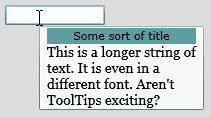
Because you can set the Content property to anything that you want, you can do this:
 <TextBox Height="20" Width="100">
    <ToolTipService.ToolTip>
        <StackPanel>
            <Border Background="CadetBlue">
                <TextBlock Text="Some sort of title" TextAlignment="Center"/>
            </Border>
            <TextBlock MaxWidth="150"
               Text="This is a longer string of text. It is even in a different font. Aren't ToolTips exciting?"
               FontFamily="Georgia" FontSize="14" TextWrapping="Wrap"/>
        </StackPanel>
    </ToolTipService.ToolTip>
</TextBox>
Note that the Content of the ToolTip can't be interacted with, so you can't put a Button (for example) in the ToolTip and expect the user to be able to interact with it, or for it to get the focus.
But this is still kind of a boring ToolTip: a plain-looking rectangle. But it is possible to make that look nicer, too.
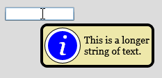
You can retemplate the ToolTip to give it new visuals. Here's an example:
The XAML is below. You'll note that I rearranged things a little bit: I put a ToolTip element under the ToolTipService.ToolTip element. I made the ToolTip.Content just a simple TextBlock again, and set the ToolTip's Template property to a fancy new Template which is defined in the page resources.
 <UserControl x:Class="ToolTipTest.Page"
    xmlns="https://schemas.microsoft.com/winfx/2006/xaml/presentation"
    xmlns:x="https://schemas.microsoft.com/winfx/2006/xaml"
    Width="400" Height="300">
    <UserControl.Resources>
        <ControlTemplate x:Key="ToolTipTemplate">
            <Border BorderBrush="Black" BorderThickness="4" CornerRadius="8" Background="PaleGoldenrod" MaxWidth="200">
                <Grid>
                    <Grid.ColumnDefinitions>
                        <ColumnDefinition Width="auto"/>
                        <ColumnDefinition Width="*"/>
                    </Grid.ColumnDefinitions>
                    <Grid Margin="2">
                        <Ellipse Fill="Black" Height="52" Width="52"/>
                        <Ellipse Stroke="White" StrokeThickness="4" Fill="Blue" Height="50" Width="50"/>
                        <TextBlock Text="i" FontStyle="italic" FontSize="40" FontFamily="Georgia"
                                               VerticalAlignment="Center" HorizontalAlignment="Center" Foreground="White"/>

                    </Grid>
                    <ContentPresenter Grid.Column="1"
                                        Content="{TemplateBinding Content}"
                                        ContentTemplate="{TemplateBinding ContentTemplate}"
                                        Margin="{TemplateBinding Padding}"
                                        VerticalAlignment="Center"/>
                </Grid>
            </Border>
        </ControlTemplate>
    </UserControl.Resources>
    <Grid x:Name="LayoutRoot" Background="Gainsboro">
        <TextBox Height="20" Width="100">
            <ToolTipService.ToolTip>
                <ToolTip Template="{StaticResource ToolTipTemplate}">
                    <ToolTip.Content>
                        <TextBlock
                           Text="This is a longer string of text."
                           FontFamily="Georgia" FontSize="14" TextWrapping="Wrap"/>
                    </ToolTip.Content>
                </ToolTip>
            </ToolTipService.ToolTip>
        </TextBox>
    </Grid>
</UserControl>
Comments
Anonymous
October 18, 2008
You've been kicked (a good thing) - Trackback from DotNetKicks.comAnonymous
October 18, 2008
Very cool, thanks for sharing. ;-)Anonymous
October 18, 2008
In this issue: Shawn Wildermuth, Laurence Moroney, Dave Relyea, Mike Taulty, Andy Beaulieu, Brad AbramsAnonymous
October 19, 2008
How could you manipulate this custom tooltip template from code? For example, say I want to generate tool-tips on the fly, but I want to apply a custom template (such as the yellow background with the info icon), how would you do that?Anonymous
October 20, 2008
JamieH, this does the same thing in code: ToolTip tt = new ToolTip(); tt.Template = (ControlTemplate) Resources["ToolTipTemplate"]; tt.Content = new TextBlock() { FontFamily = new FontFamily("Georgia"), FontSize = 14, Text = "This is a longer string of text.", TextWrapping = TextWrapping.Wrap }; ToolTipService.SetToolTip(textBox, tt);Anonymous
January 19, 2009
I'm getting the following two errors when I copy the last tool tip example XAML into Blend. What am I missing? ERROR 1: The member "Content" is not recognized or is not accessible. ERROR 2: The member "ContentTemplate" is not recognized or is not accessible. I'm sort of a noob and more of a designer rather than a developer so I just opened a new solution in Blend and pasted in the XAML. Let me know what I'm missing. THANKS!! -zacAnonymous
March 05, 2009
To clear up those 2 errors, you need to set the TargetType for the ControlTemplate, i.e.: <ControlTemplate x:Key="ToolTipTemplate" TargetType="ToolTip"> (Got those errors too, thanks to <a href='http://www.emadibrahim.com/2008/03/14/silverlight-templatebinding-throwing-an-error/'>this post for the answer</a>Anonymous
March 06, 2011
Hi, How do you make it so your don'T Wrap the text and it's larger as I have longer text and I don'T want to WrapAnonymous
March 06, 2011
Oh I saw the MaxWidth on the border. Removing it solved the problem.Anonymous
March 06, 2011
Need help. I have a stack panel vertical which have a TextBlock and then another StackPanel horizontal with 2 TextBlock. the second textblock on the horizontal StackPanel is set to wrap but it doesn't. Here's the entire code along with a screenshot that shows what it does. How would you modify it so the Note Text wrap and make the ToolTip grow to show all the text because in 1024 X 768, the ToolTip needs to grow vertically if no space is available to show the Note Text StackPanel spContent = new StackPanel() { Orientation = System.Windows.Controls.Orientation.Vertical, VerticalAlignment = System.Windows.VerticalAlignment.Stretch }; StackPanel spNote = new StackPanel() { Orientation = System.Windows.Controls.Orientation.Horizontal, VerticalAlignment = System.Windows.VerticalAlignment.Stretch }; TextBlock tbHeaderNote = new TextBlock() { FontFamily = new FontFamily("Courier New"), FontSize = 14, Margin = new Thickness() { Left = 4 }, Foreground = new SolidColorBrush(Colors.White), TextWrapping = System.Windows.TextWrapping.Wrap, Text = "Note : " }; TextBlock tbNote = new TextBlock() { FontFamily = new FontFamily("Courier New"), FontSize = 14, Margin = new Thickness() { Left = 4 }, Foreground = new SolidColorBrush(Colors.White), TextWrapping = System.Windows.TextWrapping.Wrap, Text = ncs.U_Note + Environment.NewLine + Environment.NewLine + Environment.NewLine, }; spNote.Children.Add(tbHeaderNote); spNote.Children.Add(tbNote); TextBlock tbInfo = new TextBlock() { FontFamily = new FontFamily("Courier New"), FontSize = 14, Margin = new Thickness() { Left = 4 }, Foreground = new SolidColorBrush(Colors.White), Text = "Interface Control Name : " + ncs.Name + Environment.NewLine + "Silverlight Property : " + SLProperty + Environment.NewLine + "Step : " + ncs.U_ApprovalStepId.ToString() + Environment.NewLine + "SAP Form : " + SAPForm + Environment.NewLine + "SQL Table Field : " + SQLTableField + Environment.NewLine + "SDK Property : " + ncs.U_SAPProperty, TextWrapping = TextWrapping.NoWrap, }; spContent.Children.Add(tbInfo); spContent.Children.Add(spNote); pages.videotron.com/.../tooltip.jpgAnonymous
October 27, 2011
How to set Contorl's Height / Width / Watermark as ToolTipService.ToolTip="{}" ?Anonymous
March 24, 2013
In Azure as IaaS (Infrastructure as a service) model, dedicated VMs are assigned to you with full control over O/S, updates etc. Generally used for application development, testing and IT operations. In Azure as PaaS(Platform as a service) model, Azure controls the VM instance and maintains the environment(O/S, updates etc.), while you are just concerned about your application.Anonymous
January 20, 2015
<phone:PivotItem Header="/Assets/images/Menu-icon/menu_setting_selected@2x.png"> <Ellipse Margin="43,-69,388,564" RenderTransformOrigin="1,-0.915" Fill="Red"/> </phone:PivotItem> Hi! Sir. I want to set content (text) to Ellipse but I can't do it. Help me.


