Design billing pages in a mobile broadband app
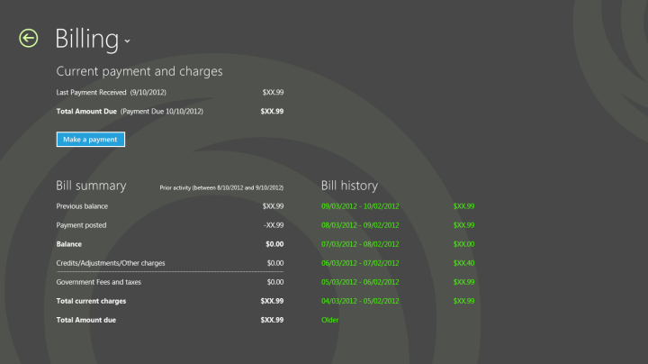
You should provide the user with the ability to view a billing summary, billing history, make payments, or recharge the plan.

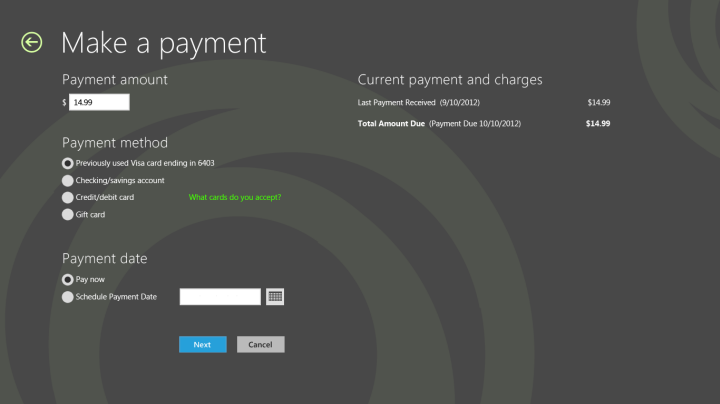
The Make a payment form should adhere to form guidelines that are described in Design purchase flows in a mobile broadband app. This page can be linked to from the Billing page for post-paid plans, and through the Recharge now button on the landing page for prepaid plans.

Quick summary
Appropriate design for the billing page:
Follow the form guidelines, including left alignment, white space, proper grid alignment, and touch friendliness.
Use a simple layout to improve readability.
Use vertical scrolling for long forms because this makes it easier to tab and to use the online keyboard.
Make the making payments process a simple experience.
Inappropriate design for the billing page:
Don’t try to fill up white space.
Don’t use an iframe to host the flows. Instead, build flows directly into the app experience.
Don’t make the user wait long times without providing visual feedback.
Don’t link to external sites outside of the app.
Additional resources
For more information about views and layouts: see Choosing a layout.
For more information about Listviews, see Quickstart: Adding a ListView.
For design guidance for error handling, see Laying out your UI.
For accessibility guidance, see Accessibility in UWP apps using C++, C#, or Visual Basic.
For more information about how to use built-in controls, see Adding controls and content.
For touch input guidelines, see Quickstart: Touch input.