Design account balance and usage info in a mobile broadband app
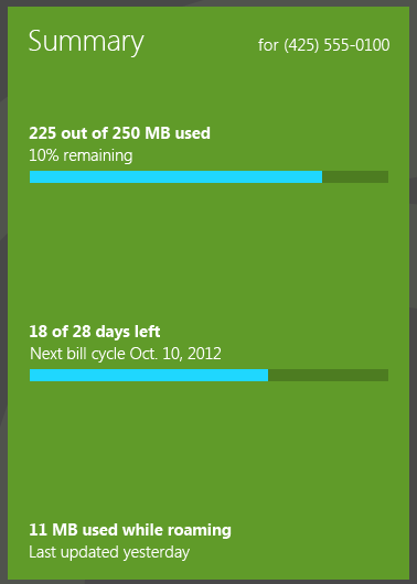
Users primarily use your mobile broadband app to view account balance and usage information. This data should be clearly visible on the app’s home screen.

Relevant account information for post-paid accounts includes the following:
Mobile phone number of account
Account balance remaining
Data used, roaming data used, and usage remaining
Billing period or plan expiration date
At a glance, users can clearly understand how much data they’ve used, how much data they have left, and when the billing cycle ends (for monthly accounts).

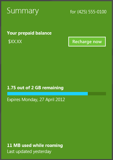
Relevant account information for prepaid accounts includes the following:
Mobile phone number of account
Account balance remaining
Recharge Now button, which links to make a payment page
Data used and remaining
Plan expiration date (if it exists)
Quick summary
Appropriate design for displaying account info:
Show relevant account information
Show when data was last updated
Use illustrations, such as charts and graphs, to visualize data
Tip You can implement a bar chart by using a determinate progress bar control, as discussed in Adding progress controls.
When remaining usage is low, show a link to the Plans page to upgrade the plan
Inappropriate design for displaying account information:
- Don’t show a long paragraph of legal disclaimers next to data usage. This can distract users from the main focus of the account usage section. Instead, show a link to a separate section of the app that has the full legal disclaimers.