Design your registration pages
The OEM registration pages present many customization opportunities. The guidance in this topic should help you implement these customization opportunities while also maintaining a consistent look-and-feel in OOBE. The guidance includes styling recommendations (colors, fonts, headers, etc.) for the HTML files linked from your registration pages and a full HTML example.
This topic describes all elements on each of the two OEM registration pages, indicating the customization options for each element. This topic also provides style guidance and code samples you can use to design your HTML flyout pages.
The layout of both OEM registration pages are locked, so the page elements themselves can't be rearranged.
Note
A minimum amount of information is required for the registration pages to display. You must provide a page title, a page subtitle, the customerinfo element, at least one additional checkbox or one link, and a public key for public/private key encryption.
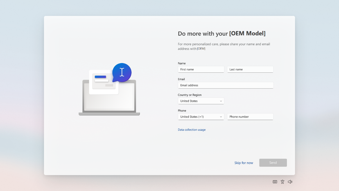
OEM registration page one
The first OEM registration page includes the elements below, some of which you can customize.

- Page title. Create a title that makes sense for your use of the page. This title also appears on registration page two.
- Page subtitle. Add a subtitle to help customers understand the tasks on the page or in some other way guide them to complete the form. This subtitle also appears on registration page two. The page title and subtitle can be customized using the
registrationelement of Oobe.xml. - Customer information fields. These fields are not customizable. Customer information consists of four input fields: First Name, Last Name, Region, Email, and Phone number. If the Email field is filled in, it will be validated as well-formed prior to allowing the customer to proceed. The Country/Region input field is a drop-down list. The associated value of each country/region is its associated two-letter country/region code based on ISO 3166-1 Alpha-2.
- One link. Customize the title, and path to, an HTML file using the
link1element of Oobe.xml. When using this link to surface a privacy policy, ensure the policy is current. - Skip button. The Skip button is visible by default, but you can configure the
hideSkipelement of Oobe.xml to hide it. No registration data of any kind is provided if the customer chooses Skip. The button text is not customizable. - Next button. The Next button moves the customer forward in OOBE. This button is not customizable.
Pre-populated customer information
When a user signs in to or signs up for an MSA in OOBE, they provide some of the customer information requested on the OEM Registration pages. To streamline the setup process for users, Windows 11 pre-populates some of the customer information fields on OEM registration page one, if the customer used an MSA earlier in OOBE.
Depending on the edition a user may choose to setup different account choices which will impact whether the account information is pre-filled.
| Account path | OEM page pre-filled |
|---|---|
| Microsoft account sign up | First name, last name, email |
| Microsoft account sign in | First name, last name, email |
| Azure AD account sign in | Nothing pre-filled |
| Local account creation | Nothing pre-filled |
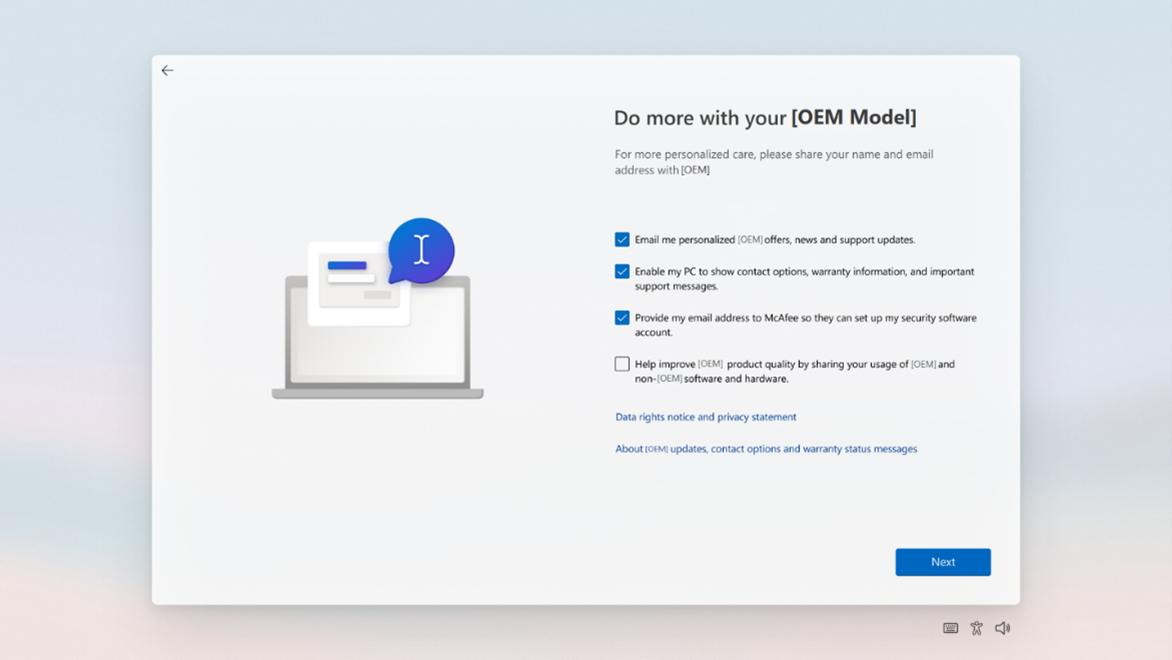
OEM registration page two
The second OEM registration page includes the elements below, some of which you can customize.

- Page title. Create a title that makes sense for your use of the page. This title also appears on registration page one.
- Page subtitle. Add a subtitle to help customers understand the tasks on the page or in some other way guide them to complete the form. This subtitle also appears on registration page one. The page title and subtitle can be customized using the
registrationelement of Oobe.xml. - Four checkboxes. Up to four checkboxes with labels can be displayed on registration page two. You can set the descriptive labels for the checkboxes, and their default states, using the
customerinfo,checkbox1,checkbox2, andcheckbox3elements of Oobe.xml. - Two links. Up to two links can be displayed beneath the checkboxes. You can specify the link labels and file paths using the
link2andlink3elements of Oobe.xml. Any text you associate with these links must be in HTML files stored locally in the%systemroot%\system32\Oobe\Infodirectory. - Next button. The Next button moves the customer forward in OOBE. This button is not customizable.
Note
You can't skip showing a link on registration page one by providing only link2 and link3 elements in Oobe.xml. A missing link1 will cause the link2 element to appear on the first registration page instead of the second.
Design HTML files for your links
When a customer clicks any link you've added to the registration pages, this opens an HTML file stored in the %systemroot%\system32\Oobe\Info folder on the device. Microsoft provides a full HTML sample below that defines the background color, font color, font sizing, font weight, padding, margins, and headers (among other elements) for your HTML files. We strongly encourage you to use this sample with little to no alteration of the design elements.
Windows OOBE has a dark blue background with light text. End User License Agreement (EULA) content uses a dark blue background and light text. Fly-out content uses a dark background with light text. To align with the design of Windows OOBE, and to create a consistent user experience, use the markup and style conventions laid out in the HTML example below when creating your HTML files.
Note
Inline CSS styling is required so that the iFrame host elements render correctly in the registration pages.
Colors
Text and background colors are defined in the CSS code example.
- Background color: #2b2b2b
- Font color: #FFF
Please use these colors to ensure a consistent user experience throughout OOBE.
Font
The standard font used throughout OOBE is Segoe UI. Please use the Segoe UI Webfont for your HTML documents to ensure the font matches the rest of OOBE.
Sizes and spacing
Use two different styles for headers and body content.
- Headers: should be rendered using the
<h4>tag. - Body text: should be rendered using the
<p>tag. - Bold text: should be rendered using the
<b>tag. - Hierarchy of information: indented sections or groups of bulleted items can be displayed with the
<DIR>tag, required for EULA content template, optional for Flyouts.
We require that the files for the in-place links are HTML. These files are rendered in a flyout. Documents in the flyout are sandboxed, such that links to external and online resources will not function.
Important
The following tags are prohibited and should not be included in your files:
<script><iframe><input><img><a>
CSS code example
Please use the following inline CSS in the head of your HTML documents.
<style type="text/css">
        [dir='rtl'] dir {
            padding: 0 12px;
        }

        [dir='ltr'] dir {
            padding: 0 12px;
        }

        [dir='ltr'] [align=right] {
            text-align: right;
        }

        [dir='ltr'] [align=left] {
            text-align: left;
        }

        [dir='rtl'] [align=right] {
            text-align: left;
        }

        [dir='rtl'] [align=left] {
            text-align: right;
        }

        [dir='rtl'] body {
            padding: 0 12px;
        }

        [dir='ltr'] body {
            padding: 0 12px;
        }

        body {
            -ms-overflow-style: scrollbar;
            background: #2b2b2b;
            color: #FFF;
            font-family: "Segoe UI", "Segoe UI Webfont", "Ebrima", "Nirmala UI", "Gadugi", "Segoe Xbox Symbol", "Segoe UI Symbol", "Meiryo UI", "Khmer UI", "Tunga", "Lao UI", "Raavi", "Iskoola Pota", "Latha", "Leelawadee", "Microsoft YaHei UI", "Microsoft JhengHei UI", "Malgun Gothic", "Estrangelo Edessa", "Microsoft Himalaya", "Microsoft New Tai Lue", "Microsoft PhagsPa", "Microsoft Tai Le", "Microsoft Yi Baiti", "Mongolian Baiti", "MV Boli", "Myanmar Text", "Cambria Math", Selawik, Tahoma, Verdana, Arial, sans-serif;
            font-size: .9375rem;
            font-weight: 400;
            line-height: 1.25rem;
            margin: 0;
            max-width: 100%;
            overflow: auto;
            padding-bottom: 0;
            padding-top: 0;
        }

        body b * {
            font-weight: 700;
        }

        html {
            font-size: 100%;
        }

        p {
            font-size: .9375rem;
            font-weight: 400;
            line-height: 1.25rem;
            max-width: 100%;
            padding-bottom: .0141875rem;
            padding-top: .0141875rem;
        }

        h4 {
            font-size: 1.25rem;
            font-weight: 400;
            line-height: 100%;
            max-width: 100%;
            padding-top: 12px;
            margin: 0;
        }
    </style>
Full HTML example
Here is a full example of an HTML flyout for OEM registration pages. Please use this sample as a baseline for your HTML flyout pages, with little to no alteration of the design elements.
> <!DOCTYPE html>
<html dir="ltr">
<head>
<meta charset="utf-8"/>
<meta name="viewport" content="width=device-width">
<title></title>
<style type="text/css">
[dir='rtl'] dir {
padding: 0 12px;
}
[dir='ltr'] dir {
padding: 0 12px;
}
[dir='ltr'] [align=right] {
text-align: right;
}
[dir='ltr'] [align=left] {
text-align: left;
}
[dir='rtl'] [align=right] {
text-align: left;
}
[dir='rtl'] [align=left] {
text-align: right;
}
[dir='rtl'] body {
padding: 0 12px;
}
[dir='ltr'] body {
padding: 0 12px;
}
body {
-ms-overflow-style: scrollbar;
background: #2b2b2b;
color: #FFF;
font-family: "Segoe UI", "Segoe UI Webfont", "Ebrima", "Nirmala UI", "Gadugi", "Segoe Xbox Symbol", "Segoe UI Symbol", "Meiryo UI", "Khmer UI", "Tunga", "Lao UI", "Raavi", "Iskoola Pota", "Latha", "Leelawadee", "Microsoft YaHei UI", "Microsoft JhengHei UI", "Malgun Gothic", "Estrangelo Edessa", "Microsoft Himalaya", "Microsoft New Tai Lue", "Microsoft PhagsPa", "Microsoft Tai Le", "Microsoft Yi Baiti", "Mongolian Baiti", "MV Boli", "Myanmar Text", "Cambria Math", Selawik, Tahoma, Verdana, Arial, sans-serif;
font-size: .9375rem;
font-weight: 400;
line-height: 1.25rem;
margin: 0;
max-width: 100%;
overflow: auto;
padding-bottom: 0;
padding-top: 0;
}
body b * {
font-weight: 700;
}
html {
font-size: 100%;
}
p {
font-size: .9375rem;
font-weight: 400;
line-height: 1.25rem;
max-width: 100%;
padding-bottom: .0141875rem;
padding-top: .0141875rem;
}
h4 {
font-size: 1.25rem;
font-weight: 400;
line-height: 100%;
max-width: 100%;
padding-top: 12px;
margin: 0;
}
</style>
</head>
<body>
<H4>Learn more about the sample</H4>
<P>Quisque efficitur lorem nec mauris semper consequat. Aliquam sollicitudin rhoncus sollicitudin. Integer ligula mauris, euismod ac lacus et, cursus pulvinar mauris. Aliquam sollicitudin blandit vehicula. Morbi ac arcu vitae mi placerat facilisis eu sed enim. Ut ornare aliquet tincidunt. Maecenas posuere et nisi in tempor.</P>
<B><P>Donec malesuada bibendum nibh, in semper nunc efficitur sit amet. Vestibulum vehicula hendrerit elit et congue.</P>
<DIR>
<DIR>
<P>1.	Pellentesque mollis cursus ultrices.</P>
<DIR>
<P>a.	Vivamus ut suscipit arcu.
</B> Donec viverra tortor lacus, eu aliquam dolor auctor quis. Praesent eget tincidunt metus, non pellentesque metus. </P>
<B><P>b.	Nulla tincidunt urna et tortor gravida, id dictum ligula lacinia.</B> Vivamus libero mauris, fermentum et pharetra id, ultricies quis urna.</P>
<DIR>
<DIR>
<P>(i)	Suspendisse porta vestibulum risus, et molestie est egestas ut.</P>
<P>(ii)	 Nullam feugiat, odio vel convallis fringilla, libero nibh volutpat metus, a ultrices justo est id nisl.</P>
<P>(iii)	Nunc vulputate turpis at eleifend malesuada.</P>
<P>(iv)	Cras maximus mi porta arcu vehicula elementum.</P></DIR>
</DIR>
</DIR>
<B><P>2.	Nullam ullamcorper placerat finibus.</B> Lorem ipsum dolor sit amet, consectetur adipiscing elit. Donec vitae tincidunt quam, viverra vehicula urna. Sed sit amet volutpat ex, id egestas odio.
Aliquam at urna mollis, commodo ex sit amet, auctor erat. Proin elit neque, pretium ut lorem eget, cursus condimentum ante. Quisque placerat tempor nunc, a pulvinar augue interdum sit amet. Sed eget sem quis tellus rutrum rhoncus. Suspendisse potenti. Vestibulum sem ipsum, volutpat ac condimentum ut, porttitor ac nulla. Quisque rhoncus sapien eu dolor posuere, ac auctor mi dapibus. Aenean egestas mauris sed tellus dapibus, sed sagittis velit volutpat:</P>
<DIR>
<DIR>
<DIR>
<P>·	Sed mattis varius libero.</P>
<P>·	Maecenas eget ultrices risus.</P>
<P>·	Maecenas venenatis tellus id euismod venenatis.</P>
<P> </P></DIR>
</DIR>
</DIR>
</DIR>
</DIR>
</body>
</html>