Use the Viva Glint Heat Map Report
The Microsoft Viva Glint Heat Map Report identifies high and low scoring teams on engagement and other key drivers. It is filterable by attributes within your Glint Employee Data File.
The Heat Map Report is useful for Human Resource Business Partners (HRBPs), admins, or any senior leader who would benefit from looking across multiple groups for comparisons.
What does the Heat Map Report show?
Note
Heat Map results are only available when confidentiality thresholds are met.
Heat maps are sorted so that it’s easy to find patterns. The first rows typically have higher scores across the most teams. The left columns represent teams with lower scores across the most drivers. Heat Maps are interactive and display scores for each question broken down by demographic attributes – (for example: team, location, or tenure). Use Heat maps to quickly and easily spot patterns and outliers.
Note
Colors indicate high and low scores relative to the median score in the Heat Map.
Accessing the Heat Map Report
Select the Reports tab on your admin dashboard and then the Heat Map Report card. The heat map display defaults to show your team.
Using the Heat Map Report
Select the Reports tab on your admin dashboard and then the Heat Map Report card.
The heat map display defaults to show your teams (Manager).
Color coding
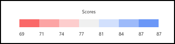
The colors in the Heat Map allow quick identification of systemic patterns and outliers. Color coding is relative and not absolute. For any population you see, the highest score is in the darkest blue, while the lowest score is in the darkest red. The other scores are plotted in various shades of blues and red relative to the highest and lowest scores.
- The maximum and minimum are always displayed as dark blue and dark red.
- All scores between the maximum and minimum are evenly bucketed in up to seven different colored buckets, with the median score being shown in the gray middle bucket. For example:
- If the minimum and maximum scores are 69 and 87, then Glint will create 7 evenly spaced buckets between 52 and 80.
- Dark red would be 69-71
- Dark blue would be 87-87
- Gray would be 77-81 with the other shades being in between
- The other color buckets are evenly spaced between the maximum/minimum values.
Here's an example of that color coding:
Changing the view of the Heat Map
Changing the view by score comparisons
The Heat Map defaults to a Scores view. You can change your view of the data by selecting the Settings button. In the Report Settings window that opens, use the Show dropdown menu to choose from:
- Scores
- Changes
- vs Company
- Scores and Changes
- Scores and vs Company
Changing the view by benchmark
Viva Glint provides four default options for comparison reporting. In addition to the following four settings, your company may have one or more internal comparisons configured (for example, Division or Business Unit).
| Comparator | Description | When to use |
|---|---|---|
| Benchmark | Provides a comparison point for feedback based on survey data compiled from all Viva Glint customers, not just within your organization. | Helpful for admins and first-time survey results analysis |
| Company | Displays team scores in comparison to company-wide scores for the same questions. | Helpful for users with more than one area of responsibility |
| My Teams | Compares a manager's team score to an overall score derived from a filter. | This setting is the superset of access and is best used with custom access or managers with large organizations |
| Average Question | Presents a single, overall score for all questions and respondents within your access. | Helpful for users looking for some level of variance in their score |

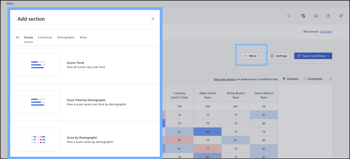
Add sections or attributes
Heat Maps can be generated for any of the attributes for which you have permission, like location or department.
Select the More button to open dropdown and then choose Add section. Within this window you can choose to view survey scores by many score options, by comments, demographic, and more.
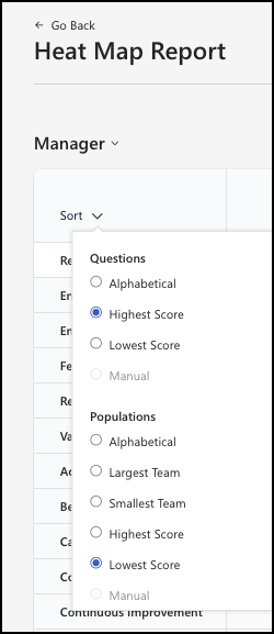
Use the Sort option
By selecting the Sort arrow you have options to sort the questions alphabetically, by score, or by size.
Deep dive into a specific cell
You can select any cell to drill down into that particular key driver within a team. Let's use this example:
You want to know why Abbi's team has scored low on Work Life Balance.
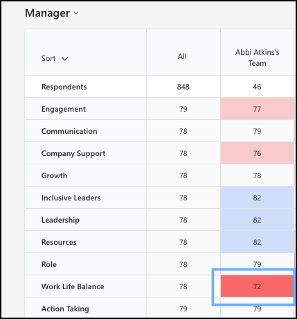
Hover over the cell to see the comparisons. Here, the score for the Work Life Balance is 72, compared to 78 which is the Company score for this driver.
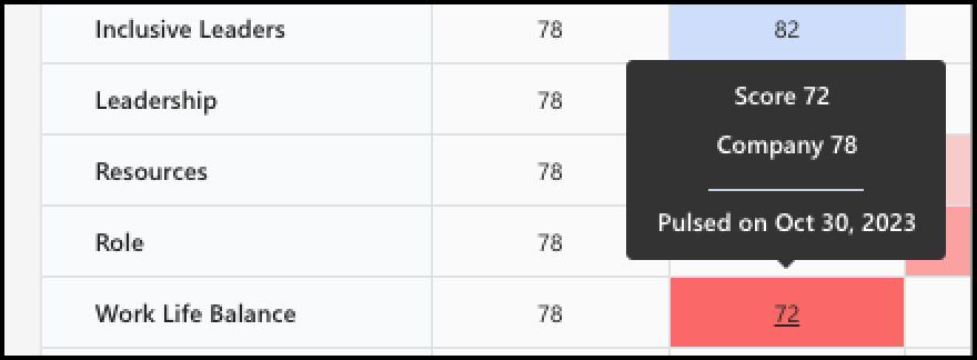
Now, select the cell to open a report to deep dive into all the information around that driver.

Use the larger report to identify hot spots or low scores, outliers, and bright spots or areas to celebrate.
How Glint improves report visualization
To improve report visualization for large customers, the number of columns that show is capped at 150. If your organization uses more than 150 columns, a message indicates that the onscreen results display 150 columns. To see the full results, users can export the report to a spreadsheet.
Export and share Heat Map Report results
Select the Export and Share button to open the dropdown menu to choose how you want to export and share your feedback with others.
