Introduction
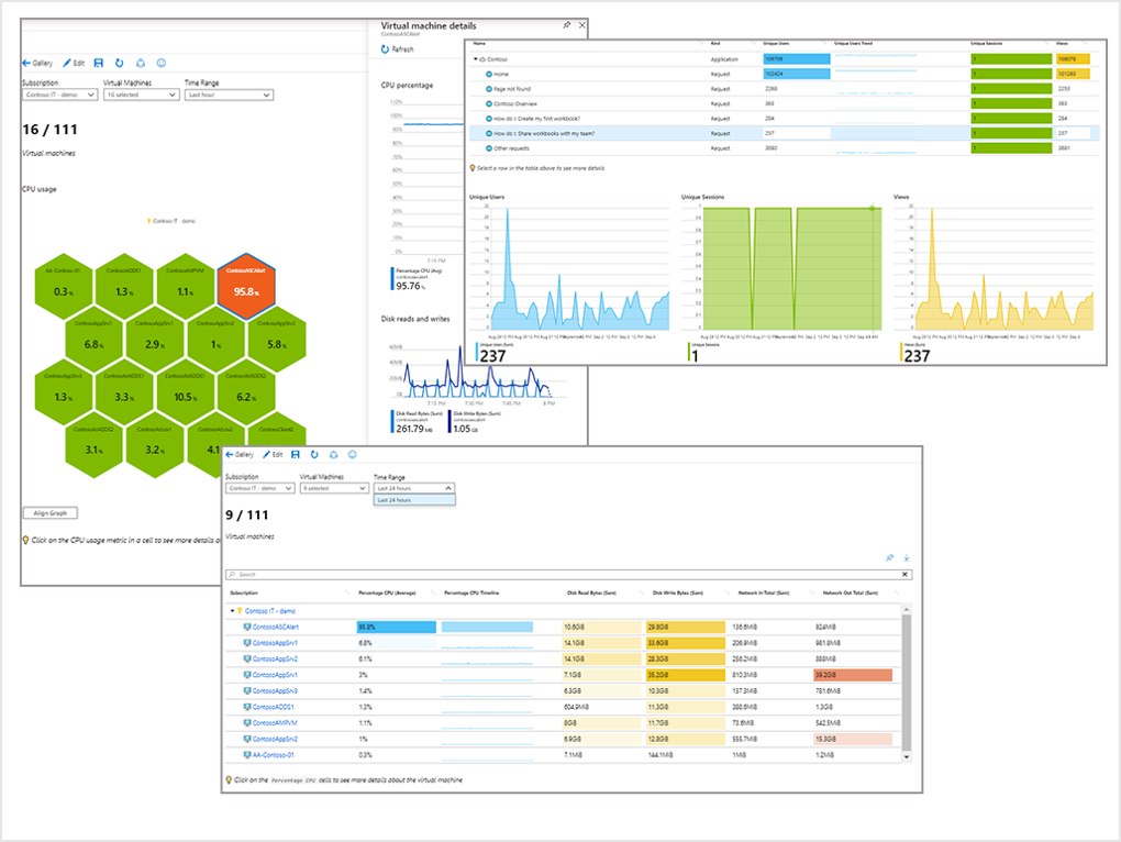
Azure Workbooks help you combine data from multiple data sources to build interactive visual reports for data analysis and reporting.

Example scenario
Suppose you’re the IT admin for a large retail company. You manage multiple application and service teams. Each team needs a way to evaluate the performance and utilization of the Azure resources in their subscription. You want to build a customized report in the Azure portal that provides information such as the type of resources, their geo-distribution, and key metrics for each resource. You want to include visuals to make it easy to understand the data and to analyze and monitor your systems. You also need to set up your report so that it can be used interactively by all your teams. By the end of this module, you'll be able to create a new visual report using Azure Workbooks. The report will display the distribution of resources across the team’s subscriptions and you'll be able to visually assess the usage of individual resources.
What will we be doing?
In this module, you'll generate a report with several visualizations to help you analyze data from multiple data sources. You'll create a new workbook, query your resources to see how they're distributed globally, and then create charts and graphs to compare data from the different resources.
What is the main goal?
By the end of this session, you'll be able to generate a report with visualizations that compare data from more than one data source.