Exercise: Use page-level resources
All the exercises in this module relate to the prebuilt TipCalculator application. You modify and improve this app throughout the module. In this exercise, you use page-level resources to eliminate repeated values in your Extensible Application Markup Language (XAML) code.
This module uses the .NET 9.0 SDK. Ensure that you have .NET 9.0 installed by running the following command in your preferred command terminal:
dotnet --list-sdks
Output similar to the following example appears:
8.0.100 [C:\Program Files\dotnet\sdk]
9.0.100 [C:\Program Files\dotnet\sdk]
Ensure that a version that starts with 9 is listed. If none is listed or the command isn't found, install the most recent .NET 9.0 SDK.
Open the starter solution
Clone or download the exercise repo from GitHub.
Note
It's best to clone or download the exercise content to a short folder path, such as C:\dev, to avoid build-generated files exceeding the maximum path length.
Open the starter solution from the exercise1/TipCalculator folder by using Visual Studio or open this folder directly in Visual Studio Code.
Verify that it builds and runs in your environment. (Any platform is fine.)
Take a few minutes to examine and run the application so you understand how it behaves.
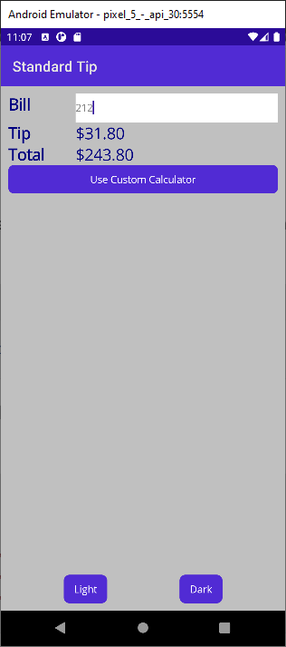
The application provides two pages. The StandardTipPage page is a simple tip calculator. You enter a value, and the page calculates the tip (15%) and the total due. The following image shows the application running on an Android device:

The Light and Dark buttons enable you to change the color theme of the page. The default is the Light theme. If you select Dark, the colors for the background and text are reversed.
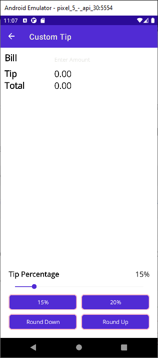
The Use Custom Calculator button switches the display to the CustomTipPage page. This page enables you to vary the tip percentage by using a slider. You can also select the 15% and 20% buttons to calculate the tip based on predefined rates.

Find repeated XAML
Open the StandardTipPage.xaml file.
Find the XAML markup that sets the background color of the LayoutRoot grid. Notice that it uses a hard-coded value.
<Grid x:Name ="LayoutRoot" BackgroundColor="Silver" Padding="10">Find the XAML markup that sets the text color of the labels in the "left column" to Navy, and the font size to 22. Notice that these same values are used on three labels.
<!-- Left column = static labels -->
<Label x:Name="billLabel"  Text="Bill"  TextColor="Navy" FontSize="22" ... />
<Label x:Name="tipLabel"   Text="Tip"   TextColor="Navy" FontSize="22" ... />
<Label x:Name="totalLabel" Text="Total" TextColor="Navy" FontSize="22" ... />
Find the XAML code that sets the color of the labels in the "right column" to Navy and the font size to 22. Notice that these same values are used on two labels.
Some of the property settings seem to form a logical group. For example, the combination of Navy and 22 is used on multiple labels.
<!-- Right column = user input and calculated-value output -->
<Entry ... />
<Label x:Name="tipOutput"   Text="0.00" TextColor="Navy" FontSize="22"   ... />
<Label x:Name="totalOutput" Text="0.00" TextColor="Navy" FontSize="22"   ... />
Consider the work involved in modifying the TextColor and FontSize values. You would need to change it in five places.
Define resources
Now let's create resources in XAML, so you can start eliminating some of the repeated code that you found in the application.
Open the StandardTipPage.xaml file.
Define a Color resource inside a ContentPage.Resources section. Give the resource an x:Key resource ID of bgColor and the value #C0C0C0 (you could also use the name of the color
Silver).Define a second Color resource. Give it an x:Key resource ID of fgColor and the value #0000AD (you could also use the name of the color
Navy).Define an x:Double resource with an ID of fontSize. Set the value of this resource to 22.
<ContentPage xmlns="http://schemas.microsoft.com/dotnet/2021/maui"
             ...>

    <ContentPage.Resources>
        <ResourceDictionary>
            <Color x:Key="bgColor">#C0C0C0</Color>
            <Color x:Key="fgColor">#0000AD</Color>
            <x:Double x:Key="fontSize">22</x:Double>
        </ResourceDictionary>
    </ContentPage.Resources>

    <Grid x:Name ="LayoutRoot" ...>
        ...
Use static resources
Now, let's apply the resources that you created.
Use the StaticResource mark-up extension to apply the bgColor resource to the Background property of the LayoutRoot Grid control.
...
<Grid x:Name ="LayoutRoot" BackgroundColor="{StaticResource bgColor}" Padding="10">
Apply the fgColor resource to the TextColor property of all the Label controls that currently set the TextColor to Navy. Additionally, replace the hard-coded font size with the fontSize static resource.
...
<!-- Left column = static labels -->
<Label x:Name="billLabel"  Text="Bill"  TextColor="{StaticResource fgColor}" FontSize="{StaticResource fontSize}" ... />
<Label x:Name="tipLabel"   Text="Tip"   TextColor="{StaticResource fgColor}" FontSize="{StaticResource fontSize}" ... />
<Label x:Name="totalLabel" Text="Total" TextColor="{StaticResource fgColor}" FontSize="{StaticResource fontSize}" ... />
...
Run the application. Verify that StandardTipPage still displays dark text on a light background at startup, as it did before.
Note
Don't worry about the styling for CustomTipPage or the Light and Dark themes at this point; you address these issues later.