Explore statistical summary
Data is often intertwined with statistics because statistics are one way in which you can explore your data. Statistics show you the distribution of your data and help you to identify key takeaways and trends and determine whether outliers exist.
The statistical summary is the information that provides a quick and simple description of your data. Power BI has many functions that help you to conduct a statistical analysis, such as Data Analysis Expressions (DAX) functions, visuals such as histograms and bell curves, advanced analytics visuals, and statistical programming languages such as Python and R.
Exploring the statistical summary gives the user a high-level view of the available data, where they can see clusters, patterns on behavioral data, data averages, and more. They can gain insights about their data that will help drive business decisions.
For example, the Supply Chain team asks you to create a report that shows the frequency of orders for certain products and what the top 10 products are in terms of sales.
Statistical functions
Power BI Desktop has a number of DAX functions that you can use to get quick statistics based on your data. You can access these quick functions by right-clicking the Values field in the Visualizations pane, as illustrated in the following image.
However, to avoid performance issues, it's better to create the statistical measures yourself by using DAX functions to calculate average, sum, min, max, and so on. For example, to analyze the inventory data to find the average order quantity for each product, you could use the following formula:
Average Qty =
AVERAGE ( Sales[Order Qty] )
Histogram
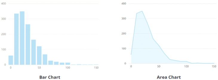
Histograms and bell curves are the most common way to display statistics about your semantic models. In Power BI terms, you can represent a histogram with one of the bar or column chart visuals and represent a bell curve with an area chart visual, as illustrated in the following image. You can also use the Q&A visual to ask a direct question about the top or bottom items in a list.
A typical bar or column chart visual in Power BI relates two data points: a measure and a dimension. A histogram differs slightly from a standard bar chart in that it only visualizes a single data point.
In this example, you use the clustered column chart visual to present a histogram that determines the order quantities by order sizes.
You start by selecting the clustered column chart icon on the Visualization pane. Next, create a new grouping for the x-axis. You will learn more about grouping and binning later in this module, but they are useful in this context also.
To create the group, in the Fields pane, right-click the data field that you want to analyze and then select New Group. In this case, you use the OrderQty field. In the Groups window that displays, set up the bin group as follows:
Rename the group as Order Bins (Buckets).
Set the Group type option to Bin and the Bin Type option to Number of bins.
Enter 5 as the Bin count, 1 as the Min value, and 44 as the Max value.
Next, populate the visual as follows:
Drag and drop the OrderQty field from the Fields pane into the Value field on the Visualizations pane.
Drag and drop the Order Bins (Buckets) group from the Fields pane into the Axis field on the Visualizations pane.
The visual now shows that the data is grouped into buckets on the x-axis, with the order quantities of that variable on the y-axis.
You have now produced a histogram that displays the order quantity (OrderQty field) by order size buckets for the Supply Chain team.
Top N analysis
The TOPN DAX function returns the top N rows of a specified table. The Top N analysis is a great way to present data that might be important, such as the top 10 selling products, top 10 performers in an organization, or top 10 customers. Alternatively, you can look at it from the other perspective and present the bottom 10 items in a list, in other words, the worst performers. Depending on the requirements, you might want to use one or both of these options.
In this example, the Supply Chain team wants to know what the top 10 selling products are. You accomplish this task in one of three ways: by using a Q&A visual, using a Top N filter, or writing a DAX formula.
Use the Q&A visual to find the top N
You've created a report for the Supply Chain team, and now the team members have questions about various other views or insights that they are interested in. Power BI has a built-in Q&A visual that allows users to ask their own questions and get answers so you don't have to address each individual question. The Q&A visual is an effective tool because it allows users to quickly get answers about the data independently, which saves time for everyone involved. The Q&A visual is unique in that it does not require knowledge of Power BI to use the visual; users can ask their question and they, too, can create insightful visuals.
Add the Q&A visualization to your report, and then reposition the visual and customize its formatting, as required.
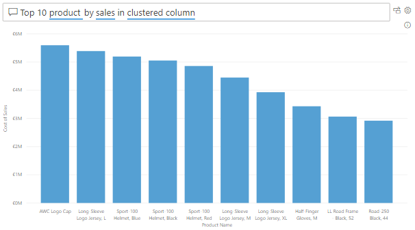
Now, you can use the visual to get answers. In this case, you want to know what the top 10 selling products are, so you enter a question such as, "What are my top 10 products by sales?" Power BI will automatically display those results for you.
Use a Top N filter type
Top N is a filtering option that is available on the Filters pane. Select the field that you want to analyze on your report page (in this example, it's the Product Name field). In the Filters pane, expand the Filter type list and select Top N. In the Show items settings, select Top and 10. Then, select Cost of Sales as the value that you want to filter the field by. The visual updates accordingly.
Use a TOPN DAX function
You can also calculate your top 10 products in DAX by using the TOPN function. This option could be useful if you want to present the top 10 in a different context, such as how much of the top 10 best-selling products contributed toward the overall total sales.
Start by creating a new measure called Top 10 Products. Then, use the TOPN function, along with the SUMX function, to calculate your top 10 products by total sales, as follows:
Top 10 Products =
SUMX ( TOPN ( 10, Product, Product[Total Sales]), [Total Sales] )
The following image shows the top 10 products versus total sales for comparison.
You can adjust the DAX formula to present the same result in percentages.
For more information about the statistical capabilities of Power BI, see Statistical Functions - DAX.


