Implement tab navigation with .NET MAUI Shell
Tab navigation is a navigation pattern where a tab strip (a row of touchable controls) is permanently displayed at the top or bottom of the screen. Tab navigation provides a mechanism for a user to select between pages in a multi-page app.
In this unit, you learn how to create an app that implements tab navigation.
What is tab navigation?
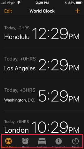
In an app that uses tab navigation, each tab represents a specific section or page of the app. Users select tabs within the tab strip to move between content in the application. As an example, the following illustration shows the use of tab navigation in the iOS Clock app. The icons highlighted at the base of the page, enable you to switch between different views. These icons correspond to tabs, and the views are tabbed pages:

Because the tab strip is always visible, tab navigation allows users to quickly switch between content in an application. Tab navigation is ideal when an application has several sections that a user is likely to use frequently. Clock applications are an excellent example. The clock, alarm, and stopwatch sections are likely to be frequently used.
On mobile devices, the tab strip typically has a limited amount of space and can display only a fixed number of tabs, depending on the device size and orientation. The recommendation is to use only three to four tabs. If you include more tabs, you're not guaranteed to have enough space to show all of the tabs on all devices. The operating systems supported by .NET MAUI do allow for an overflow area. This area provides more area to access tabs that don't fit on screen. However, navigating to these overflow tabs requires extra steps by the user. These sections are less discoverable.
If you need more than four tabs, consider using another navigation pattern, such as flyout item navigation. Additionally, tab navigation isn't the best option if your data forms a natural, master-detail hierarchy. In these cases, you should consider stack navigation.
Tab navigation in a .NET MAUI app
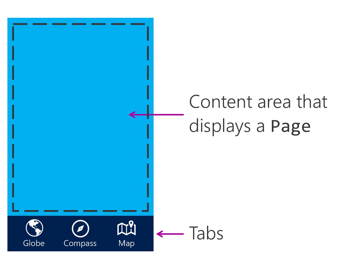
You use the TabBar object to implement tab navigation in a .NET MAUI shell app. The TabBar object displays a set of tabs and automatically switches the displayed content when the user selects a tab. The following illustration shows the UI areas.

To use tabs in a .NET MAUI Shell application, create an instance of the TabBar class as a child of the Shell class. Then add Tab objects to the TabBar. Within the Tab object, a ShellContent object should be set to a ContentPage object.
Create a TabbedPage
You can create a TabBar instance as a child of the Shell class. Add Tab objects as children to the TabBar as needed. Within the Tab object, a ShellContent object should be set to a ContentPage object.
<Shell xmlns="http://schemas.microsoft.com/dotnet/2021/maui"
       xmlns:x="http://schemas.microsoft.com/winfx/2009/xaml"
       xmlns:views="clr-namespace:Xaminals.Views"
       x:Class="Xaminals.AppShell">
    <TabBar>
       <Tab Title="Moon Phase"
            Icon="moon.png">
           <ShellContent ContentTemplate="{DataTemplate local:MoonPhasePage}" />
       </Tab>
       <Tab Title="Sunrise"
            Icon="sun.png">
           <ShellContent ContentTemplate="{DataTemplate local:SunrisePage}" />
       </Tab>
    </TabBar>
</Shell>
Tabs within a flyout menu
A flyout item can open up a page with a tab bar that displays one or more tabs.
To implement this design, add a <ShellContent> item within the <FlyoutItem> for each tab you want displayed.
Set the Title and Icon on the <ShellContent> to control the tab's title and icon.
<FlyoutItem Title="Astronomy" Icon="moon.png">
    <ShellContent Title="Moon Phase" Icon="moon.png"
        ContentTemplate="{DataTemplate local:MoonPhasePage}"/>

    <ShellContent Title="Sunrise" Icon="sun.png"
        ContentTemplate="{DataTemplate local:SunrisePage}"/>
</FlyoutItem>

<FlyoutItem Title="About" Icon="question.png">
    <ShellContent
        ContentTemplate="{DataTemplate local:AboutPage}"/>
</FlyoutItem>