Survey headers and branding
Every organization has its own set of branding and style guidelines. Typically, a company will have a marketing department that is responsible for determining the fonts, logos, and color scheme to be used for each item of communication between them and their customers. Consistency is key when presenting any type of content to the outside world, making sure it’s obvious where collateral has come from and providing brand recognition each time.
Dynamics 365 Customer Voice offers several ways that you can customize a survey to fit in with a set of brand guidelines. You can achieve this customization by using the following elements:
Survey background image
Survey color
Custom survey header
Font style, color, and size
Customized thank you message and footer text
Set the branding
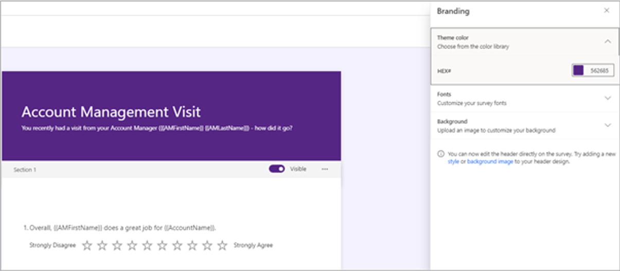
The quickest way to transform a survey and add some branding is to adjust the branding from the Customization menu. The first option is to set the theme color. Sixteen standard colors are available to choose from, but you can make the theme color more specific and selected by using what is known as a HEX number. The HEX number defines a specific color and is typically something that an organization’s marketing department can provide. The color is used in a slightly lighter shade on the survey’s background and in the header of the survey as the exact HEX match.
You can set fonts universally from the branding menu by selecting from a list of predefined fonts for the header and the body of the survey. Setting fonts in one place means that it will filter through the entire survey. If the size of the font needs to be adjusted for specific questions, you can highlight text, and then a small control will appear with tools to change the size and color and to make something bold, italic, or underlined.
Additionally, you can upload an image from the branding menu to be used as the background for the survey. Uploading an image might change the brand color that was previously selected and might adjust it to a more complimentary color. Then, you can adjust the color again if you want. Though the image will be displayed from a desktop, it won't show when you’re reviewing on a mobile device.
Custom survey header
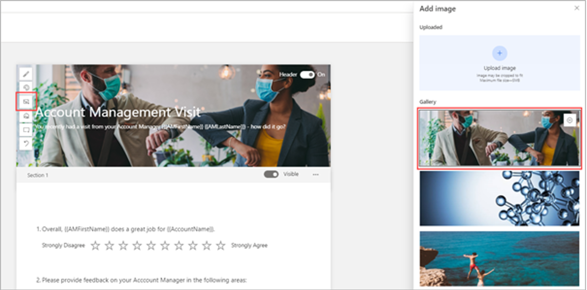
The top section of the survey is known as the header. Hovering a mouse cursor over this section (but not selecting it) will cause controls to be displayed. This ability allows you to adjust the header. Also, instead of using a theme color, survey makers can use organization logos and imagery to make a customized experience that aligns with brand guidelines.
The menu controls that display are as follows:
Style - Selecting this option opens a side panel that provides style options. These options range from professional or friendly to playful or relaxed. Users can select the style that is most fitting for the purpose of the survey and the target audience.
Theme color - This option shows the same color palette and options that are available when users are accessing from the theme color in the branding area.
Image - The survey maker can select from a series of provided images or upload their own image to be used in the survey header.
Focal point - If an image has been uploaded, the focal point option provides the ability to drag the image around to set it in the best place for optimum visibility.
Logo - Selecting this option opens file explorer on the survey maker’s workstation, where they can browse and find a logo file for their organization. After they’ve added the logo, the survey maker can hover the mouse cursor over the logo to display another menu to determine the placement of the logo within the survey header.
Undo - This option provides a quick way to undo the last changes that were made.
Survey makers can turn on or off the entire header by selecting the header on/off switch from the upper right while hovering the mouse cursor over the header. Turning off the toggle switch can be helpful if the survey should be used to embed into a website. With the header removed, it will fit cleanly as if it's part of the website; therefore, using this option can be beneficial in some circumstances where necessary.
Customized thank you message and footer text
By default, when a respondent submits their response to a survey, the displayed thank you message states, Thank you for sharing your feedback. You can modify this text and adjust it to show something different. Additionally, you can include hyperlinks and display modified font by using the methods previously indicated. You can add multiple thank you messages and then use logic to determine when the message is shown. For example, if a specific question might only be answered by some people based on branching rules, the thank you message can be displayed only to people who answer that question. Thank you messages can also be displayed based on variables that have been used within the survey. If a variable contains, is equal to, or is not equal to, the message can be displayed. This approach provides more flexibility to make surveys as personalized and customized as possible.
You can change the footer text if needed. By default, it displays The feedback you submit will be sent to the creator of this survey. Update this text to show information about an organization, including a hyperlink to terms and conditions, or any kind of online privacy statement or policy.
Watch the following video to learn more and for a demonstration of survey headers and footers.

