Exercise - Reuse components by creating a template
The pizza company wants the My Orders page to show customers more details about their past orders, such as which pizzas were in the order and what time the customer made the order.
A template can help you improve the display and functionality of the My Orders page on the Blazing Pizza app. In this exercise, you create a pagination template component that you reuse on the My Orders page.
Create the pagination template component
Create a new Blazor pagination template component file and pagination controls.
Create the file and add the markup
In your Blazor app project in Visual Studio Code, create a new folder named Components. In the Components folder, create a new file named PaginationComponent.razor.
In the newly created template component, add the following Razor markup:
@typeparam TItem

<div class="container-sm py-4">
    @ItemContent(Items.ElementAt(selectedIndex))
</div>
<nav aria-label="Pagination functionality">
    <ul class="pagination pagination-lg justify-content-center">
        <li class="page-item @(previousDisabled ? "disabled" : "")" disabled="@previousDisabled">
            <a class="page-link" @onclick="@(() => SetIndex(0))">
                <span>⏪</span>
            </a>
        </li>
        <li class="page-item @(previousDisabled ? "disabled" : "")" disabled="@previousDisabled">
            <a class="page-link" @onclick="DecrementIndex"><span>⬅️</span></a>
        </li>
        @foreach ((int index, TItem item) in Items.Select((item, index) => (index, item)))
        {
            var isActive = index == selectedIndex;
            <li class="page-item @(isActive ? "active" :"")">
                <a class="page-link" @onclick="@(() => SetIndex(index))">
                    @ItemLabel(item)
                </a>
            </li>
        }
        <li class="page-item @(nextDisabled ? "disabled" : "")" disabled="@nextDisabled">
            <a class="page-link" @onclick="IncrementIndex"><span>➡️</span></a>
        </li>
        <li class="page-item @(nextDisabled ? "disabled" : "")" disabled="@nextDisabled">
            <a class="page-link" @onclick="@(() => SetIndex(Items.Count - 1))">
                <span>⏩</span>
            </a>
        </li>
    </ul>
</nav>
The markup accepts a generic type parameter TItem, defines a container to display the selected item, and uses a <nav> element to display the pagination controls.
The controls use a <ul> element with each list item being a page number. The page number is defined based on the ItemLabel render fragment, which is passed in to the method as a parameter. The ItemLabel render fragment is defined in the component that uses the template.
Add the code directive
Add the @code directive to handle which item is active.
@code {
    [Parameter, EditorRequired]
    public required List<TItem> Items { get; set; }

    [Parameter, EditorRequired]
    public required RenderFragment<TItem> ItemContent { get; set; }

    [Parameter, EditorRequired]
    public required Func<TItem, MarkupString> ItemLabel { get; set; }

    int selectedIndex;

    bool previousDisabled => selectedIndex == 0;
    bool nextDisabled => selectedIndex == Items.Count - 1;

    void IncrementIndex() => selectedIndex++;
    void DecrementIndex() => selectedIndex--;
    void SetIndex(int index) => selectedIndex = index;

    protected override void OnInitialized() =>
        selectedIndex = Items.Count - 1;
}
The preceding code block defines the parameters that are required to use the template.
- The
Itemsparameter is a list ofTItemitems to display. - The
ItemContentparameter is a render fragment that defines how to display the content of a selected item. - The
ItemLabelparameter is a function that defines how to display the label for each item.
The selectedIndex field tracks which item is currently selected. The IncrementIndex, DecrementIndex, and SetIndex methods are used to change the selected item index.
The OnInitialized method sets the initial selected item to the last item in the list.
Update the MyOrders component
Now, update the My Orders page to use the template component.
In Explorer, expand Pages and then select MyOrders.razor.
After the last
@injectdirective, add the@usingdirective:@using BlazingPizza.ComponentsThis line enables the
MyOrdercomponent to use the newly created component template.Within the
<div class="main">markup, in theif/else if/elselogical block, replace the existingelsebranch with the following code:else { <PaginationComponent TItem="OrderWithStatus" Items="ordersWithStatus.OrderBy(o => o.Order.CreatedTime).ToList()" ItemLabel='item => new($"{item.Order.CreatedTime:ddd, MMM. d, yyyy}")'> <ItemContent> <div class="list-group-item bg-secondary text-white"> <div class="col"> <h5>@($"{context.Order.CreatedTime:dddd, MMMM d, yyyy hh:mm tt}")</h5> Items: <strong>@context.Order.Pizzas.Count</strong> </div> <div class="col"> Status: <strong>@context.StatusText</strong> </div> @if (@context.StatusText != "Delivered") { <div class="col flex-grow-0"> <a href="myorders/@context.Order.OrderId" class="btn btn-success"> Track > </a> </div> } </div> <div class="list-group-item"> <div class="col"> <OrderReview Order="@context.Order" /> </div> </div> </ItemContent> </PaginationComponent> }
The code now relies on the PaginationComponent, providing the generic type of OrderWithStatus, a list of past orders sorted by their creation date, and a function to generate the label for each item. The ItemContent render fragment defines the markup for each item.
Test your updates
In Visual Studio Code, press F5 or select Run > Start Debugging.
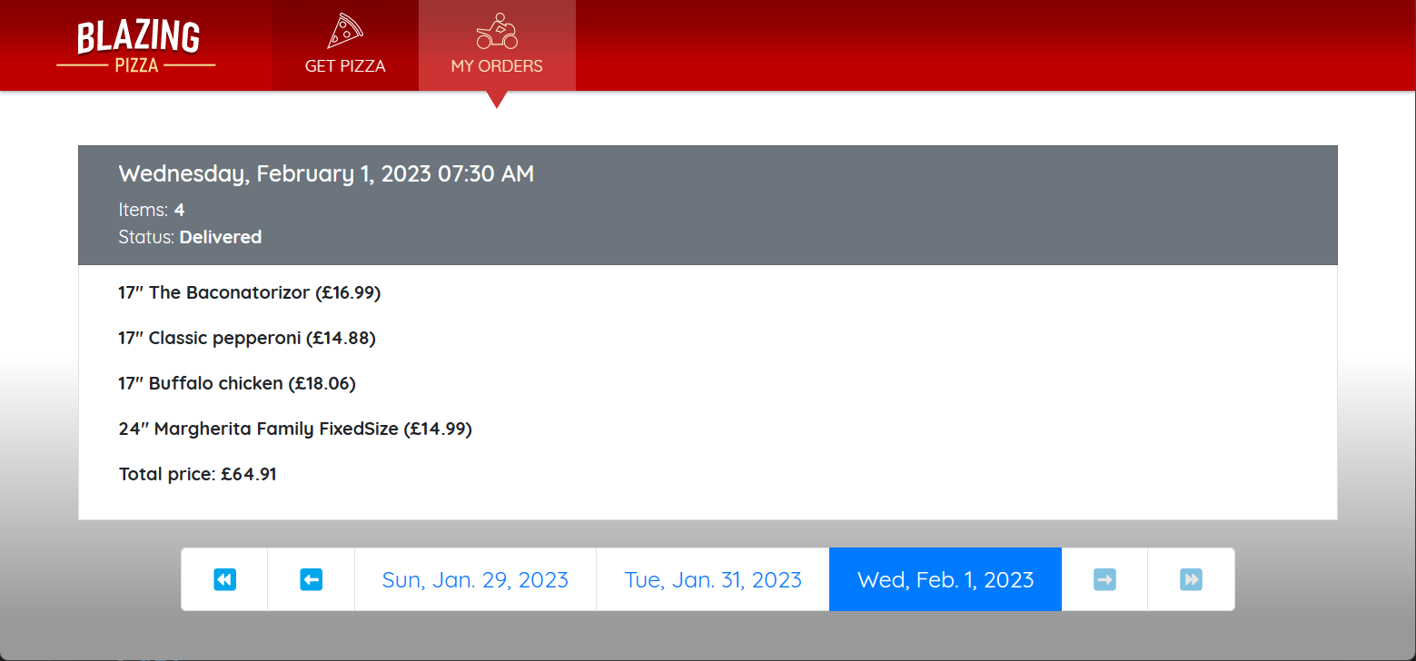
In the app, make a couple of orders and then select My Orders. Verify that you see a pagination control with a list of your orders, and can select an order to load the order details.
Press Shift+F5 or select Run > Stop Debugging to stop the app.
