September Update to docs.microsoft.com
This post was written by Jeff Sandquist, General Manager in the Cloud + Enterprise Division.
Our team is committed to continuously deliver features that delight and excite our users, as well as make their experience with our documentation in the most efficient way. In the past month, we have made several changes to back that commitment.
Performance Improvements
Among the exciting user experience changes, we are very conscious about the overall site performance, so we worked on improving the underlying code and CSS - we reduced the size of the fetched page by about 40%, which should make it much faster and also saving you data on mobile devices.
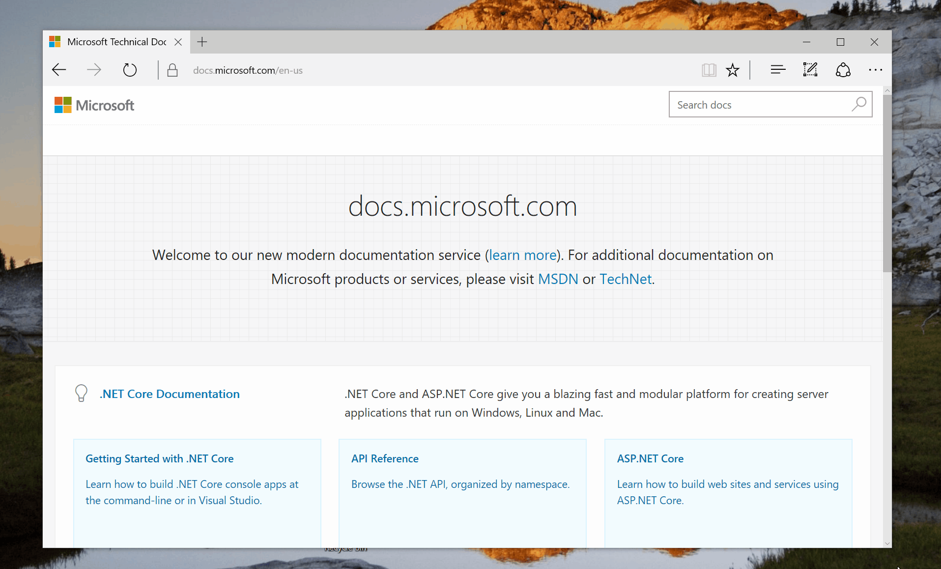
Addition of Site-Wide Search
This was one of the first ideas that our users submitted. You will no longer have to rely on a search engine and use the site:docs.microsoft.com filter in your search query. Simply open any page within docs.microsoft.com and use the search box:
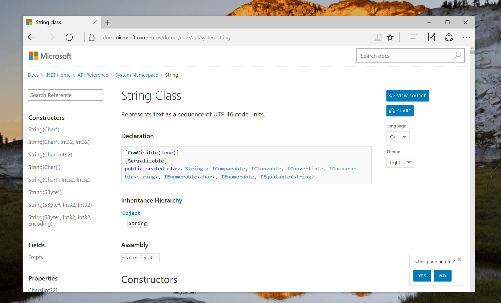
Reference Content Styling
One of the important things about docs.microsoft.com is consistency - whenever our users navigate through various pages within the site, they should feel familiar with the layout and all the options made available to them. To achieve that, we have made improvements to the API reference documentation pages. Those are now formatted the same way conceptual pages are (use the System.String page as a reference):
Improved Theme Switching
By now, you should be aware that docs.microsoft.com supports light and dark themes:
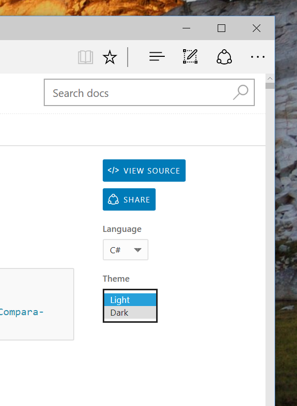
One thing we and some of our customers noticed is when the dark theme would be engaged, every time the user would go to a new page within the site they would see the light theme briefly flash before switching to the right mode. This was frustrating, so we developed a fix - you will now consistently see the theme that you selected, on all pages, with no delay.
Improved Language Picker
docs.microsoft.com supports a variety of locales for international content. Previously, we let users switch through a language picker that was not keyboard-accessible and located in a place where users weren't intuitively drawn to. Today, we replaced it with a better dropdown, located in the site footer, accessible from a keyboard or screen reader software:

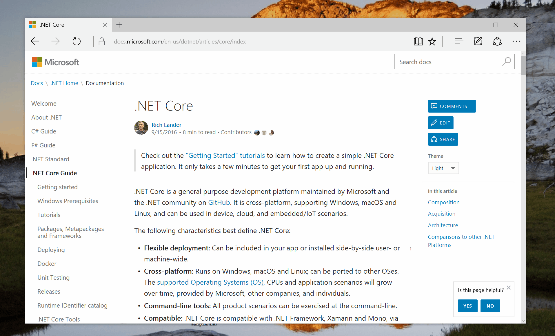
Sticky Action/Navigation Bar
When scrolling through a large article, often times users want a quick jump-off point to another section or simply use one of the built-in quick actions, such as editing or sharing. To make sure that's possible, we made the action/navigation bar on the right side of the page sticky, so that you can always quickly access the necessary information:
Post Scriptum
The work continues on making our experience the best documentation experience possible. Make sure to follow our blog and Twitter account for the latest updates.