Use Office UI Fabric React components in your SharePoint client-side web part
Office UI Fabric React is the front-end framework for building experiences for Office and Office 365. It includes a robust collection of responsive, mobile-first components that make it easy for you to create web experiences by using the Office Design Language.
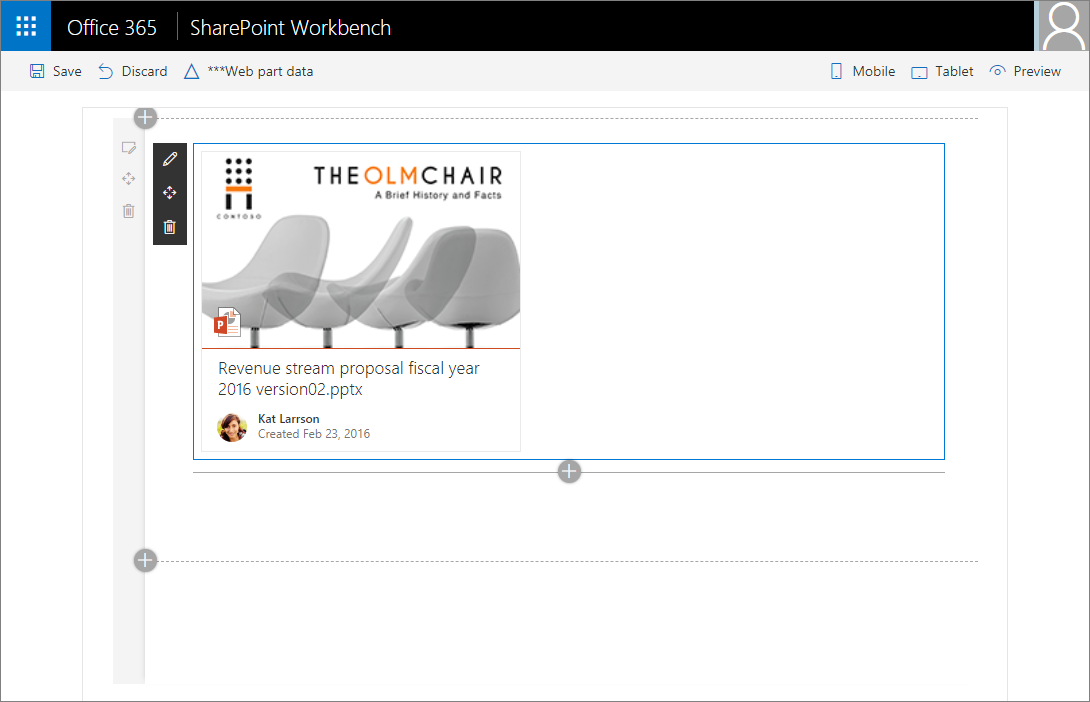
This article describes how to build a web part like in the following image, that uses the DocumentCard component of Office UI Fabric React.

You can also follow these steps by watching this video on the Microsoft 365 Platform Communtiy (PnP) YouTube Channel:
Office UI Fabric React & Fluent UI React
Note
Microsoft renamed Office UI Fabric to Fluent UI in early 2020.
The transition from Office UI Fabric to Fluent UI, and the respective React components, is currently in a state of transition. To learn more about the current state and their roadmap, see the FAQ provided by the Fluent UI team: FAQ Fabric and Stardust to Fluent UI.
SharePoint Framework (SPFx) packages currently reference the original Office UI Fabric NPM Packages. These packages are currently supported & will continue to work.
The primary Fluent UI React package, @fluentui/react, simply exports components from the office-ui-fabric-react package used in SharePoint Framework projects. At this time, you should continue to use the office-ui-fabric-react package in your SharePoint Framework projects.
This page will continue to refer to the Office UI Fabric packages until Microsoft recommends switching to the Fluent UI packages. The documentation links on this page may point to the Fluent UI documentation but it applies to the Office UI Fabric as well.
- Fluent UI website - detailed API documentation along with implementation code examples for each control.
- API reference - detailed API reference documentation.
- Office UI Fabric React / Fluent UI React - source code repository on github.
Create a new web part project
Create a new project directory in your favorite location:
md documentcardexample-webpartGo to the project directory:
cd documentcardexample-webpartCreate a new project by running the Yeoman SharePoint Generator from within the new directory you created:
yo @microsoft/sharepointThe Yeoman SharePoint Generator will prompt you with a series of questions. For all questions, accept the default options except for the following questions:
- Which type of client-side component to create?: Web Part
- Which template would you like to use?: React
At this point, Yeoman installs the required dependencies and scaffolds the solution files.
Starting with SPFx v1.8.2 version, Yeoman will include the recommended @microsoft/sp-office-ui-fabric-core package version to your solution when you select the React as the desired web framework.
Note
Starting with SPFx v1.8, you can use either Office UI Fabric React v5 or v6. Each version of SPFx upgrades the version of Office UI Fabric React in new projects. For example:
- SPFx v1.8 projects use Office UI Fabric React v5.132.0 by default
- SPFx v1.9 & v1.10 projects use Office UI Fabric React v6.189.2 by default
Different versions of Office UI Fabric React have different dependencies on versions of TypeScript. If you want to upgrade an existing SPFx project to a newer version of Office UI Fabric React, see the following section: Appendix: Upgrading Office UI Fabric React versions
This page assumes you are using the latest version of the SharePoint Framework.
Next, execute the following command to open the web part project in Visual Studio Code:
code .You now have a web part project with the React web framework.
Open DocumentCardExampleWebPart.ts from the src\webparts\documentCardExample folder.
As you can see, the
render()method creates a react element and renders it in the web part DOM.public render(): void { const element: React.ReactElement<IDocumentCardExampleProps> = React.createElement( DocumentCardExample, { description: this.properties.description } ); ReactDom.render(element, this.domElement); }Open DocumentCardExample.tsx from the src\webparts\documentCardExample\components folder.
This is the main react component that Yeoman added to your project that renders in the web part DOM.
export default class DocumentCardExample extends React.Component<IDocumentCardExampleProps, {}> {
  public render(): React.ReactElement<IDocumentCardExampleProps> {
    return (
      <div className={ styles.documentCardExample }>
        <div className={ styles.container }>
          <div className={ styles.row }>
            <div className={ styles.column }>
              <span className={ styles.title }>Welcome to SharePoint!</span>
              <p className={ styles.subTitle }>Customize SharePoint experiences using web parts.</p>
              <p className={ styles.description }>{escape(this.props.description)}</p>
              <a href="https://aka.ms/spfx" className={ styles.button }>
                <span className={ styles.label }>Learn more</span>
              </a>
            </div>
          </div>
        </div>
      </div>
    );
  }
}
Add an Office UI Fabric component
The new modern experiences in SharePoint use Office UI Fabric and Office UI Fabric React as the default front-end framework for building the new experiences. As a result, SharePoint Framework ships with a default version of Office UI Fabric and Fabric React that matches the version available in SharePoint. This ensures that the web part you're building uses the right version of the Fabric styles and components when deployed to SharePoint.
Because we chose React as our framework when creating the solution, the generator installed the right version of Office UI Fabric React as well. You can directly import the Fabric components in your react components without any additional work.
To add an Office UI Fabric component
Open DocumentCardExample.tsx from the src\webparts\documentCardExample\components folder.
Add the following
importstatement to the top of the file to import Fabric React components that we want to use.import { DocumentCard, DocumentCardPreview, DocumentCardTitle, DocumentCardActivity, IDocumentCardPreviewProps } from 'office-ui-fabric-react/lib/DocumentCard';Replace the existing
render()method with the following:public render(): JSX.Element { const previewProps: IDocumentCardPreviewProps = { previewImages: [ { previewImageSrc: String(require('./document-preview.png')), iconSrc: String(require('./icon-ppt.png')), width: 318, height: 196, accentColor: '#ce4b1f' } ], }; return ( <DocumentCard onClickHref='http://bing.com'> <DocumentCardPreview { ...previewProps } /> <DocumentCardTitle title='Revenue stream proposal fiscal year 2016 version02.pptx' /> <DocumentCardActivity activity='Created Feb 23, 2016' people={ [ { name: 'Kat Larrson', profileImageSrc: String(require('./avatar-kat.png')) } ] } /> </DocumentCard> ); }Save the file.
In this code, the
DocumentCardcomponent includes some extra sections:- DocumentCardPreview
- DocumentCardTitle
- DocumentCardActivity
The
previewPropsproperty includes some properties of the DocumentCardPreview component.
Copy the image assets
Copy the following images to your src\webparts\documentCardExample\components folder:
Note
In the code, we were referencing these images using relative path from the root location. As your reference the images in the code, it will cause them to be included in the *.sppkg solution package as long as you have the includeClientSideAssets set as true in the package-solution.json file.
Preview the web part in the hosted workbench
In the console, enter the following to preview your web part in the SharePoint hosted workbench:
gulp serve --nobrowserOpen a browser and navigate to your SharePoint site's hosted workbench:
https://enter-your-SharePoint-site/_layouts/workbench.aspx.In the toolbox, select your
DocumentCardExampleweb part to add:
Appendix: Upgrading Office UI Fabric React versions
Starting with SPFx v1.8, you can use either Office UI Fabric React v5 or v6. Each version of SPFx upgrades the version of Office UI Fabric React in new projects. For example:
- SPFx v1.8 and prior versions projects use Office UI Fabric React v5.x by default
- SPFx v1.9 & v1.10 projects use Office UI Fabric React v6.x by default
Different versions of Office UI Fabric React support different minimum versions of TypeScript.
Office UI Fabric React v5 depends on TypeScript v2.x. SPFx v1.8 and prior projects also depend on TypeScript v2.x.
Office UI Fabric React v6 require TypeScript v3.x. All SPFx v1.9 and later projects are configured to use TypeScript v3 or higher that matches the same dependency of Office UI Fabric React v6.
In the case where you want to upgrade an SPFx v1.8 project to Office UI Fabric React v6, you'll also need to upgrade the version of TypeScript on the project. See the SPFx v1.8 release notes for details: SharePoint Framework v1.8 release notes: Support for TypeScript 2.7, 2.9 and 3.x.